We believe in data driven decision making. Your existing website analytics is really helpful to understand the user patterns and key metrics in order take informed decision in the redesigning process. Some metrics we consider tracking are
A truly effective redesign is more than just about creating a new look; it’s about generating more visitors, leads, and customers. An entire website redesign isn’t always needed according to your marketing goals, but regular updates are a must aligned with your newest marketing plans. Here’s what we do:
When it comes to redesigning your website, we help you assess the successes and failures of your competitors to improvise on business strategy according to your goals. We determine this by analyzing close competitor’s websites or industry-specific websites. Side-by-side comparisons can be the best way to determine what your website doesn’t have, and further scope for improvement. It’s not about copying, but looking at what we can do differently and better.
When visitors reach your website they will need to very quickly understand who you are, what you do, if you can help them and why they should stay on your website (and ultimately buy). In order to achieve this you must have a unique selling proposition (USP) or in other words, the one thing that makes your company different. Then, your USP must be used to influence content across your entire website, especially on your homepage or other high entry pages. Hence, before crafting design and content strategy, we identify your Unique Selling Proposition (USP) so that it is consistent across entire website. This step defines how the world communicates with your website.
By clearly identifying your customers/visitors, you’ll be able to build a website that truly speaks to them. We develop one or more customer personas with your help, which are fictional characters, based on real data about customer demographics and online behavior, along with details about their personal attitudes, value drivers and concerns. This helps us imagine your ideal prospect and tailor the website to meet their needs. Some of the details includes demographics, geography, industry, designations etc. Also, need based analysis includes What are the biggest problems they are trying to solve? What do they need most? What information are they typically searching for? What trends are influencing their business or personal success?
Every website has functional and nonfunctional requirements. Before actual design & development process it is important to define those requirement. We jot down every feature you would like on your new website. Then, consider which features will help you meet or exceed your website goals as well as the needs and preferences of your website visitors. Categorize all the features into separate lists for “must have”, “want to have” and “nice to have”.
A visual sitemap is extremely helpful when planning website redesign. It helps organizing website content and capture all of the main sections that needs on new website. We start with drawing existing website sitemap. The purpose of making a sitemap for the existing website is to have a better idea of the site’s current information architecture and also usability issues.
Based on the content addition or deletion, features and other factors we create new sitemap for all stakeholder to understand the scope. It also helps to
Our design process starts with designing wireframes of all key pages. Wireframes illustrate the placement and prioritisation of content and functionality. It also help guide the navigation and layout design. We do it iteratively until all stakeholders reach a consensus.
Once the blueprint for the website has been defined through the creation of the sitemap and wireframes, the next step is to create a visual style. The overall visual mockups will most likely be determined by the visual brand of the organization; the goals being to connect the web with all other forms of the organization’s communications.
We believe in simplicity being the key. While designing the website concept, we emphasis on your branding guidelines, typography, iconography, visual language, simplicity and usability. We design visual mockups for all key pages for desktop & also create separate mockups for mobile.
As the number of people using mobile devices increases, so too does the pressure to ensure that our websites look good and are legible on mobile devices. While designing mockups we also make sure we test those on real mobile phones. This really helps us addressing usability issue before it becomes problem.
During this phase we will be responsible for the client-side as well as server side development ensuring the project adheres to W3C standards and best practices. We emphasize on
The major scripting & programming languages we use with website designing are Javascript, BootStrap, PHP, HTML5, CSS3, jQuery, AngularJs, Backbone.js
Quality of work is supervised by QA (Quality Assurance) team performing series of tests. We carry following QA activity before and after release of the website.
Does the website perform the functions defined in the original project definition, create task list and conduct methodical testing
Launching a new website can be a tedious task, but we alleviate some of the stress by following this comprehensive website launch checklist.
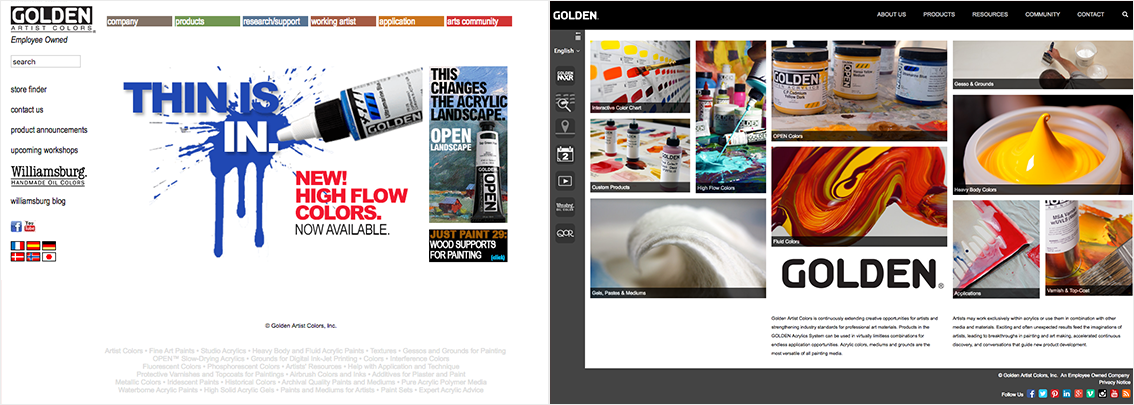
A newly revamped website to build a global community of artists.
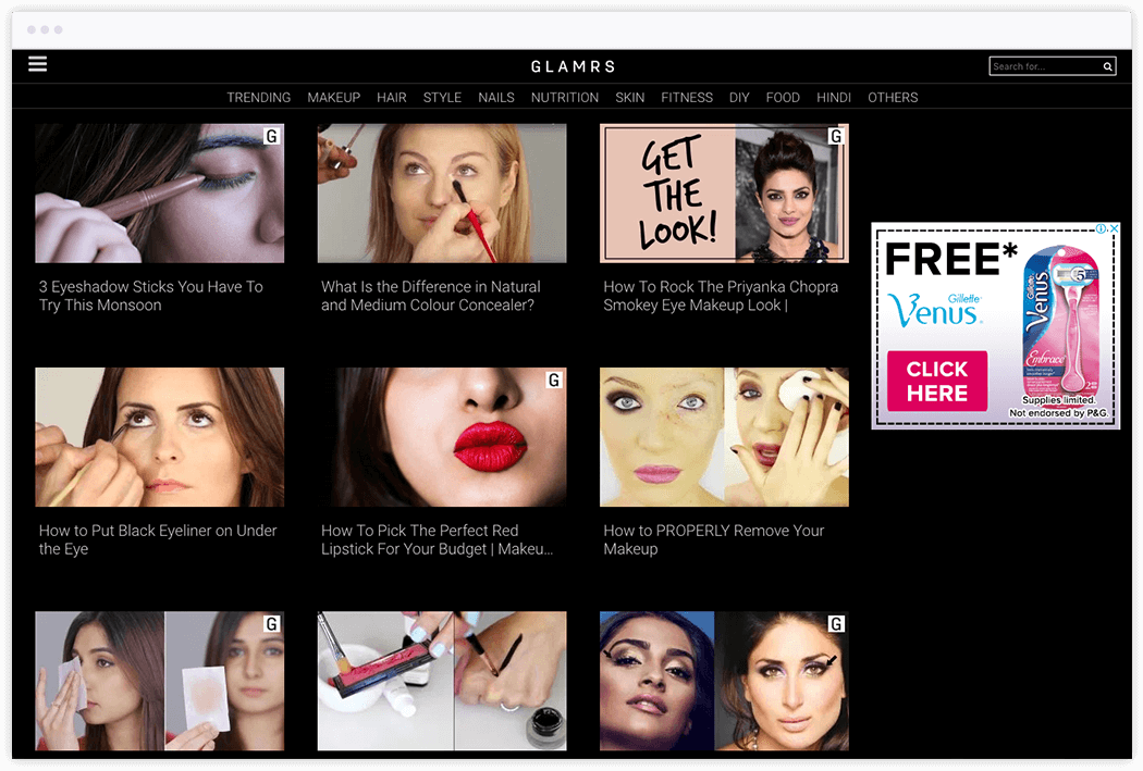
A newly revamped website related to beauty, fashion, lifestyle and much more!
 Current Website Metrics Analysis
