Today, mobile devices are becoming more popular than desktops as the number of mobile users is increasing day by day. So the highlight is how to cater the need of mobile users in order to provide the seamless mobile user experience. The first thing to do is to change our traditional approach towards the information architecture for mobile devices. As compared to a desktop, a mobile architecture is different as it depends on the mobile’s physical dimensions and capabilities. Also, the way people interact with mobile device changes from device to device. For example, the tablet is generally significantly bigger than a smartphone and prevent heavy mobility usage. While the smartphone is supposed to be with you almost all the time, in a pocket. When you are on the move, a smartphone might be preferable as it fits in a pocket or lighter to carry. In the opposite, if you have a lot of information to look at you will prefer a bigger screen i.e tablet.
The information architecture (IA) for desktops has become common practice but for mobile, there is still a long way to go as it is not yet established as a common discipline. Although mobile information architecture is hardly a discipline today, it certainly ought to be because of its differences from desktops.
The IA Should Be Differently Organized and Cater to Mobile Needs
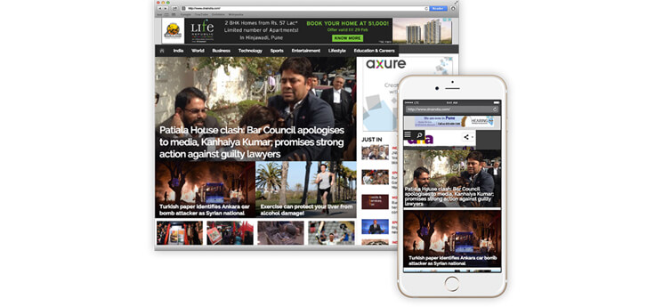
Following figure 1 shows how a typical news website is shown in desktop and mobile browser. Here we see the mobile website is just ported from desktop to make it work on a mobile browser. However, this approach is not useful in case of mobile devices because of its physical dimensions & capabilities. The IA should be differently organized to cater mobile needs.
Figure 1. Comparison of a news website in desktop and mobile browser
The role of a mobile information architect would be to interpret the website content in the mobile context. Below are some questions you have to ask yourself when starting to create a mobile information architecture:
- Do you use the same structure or sections as on desktop website?
- Do you present the same information above the fold? If so, how should that be prioritized?
- How does the user navigate to other areas?
- Do you use the same visual and interaction paradigms, or invent new ones? And if you do start to invent new paradigms, will you lose the visual characteristics of what users expect?
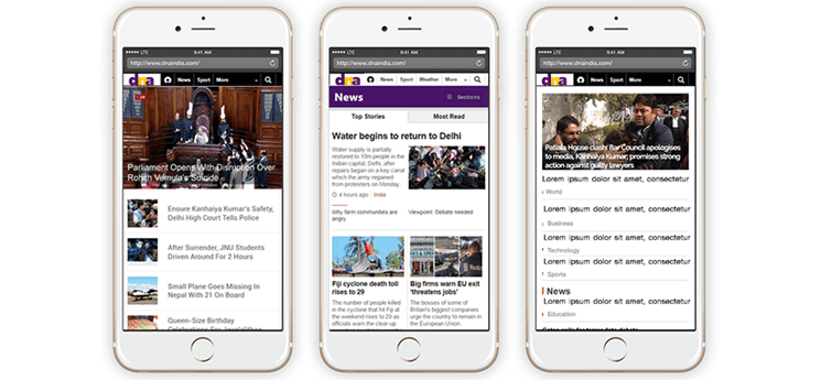
As we see in Figure 2 there are many ways that the news website has been interpreted in the mobile browser.
Figure 2. Many interpretations for the news website in the mobile browser.
But we are only beginning to scratch the surface. We also need to organize our mobile information architecture to address the mobile device context and capabilities. For example, the news website could show headlines based on the user’s location to make it more contextual & utilize mobile devices capabilities.
Site Maps
The first deliverable we use to define mobile information architecture is the site map. They visually represent the relationship of content to other content and provide a map for how the user will travel through the informational space, as shown in Figure 3.
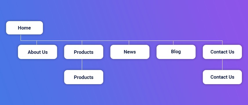
Figure 3. Typical mobile site map
Mobile sitemaps are not that dissimilar from desktops. But there are a few things specific to mobile that we need to consider while creating a mobile sitemap.
Offer Only What is Required:
Take an example of a typical e-commerce website, generally, there are 5-10 main navigation sections which help the user navigate through the website. If a user goes to the wrong section, he can simply click back & goes to another section. In the mobile context, tasks are short and users have limited time to perform them. In mobile websites, we can’t assume reliable network bandwidth that allows a user to quickly go back in case of a wrong choice. Therefore, the solution is to offer only what is absolutely required on mobile devices to minimize the risk of wrong choices.
Therefore, the solution is to offer only what is absolutely required on mobile devices to minimize the risk of wrong choices.
In Figure 4, you can see a poorly designed mobile information architecture that too closely mimics its desktop cousin; it was not designed with the mobile user in mind.
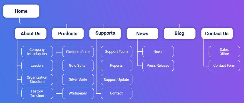
Figure 4. Mobile site map with traditional web approach
Now, in figure 5, we see an optimized site map for a mobile website which is created with the mobile user in mind. Here, each page in site map shows first few important items of the page which helps us to quickly present what type of content the user can expect from each page.
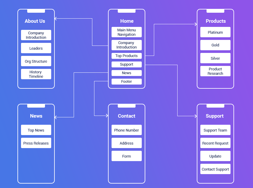
Figure 5. Optimized site map for a mobile website
We can even go deeper by simply taking one page at a time and showing its entire Clickpath journey which user may performs. Figure 6 shows Clickpath journey for About Us page.
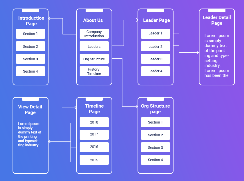
Figure 6. Clickpath journey for “About Us” page
Handy Tips for Creating Effective Mobile Information Architecture
Here are some tips you can keep in mind when you work on custom mobile app development services related to information architecture:
-
- Take a minimalistic approach.
- Focus on user goals.
- Do task-centered design.
- Respect the user's time and attention.
- Don't frustrate users.
- Give less choices-no long menus, no long options, no long pages.
- Maximum 10 links on a page.
- Navigation should be drill down, and contextual.
- Customize navigation according to the page. No more than 5 levels of drilling down.
- No pages with just links to drill down further. Make sure each page has valuable content. Even the homepage should have actionable content.
- Prioritize links and content. What's more important goes to the top.
- Always provide a way to exit to home, and a step back in each page.
- Break lengthy/complicated forms into a wizard-like step-by-step
The consistent flow of Architecture
App architecture is a designing process which has to manage all the defined flow. Basically, the flow includes three different layers:
-
Presentation layer
-
Business Layer
-
Data Layer
What Will Be The Next Step?
Cross-cutting is the fourth participant. This comprises the configuration, security, and connectivity/communication. After perfectly working on all these, now you can expect a better app architecture.
Designing mobile architecture is one of the crucial steps, and working with some of the best mobile app developers in India can help you manage the entire architecture flow in an effective way then you are on the right path. The mobile app developers can help you achieve your target in a minimal time frame.
Author's Bio

Dhiraj is a Sr. UX Analyst at Mobisoft Infotech. He has a passion for providing simple solutions to complex problems and actively plays the role of user advocate throughout the project life cycle. He is also a passionate Blogger & Tech. enthusiast. His hobbies include exploring new places & trekking.

 February 29, 2016


