Information Architecture is an art and science of organizing websites and softwares to support find-ability and usability.Information Architecture on it’s own can increase the propensity for success.
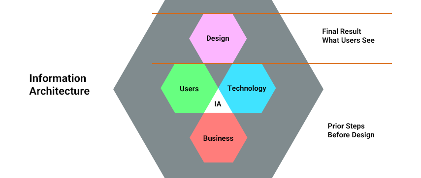
The following diagram defines what exactly Information Architecture is :
The good Information Architecture recipie is made up of three things as follows :
1.Business Strategy : which means to understand the value of your business.
2.The User : you must understand your user.
3.Technology : know the technology and it’s limitations.
No house is built without drawing the blueprints. So there’s no point in spending hours on thinking about the visibility & flow of the project without drawing the wireframes. The Design sometimes tends to be inaccurate in the case if we dont practice IA or usability as a part of the project.
Many of us think that information architecture is just the wireframing and organization of content in a way that proves useful for the people to understand in relating and explaining and creating navigation schemes. Technically, this is right, too. However, if we want to make this point more clear, we’ll need to acknowledge that Information Architecture proves to be important from user point of view because if user does not understand the navigation & flow there are chances that the user may get lost or feel frustated & think to leave & never return.
Information architecture can be a challenge for the growing number of interaction designers, user interface designers, visual designers, and software developers.
Simple defination of Information Architecture :
Information architecture helps people to find what they are looking for. It provides multiple ways to get to the same information. Providing the same information in multiple ways, gives user a choice to select the scheme in such a way that one scheme might work better than another. As the hierarchy increases the possibility of confusion increases which may result in users getting lost thus, depth & level of hierarchy is one of the important point to be noted while creating Information Architecture.
1. GATHERING INFORMATION:
This is the start point of every designer for each project. Every UX designer needs to play a role of detective at the very first stage of a project. The designers first need to find out much about the “People, Problem, & Project”.
Meeting with the client and identifying the requirements. Also benchmarking and studying the recent trend analysis.
2. STARTING WITH THE DESIGN:
Every single designer practice the method of quick sketching or some other prototyping form as the very first step of the design process.
Designers start working on the material gathered in the first step and find a design worth refining. This stage includes documenting along with the artistic and creative view.
3. CREATING DESIGN:
Sometimes instead of creating document most of the designers create wireframes and prototypes so as to experience & understand the actual flow of the project and then forward them to the developers. The rough sketches from the previous stage are low-fidelity and are usually not considered. High-fidelity design is the next step which is done by visual designers.
4. PROJECT APPROVAL:
This is an important part of the design process. Research documents and mockups coax this process. None of us want to see our work littered. Sometimes it happens that great projects get rebuffed just because idea & the motive behind the design process was not convincing.
Mobile Design : Information Architecture
Today 87% of the world’s population are mobile subscribers. Considering the remaining 13% people use a desktop computer, that’s quite a big difference.
Today mobile devices are dominant over desktop PC’s and they are clearly going to be dominant & in demand day-by-day. Along with these demanding mobile phones , there comes a set of new constraints, trends & opportunities for visual designs. Here are some points we should look out to update our approach.
Mobiles are different
Mobile Designs are far different , not only in regards to size but also the specifications of mobile devices bring in the different design affordances and requirements. Mobile devices are portable,moreover they are convenient to use. Thus people are habitual to them and because of the regular use people feel a solely bond with the mobile devices.
Specifications of mobiles
Now a days almost all mobile phones have touch-screen. Users depend on kinesics to interact with them. As mobile devices are handy & small the project content, flow & structure should be simple and easy to understand. Also, considering the bandwidth & connectivity, the designs should be made considering the loading time, with reduced data requirements.
Today most of the users feel a tender care towards their mobile device & thus feel lost if something happens with their phone. Thats why mobile phones are personified “alive” or one of the element they cant live without.
As the mobile devices have gone beyond the user expectations, it’s extremely important that designers must follow a user-centered design along with the latest trends but must be simple to navigate.
Different patterns for mobile architecture
Mobile devices have their own set of Information Architecture patterns. But there’s no particular method to wireframe a mobile site or an application.But there are some of the most popular patterns: Hierarchy, Hub & spoke, Nested view, Tabbed view, Bento box and Filtered view:
Hierarchy:
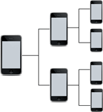
The hierarchy is defined as an arrangement of an index page/main page and a series of sub pages. This is a standard practice while making a website, however introducing additional patterns could allow you to tailor the experience for mobile.In this view one must take care of navigation. Complicated navigation structures can awake a problem for people using small screens.
Hub & spoke :
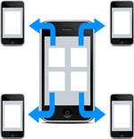
A hub and spoke pattern gives a central index from which users will navigate out. It’s the default pattern on Apple’s iPhone. Here users must return to the central index. This practice is now being more popular within the mobile landscape as it focus on one task.In this view one must one must consider the users that want to multi-task.
Nested view:
The nested viewpattern leads users to navigate to more detailed screens. In this view user can markout where they are in the the flow of the app while moving forward and then back. In this view users won’t be able to quickly navigate to other sections so check whether this view will be suitable or not before designing.
Tabbed view:
This is the regular patterns in app. It’s a collection of sections tied together by a toolbar menu. This allows the user to quickly move and understand the complete functionality of the app when it’s first opened.
Before implementing this view one must check the complexity. This view proves best for very simple content structures.
Bento Box/Dashboard:
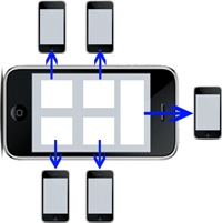
The bento box or dashboard pattern prvides more detailed content directly to the index screen by using components to display portions of related tools or content. This pattern is mostly practiced in tablets than mobiles. It serves to be powerful as it allows the user to get the information at a glance, but only if a well-designed interface with information is presented clearly. This pattern is well implemented in tablets as we get lot of space to utilize, so it is important to understand how a user will interact with the content. One must ensure that app is easy, efficient and enjoyable to use.
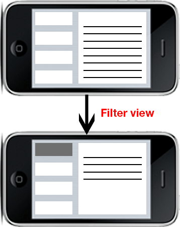
Filtered view:
The filtered view pattern allows the user to navigate within the application by selecting filter options. Filtering method is an excellent way to allow users to explore content in a way that suits them or more specifically about the “particular” content or tool.
UX designers need to resolve the problems identified during the above processes, to have more creative work and research. They need to demonstrate their work beyond wireframes, spread understanding of UX design. This leads to increase their effectiveness.
Thus, Information Architecture plays an important role and is a crucial part of each & every project.




 November 27, 2012


