"You have 10 seconds to leave an impression and tell them what they'll get out of your website and company. After this time (and oftentimes before), they'll leave." -- How People Read on the Web: The Eyetracking Evidence
No one would like to miss out on a prospective client. An impressive and impeccable web design can meet the need of any enterprise. In order to keep people hooked, web design field is constantly evolving. Let us have a look at web design trends that are expected to change the web industry in a year.
Mobile Only Websites
“4 out of 5 consumers shop on smartphones.” From Brick-and-Mortar to Mobile Click-and-Order: Which Retailers are Carving Out Space in the M-Commerce Market?
The web design industry is moving from desktop to mobile only website. This drastic shift of users is forcing enterprises to consider mobile only strategy. If you have a website for mobile, there is a high possibility of more visitors than desktop. Many, these days, consider ‘Mobile First’ strategy as well, since they know it holds the success in future.
Let’s take Google Map, for instance. We all use it on our smartphone and since they have interface apt for mobiles, we find it easy to use and prefer it most. Had it not been with mobile website, we would have preferred conventional way of locating destination while on the go.
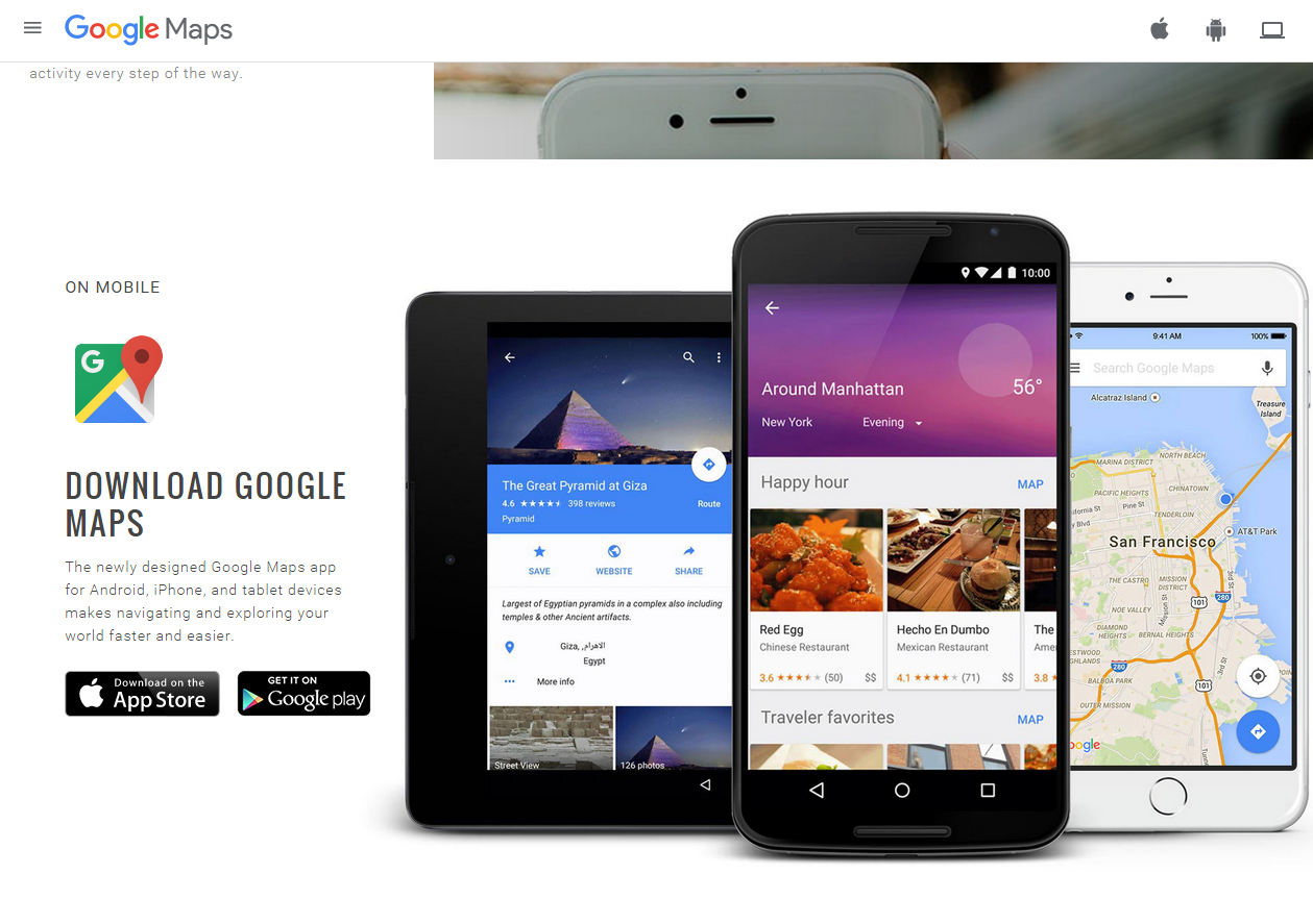
(Image Courtesy: Google Products)
Large Background Images
Photographs with models or Photoshop images are losing its importance. People prefer natural photographs of real people over everything else. Hence, companies are putting photographs of their team members and employees on website design to increase trustworthiness amongst its potential customers.
Typographic design
While some companies and enterprises would be opting for large background images, some would simply replace background image with typography. Web designers are exploring their creative side by using typographic design. In the near future, we could expect a lot of it.
Scroll Down
Companies are moving away from link-based approach. With increasing usage of latest devices, companies are adopting scroll down designs. This, further, enhances the storytelling technique of a web designer as well.
Take a look at Nasa Prospect (www.nasaprospect.com). The website perfectly uses the feature of scroll down and tells a story through their graphics. This certainly keeps the visitor hooked up to the website and increases their curiosity to scroll down.
Storytelling
Compelling storyline can extend a user’s attention for couple of seconds more than usual. Companies and enterprises are getting creative and using various techniques of storytelling to achieve this.
Storytelling ways include videos, animations, impressive content and photographs. Web designers are expanding their creativity by including these elements in their storytelling.
Prince Pal, in his blog titled, ‘Web Design Trends Predictions for 2016 by Prince Pal’, gives example of www.story.glass. The designer is successful in grabbing the attention of the user while trying to tell the story. He/She has engaged user through scroll down feature as well.
Split Screen
Nicole Boyer says in blog titled, ‘5 website layout trends of 2015 so far’, that many businesses use split screen to provide two elements. Some uses it to promote two products or services with equal importance whereas some use this design to promote a product and build the brand image of the company at the same time.
Since companies offer multiple products or services we can expect more of this design in the near future. The entire marketing strategy is changing and companies are getting personal. Perhaps, this design could help companies to build a personal connection with their potential customers as well.
Take Dewey's Pizza, for instance. They have used the split screen feature to creatively display their products with central menu bar. It, indeed, is one the best ways to use slip screen to break the monotony and enhance the look of the website.
(Image Courtesy: Dewey’s Pizza)
Card Web Design
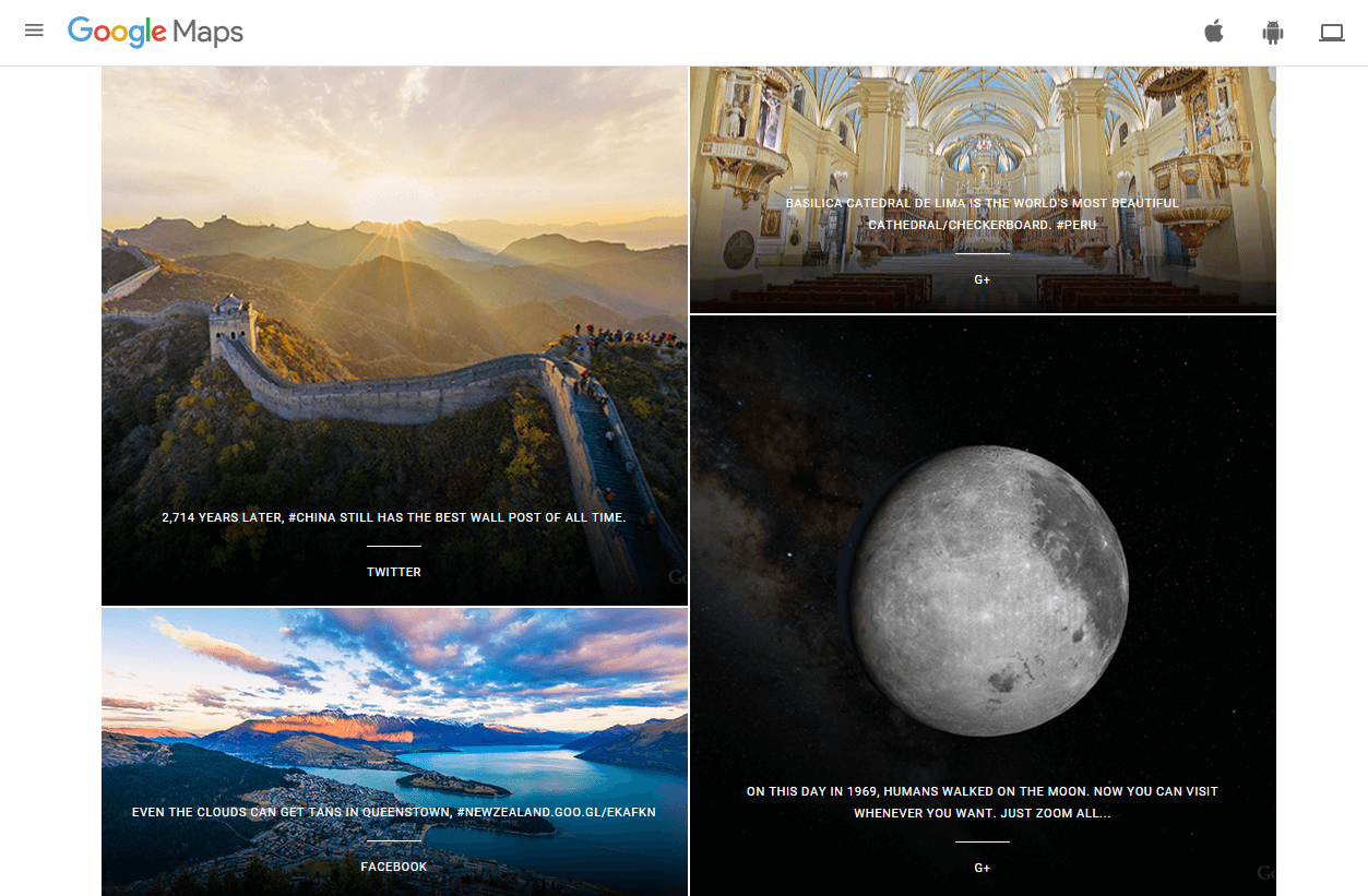
Card web design is gaining popularity amongst web designers. Not only they look attractive but it is possible to display a lot of information above the fold. Most popular example of this design is Pinterest.
Generally, shopping portals use this feature. For instance, Greats (www.greats.com) have managed to pull out the feature to the best use. Cards could be systematic and of similar sizes or can be irregular where one would spread across page while others are below or around it.
(Image courtesy: Google Maps)
Ghost Buttons
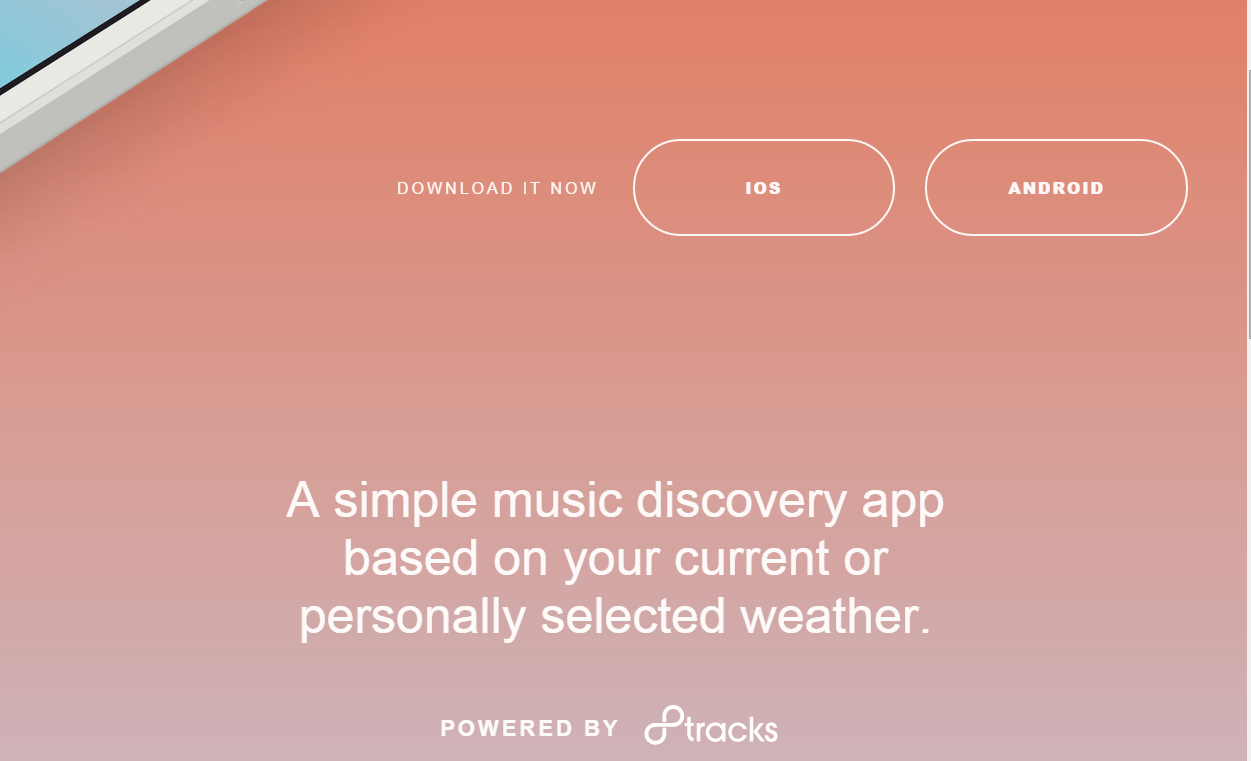
Ann-Feliza Sy mentioned in a blog, titled ‘6 Design Trends Taking Over The Web’, that ghost buttons got popular post Apple iOS 7. These transparent buttons enhance the aesthetic of the web design without hampering the background image or text. In a year, we can expect this to be a prominent part of the web design.
Weather Jams (www.weatherjams.com) has creatively incorporated trending features to come up with an informative and engaging website. Look how they have placed their ghost buttons and have made it more appealing to the visual.
(Image courtesy: Weather Jams)
Visually appealing
Right when multimedia was getting old, designers were experimenting with different elements to create more visually appealing websites. Joanna Krenz Kurowska & Jerzy Kurowaki mention that Flash was one of the platforms for such experiments in their blog, ‘The big design trends for 2015’, for 99 designs.
Today, HTML5 element is used to create visual effects for website pages. Designers are considering these experiments since it has the potential to disable user for some moment by giving them visually appealing pages. They are also using graphic designs innovatively to improve the visual appeal.
(Image courtesy: Apple)
Single Screen Design
While split screen is getting popular amongst designers, some companies are opting for single screen design. This is opposite to split screen and has one screen just like a television screen. This one image will be symbolic to the product or service a company offers.
Nicole Boyer (5 website layout trends of 2015 so far) says the idea is to provide clarity and focus to the customers. In this, the image has to be stunningly beautiful and attractive to overcome the absence of chrome.
User Friendly web designs
Diminishing user’s attention is calling out for not only attractive and interactive designs but also those that are easy to understand. This calls for a user-friendly design. For this, designers have to bend certain rules in order to meet the end-user’s expectations.
With more people leaving conventional web viewing habit and shifting to handy devices, designers would focus more on easy yet attractive layouts. Wait and see how rules are bent to meet user’s expectations.
Increasing popularity of Flat Design
“68% of the web designers say flat web design will be here for around five years” – User Experience Report: Flat Web Design Is Here To Stay.
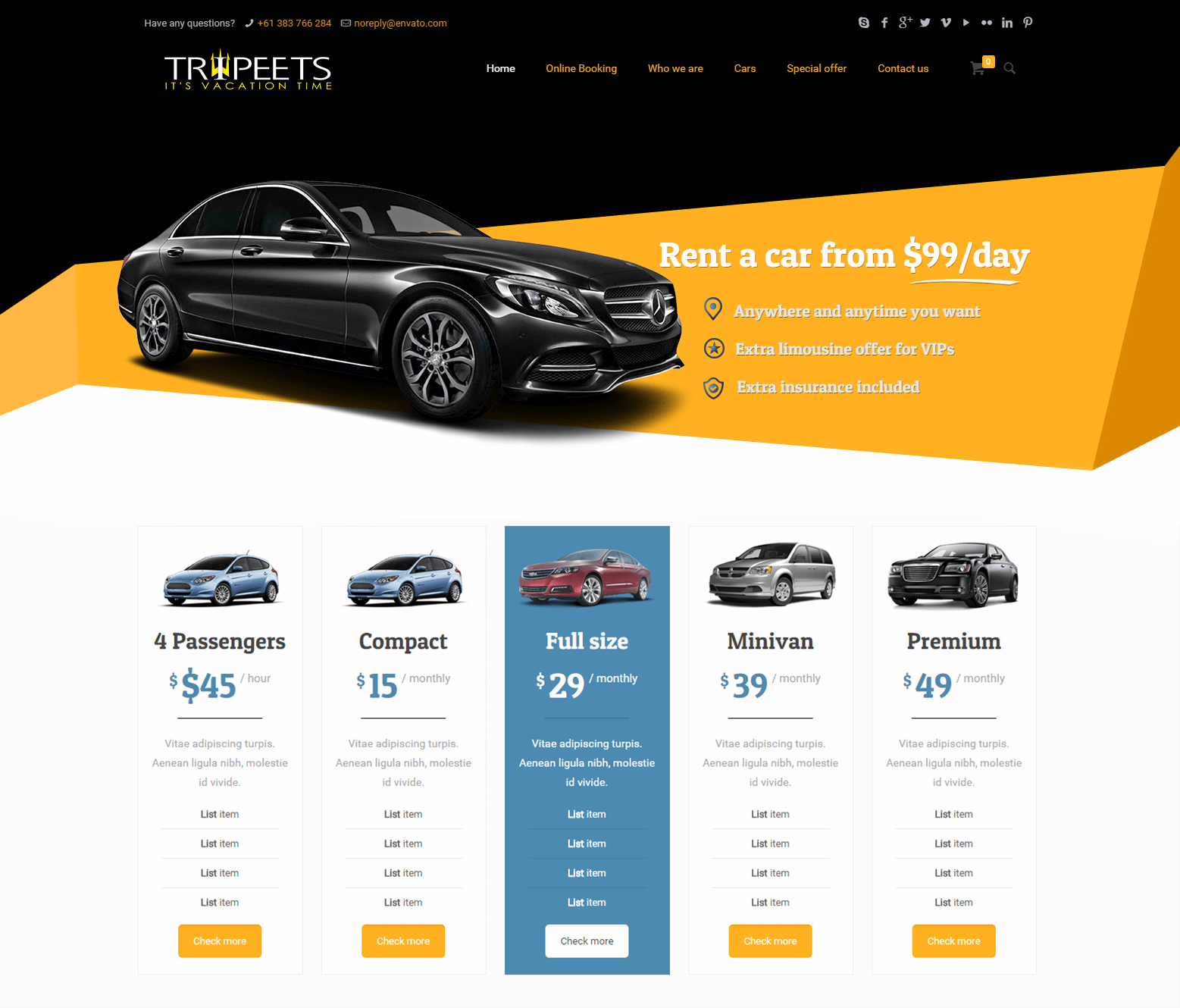
Flat design gained more momentum than expected. Big or small, every company is adopting this design because of its advantages –focus on content, wise usage of colors to guide user’s visual and excellent use of white spaces.
Undoubtedly, this helps users as well. They get a clean and attractive website with required information. Designers have the liberty to play around with the flat designs by adding up 2D or 3D images or illustrations.
Animations in Web Design
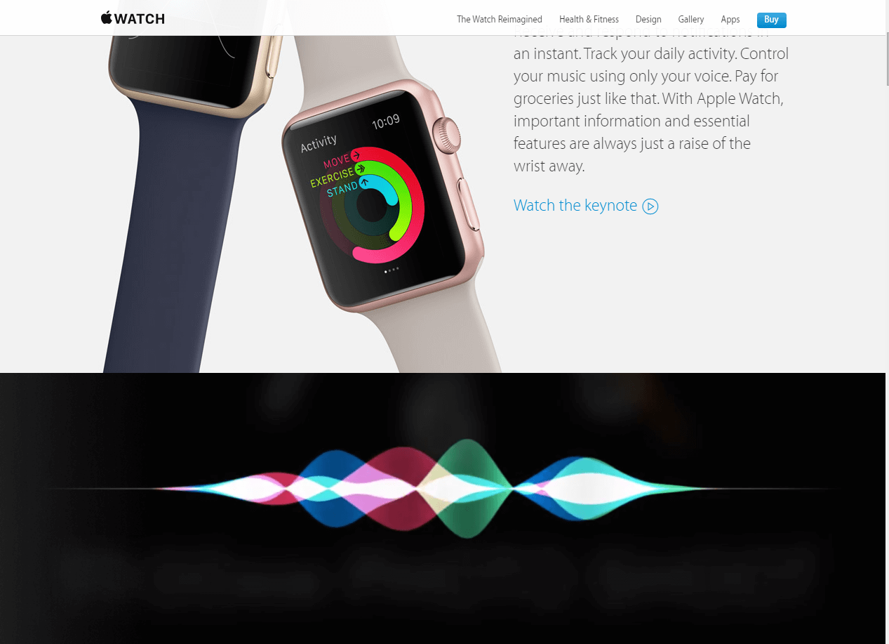
Animation is moving from movies to websites. Companies suffer from reduced users’ attention and thus are finding out ways to retain them. Animated web pages are one of the ways to increase user’s attention.
The animation moves when the cursor is rolled over on the screen. Though the effect is for short period, it does get user’s attention. This might not get as popular as other trends yet it would be prominent amongst web designers.
Mighty Nice (www.mightynice.com.au) is one such website that used the animation to the best. You would be stunned by the creative use of animation.
(Image Courtesy: Apple Watch)
Innovative Header Background
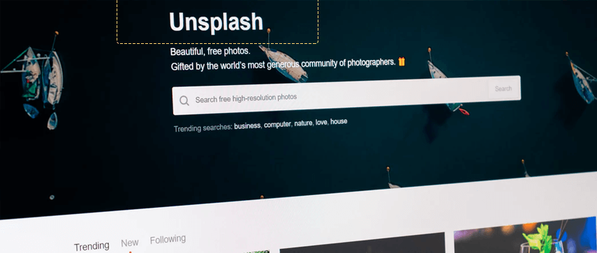
Once, web pages had a large header with some texts on the top of it. However, some companies decided to bend the rule and gave rise to some new attractive trends. While some are leaving the large header background some are making it bigger than before.
Amber Leigh Turner gives example of The New Wave Company on her blog, 10 Web design trends you can expect to see in 2015, for The Next Web and explains how the large header is replaced by a large typography at the company’s home page.
(Image courtesy: The New Wave Company)
Web-design dominated by loading speed
“47% of people expect a web page to load in two seconds or less. Whereas 40% of people will leave a website if it takes more than 3 seconds to load.” — Econsultancy
Once designers had freehand to work on the web pages, but today they have various factors influencing their creativity; loading speed being of them. Web designers are working hard to not only simplify the website but also to make it light to increase the loading speed. Thus, expect more of quick loading simple websites in the near future.
Getting Material Design
Google extended the flat design and gave us Material Design. This user interface design has main focus on clean, minimal color usage, typography and shapes. Since Google is one of the trend setters, don’t get shocked if you see this trend getting popular. They have used this design perfectly for their mobile inbox. You get all the required information on an attractive and stunningly designed page.
Attractive & Informative Infographics
Infographics became popular last year and would continue till next year. However, in its journey, they would become more attractive and informative. Web designers are using various ways and techniques to make infographics the center of attraction on web pages.
Using videos
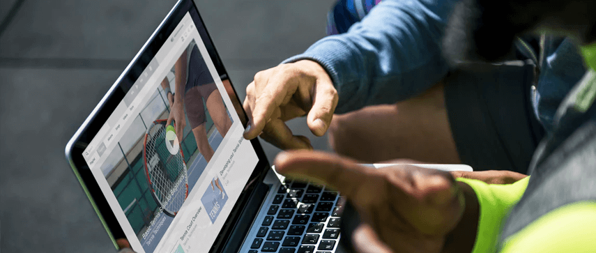
Videos were never an element of web design until recently. Videos are able to retain visitors while giving out required information. Since users want quick information, web designers are including videos as an element in design. Perhaps, in a year you would notice that videos would be prominently used against content.
(Image courtesy: Apple Watch)
Colorful web pages
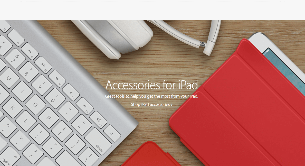
Until recently web designers played safe. They gave simple web pages with limited colors. However, with time they have turned bold. Web designers are not shying away from playing with colors. Interestingly, users are welcoming this boldness thus encouraging them to step out from their comfort zone.
(Image courtesy: Apple)
Collaboration of conventional and modern techniques
Social media buttons are successful in increasing the visibility by helping startups and enterprises reach out to the masses through various social media mediums. What’s next? Well, now startups and enterprises are experimenting by bringing conventional and modern marketing strategies together.
We have already started seeing a trend of bringing social media buttons along with direct email marketing buttons on the landing page. This would be used to survive the nasty and competitive market.
Moving Images
Moving images, also called as cinemagraph, are an emerging trend in the latest web design industry. Web designers have come up with this element, which is the mixture of photograph and video.
There have been few websites that have experimented with this element. Many believe that this element increases the visitor’s attention by 15 percent. In a year, this might become more common than now.
Design language
Design has its own language. Since designers are experimenting with various designs, it is legit to expect evolved design language in the coming year. Designers would use various elements and would define new rules to incorporate designs.
Responsive Design
Popularity of handy devices like tablets and mobile phones is influencing web designs. Experts are focusing on responsive designs as maximum people prefer handy devices over desktop. Since it is turning the need-of-the-hour, we can expect some great output by next year.
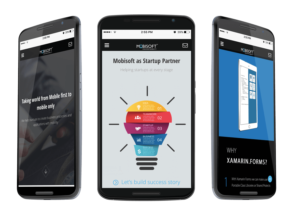
Innovation is the key to success. Technology advancement influence web designing to a greater extent. With so many software, techniques and algorithms, web designers are looking for better, innovative and attractive ways to grab a user’s attention. Last year had seen a lot of new trends in web designing industry, which certainly is going to continue to 2016.


 October 1, 2015


