Think about this for a second: you’ve spent months building a sharp mobile app UX design or a responsive website. The visuals look great, colors pop, maybe you even threw in some slick animations. But when people actually start using it, their excitement eventually fades. They can’t find important features, buttons feel way too small to tap, and the checkout feels more like a frustrating maze.
Mobile UX has grown beyond a ticking-the-box exercise. Now, it’s the frontline where brands either hold onto their customers or lose them outright. Poor mobile user experience impacts engagement, retention, conversions, and brand loyalty, so it really matters.
Let’s walk through the 10 biggest mobile UX mistakes that sneak under the radar and, more importantly, how to fix them. This way, you gain an edge and show some serious digital strategy muscle.
Tiny Touch Targets – A Common Mobile UX Error
Small buttons or links often go unnoticed until users try to tap them. Then it becomes a pain point instantly. When people need to zoom in or aim carefully, it just kills their flow and leads to frustration.
Why should leaders care? Because what might seem like a small annoyance can quickly turn users off. Overlooking this basic UX design mistake in mobile apps signals a disconnect from users’ real needs and expectations.
How to fix it?
Design buttons with a minimum hit area of 44 by 44 pixels. Add plenty of padding to avoid accidental taps. And place important buttons where thumbs can easily reach, usually the bottom center or the right side for right-handed users.
This isn’t just a suggestion. It’s backed by research and mobile UX best practices from Apple and Google. Following this shows you’ve stepped up your UX for mobile apps. Check out these mobile app UX best practices to design experiences that flow naturally.

Slow Load Times – A Major UX Mistake That Hurts Retention
Speed rules here. Even a couple of extra seconds for loading feels like forever when people are on the move. From a leadership view, optimizing performance shows operational discipline and a focus on user needs. It means design, development, and backend teams are collaborating well. That kind of teamwork is a sign your organization really prioritizes mobile app UX design.
What to do?
Compress images and serve them with modern formats like WebP. Cut down JavaScript and CSS to the essentials. Use lazy loading to delay non-critical stuff. Add a content delivery network so assets load fast, depending on where users are.
In short, slow load times are one of the most common UX issues in mobile apps, and fixing them is a business must-have tied directly to keeping users around.
To keep your users engaged, explore our mobile UX design services that focus on building faster, more responsive apps.
Clunky, Overstuffed Navigation – A UX Mobile App Pitfall
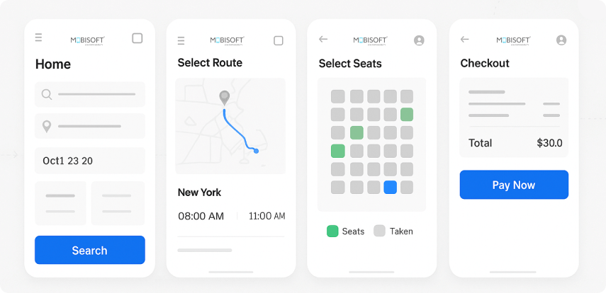
Think of navigation like the GPS for your users. If you pack it with too many options or layer deep menus, you’re basically handing someone a complex map with no landmarks.
The fallout? Users feel lost. Overwhelmed. They get cognitive overload and often give up on their goal. Hick’s Law tells us that decision time goes up with each added option, so less really is more here.
From a leadership perspective, UX isn’t about stuffing every feature into the menu. It’s about figuring out what users really want and guiding them there. Cutting down navigation based on data and research reduces common UX flaws in mobile apps and signals maturity in your approach.
How to improve?
Keep the main navigation options to 3 to 5 clear categories. Use bottom navigation bars so thumbs can easily reach the key spots. Show more complex options only when necessary; that way, users aren’t overwhelmed upfront.
Good navigation follows mobile UX best practices and helps users achieve tasks faster. Simplifying navigation starts with a proven mobile app design process, ensuring users can move through your app with confidence.
Ignoring Thumb-Friendly Design – UX Mistakes That Break Flow
How people hold their phones, mostly with thumbs, matters a lot.
This goes beyond aesthetics. Designing for thumb reachability shows you’re really thinking about users. An approach invested in human-centered mobile UX design reflects leadership quality.
What does that mean practically?
Map out “thumb zones” and avoid putting critical buttons in hard-to-reach spots, like the top-left corner for right-handed users. Make tappable areas bigger near those easy-to-reach places. And test your designs with a diverse group, considering different handedness.
Thinking about ergonomics like this helps prevent poor mobile user experience and shows you want your product to work well for people.
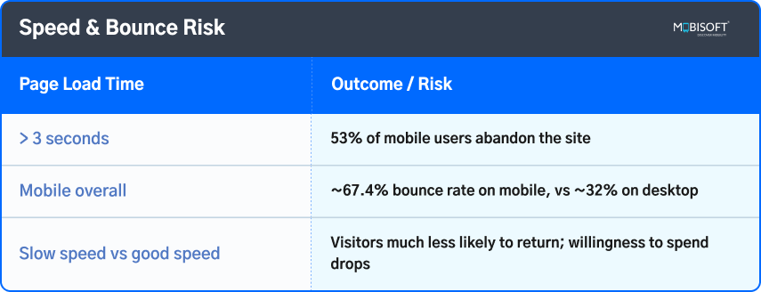
Speed & Bounce Risk” Table
Overcomplicated Forms – A Mobile UX Mistake That Reduces Conversions
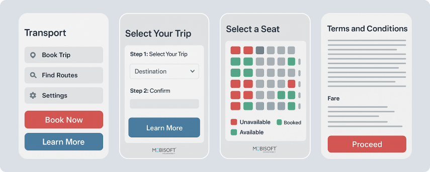
Long, confusing forms are a quick way to scare users off on mobile.
Why does this matter from a business stance? Form abandonment means lost customers and missed chances to connect. What helps?
How to fix it?
Keep forms short, ask only what’s really needed upfront. Use smart input types like phone-specific keyboards and validated email fields. When forms need multiple steps, add progress bars so users know where they stand. Add inline validation with friendly messages so users aren’t left guessing if they made a mistake.
Smooth, efficient form design isn’t just good UX. It reflects a mature operation that values user experience and avoids mobile app UX errors. Thus, helping with customer retention.
Ignoring Accessibility – A Critical UX Mobile App Mistake
Accessibility is an ethical responsibility and smart business practice.
Leadership-wise, inclusive design opens you up to wider audiences and enhances your reputation. The World Health Organization reports that over 1.3 billion people, or 16% of the global population, experience significant disability worldwide. That’s a massive group you don’t want to ignore.
What does a good accessibility strategy look like?
Make sure color contrast meets WCAG 2.1 AA standards. Add descriptive alt text for images and properly label forms. Support screen readers and keyboard navigation. You can’t just guess that it works, test your site with real users and accessibility tools instead..
Leading companies bake accessibility into their UX KPIs and quality checks. Avoiding this is one of the biggest UX design mistakes in mobile apps, while prioritizing it marks you as a forward-thinking, socially responsible organization.
Source: Global report on health equity
Pop-Up Overload – A Poor Mobile User Experience
Pop-ups can backfire if overused or poorly timed. This hurts your bottom line. If pop-ups appear too early or all the time, users get annoyed and leave, causing lost conversions and bad reviews.
How do wise leaders handle it?
Use real data to decide when to show pop-ups. Only show them after meaningful user actions, not immediately. Prioritize what users want over aggressive marketing pitches.
Avoiding common UX issues in mobile apps like intrusive pop-ups respects users’ time and focus and shows emotional intelligence in how you lead products.
Inconsistent Visual Language – A Common Mobile App UX Error
Consistency in design is more than aesthetics. It builds trust and professionalism. Why care? Users expect to recognize your interface across screens without confusion. Mixed fonts or mismatched buttons break that trust, resulting in a poor mobile user experience.
Leadership-wise, a strong design system is a strategic asset. It keeps things cohesive, speeds development, and protects your brand identity. Companies that avoid these UX design mistakes in mobile apps and adopt a systemized approach tend to grow better and retain users longer.
How to tighten up?
Document your typography, colors, spacing, and button styles. Use libraries and design system consulting for mobile apps that everyone can access.
Consistent visuals prevent common UX issues in mobile apps. This makes the users feel that your product is solid and dependable. A unified look can be achieved through expert design system consulting for mobile apps, helping you maintain coherence across every screen.
Not Testing in Real Conditions – A Costly UX Mistake That Hurts Retention
Testing only in perfect labs or quiet offices doesn’t cut it. Real users deal with all sorts of environments. Mobisoft’s usability testing services account for these variables, helping uncover real-world mobility app UX challenges and improving design for smooth, skimmable experiences.
Thinking strategically, testing under real-world conditions uncovers problems you won’t spot otherwise, slow networks, bright sunlight, and noisy places. It’s critical to designing smooth, skimmable experiences.
Good leaders invest time and budget to test on different devices, OS versions, and in various scenarios. This supports fast, informed improvements based on real user feedback. Strengthen your approach by creating a seamless mobile user experience that adapts to real-world conditions.
Good leaders invest in testing:
- Performance on slow or unstable internet.
- Usability in distracting settings.
- Accessibility with assistive tech.
- Reading under bright or dim light.
Forgetting Micro-Interactions – Overlooked Mobile UX Best Practices
Small details like micro-interactions make an app feel alive and responsive. Why bother? These little feedback moments build user confidence and make interactions smoother.
From a leadership standpoint, focusing on micro-interactions avoids subtle mobile UX errors and shows you care about emotional design, an important trend in UX for mobile apps.
How to improve micro-interactions?
Animate button presses with subtle cues or haptic feedback. Show confirmatory messages like “Added to Cart.” Use smooth transitions to guide focus. Celebrate small wins with playful animations.
These touches turn ordinary flows into memorable experiences, helping reduce mobile UI mistakes that reduce conversions and boosting retention.
Bonus Mistake: Designing for Yourself, Not Your Users
One big trap is designing based on personal taste instead of real user needs. This matters because true UX leadership means making decisions based on user personas, usability data, and continuous validation. Rather than sticking to just gut feeling or trends.
Good practice includes:
- Frequent usability tests and interviews.
- Using heatmaps, recordings, and analytics to track real behaviors.
- Keeping personas central in decision-making.
Avoiding self-centered design prevents UX design mistakes in mobile apps and ensures products are built for users, not vanity.
Survey-Based Stat Pool
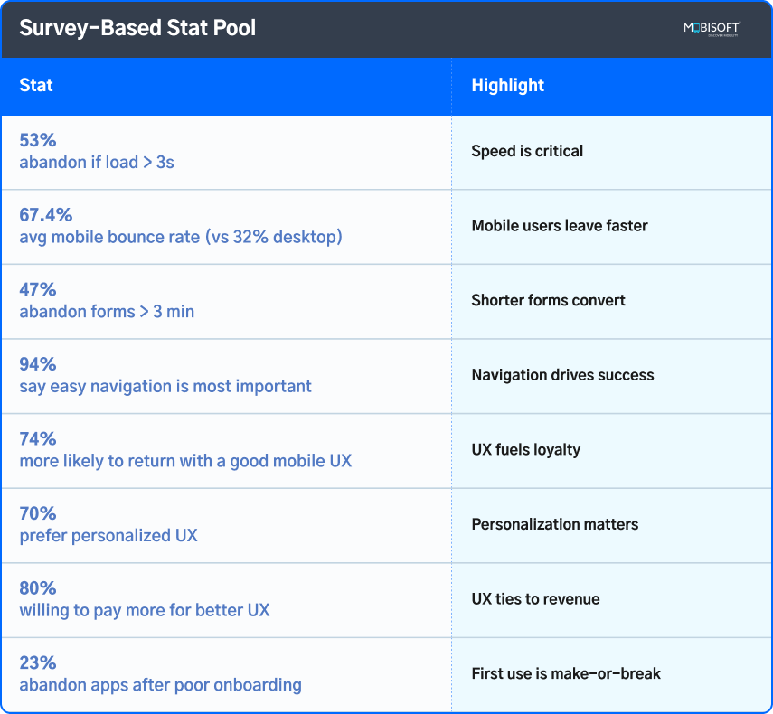
The Big 3: Must-Have Tips for Better Mobile App UX Design

Focus on these three improvements, and you will be able to deliver the biggest payoff:
Speed Is Non-Negotiable
- Performance is the final visible sign of quality, and users expect instant results, with small latencies intolerable on mobile devices.
- A one-second wait holds people in place, but when that is extended to five seconds, the chance of the person bouncing approximately doubles, producing weaker engagement and reduced conversions.
- The answer is to tune image formats, minimize large scripts, and cache with CDNs so that the content feels instantaneous across the board. Think of performance as an underlying mobile UX best practice that eliminates one of the most common mobile app UX mistakes.
Thumb-Friendly Controls
- Operation of the mobile is almost entirely one-handed, and as the thumbs do the bulk of the work, small or inconveniently-located controls render the whole interaction clumsy.
- Research on "thumb zones" finds that individuals prefer the bottom center and bottom right screen positions, where call-to-actions have the greatest success.
- Controls should be no smaller than 44-48 points in width with appropriate padding to prevent mis-clicks. Usability through comfort inherently boosts satisfaction and completion levels. Thus, avoiding a poor mobile user experience caused by UX design mistakes in mobile apps.
Keep It Simple
- Mobile is not optimized for complexity, and jam-packed menus, intimidation-based options, or lengthy forms create decision fatigue that accelerates abandonment of tasks.
- True simplicity requires reducing navigation to the absolute minimum, offering clear signs, and asking only for information that is absolutely vital in the immediate present from the user.
- Progressive disclosure creates a thin and friendly interface by revealing information when necessary, reducing friction, fast-tracking goals, and communicating professionalism. This prevents common UX issues in mobile apps that frustrate users.
Learn how tailoring apps for UX design for Gen Z users can improve engagement with younger audiences.
Don’t Make Users Work So Hard
The best mobile app UX design is invisible. It makes tasks feel easy, natural, and even enjoyable. Avoiding these mobile UX mistakes that hurt retention isn’t about small tweaks; it’s about committing to your users’ success and satisfaction.
Stick to these principles, and you’ll avoid poor mobile user experience, build relationships that fuel growth, and build strong brands. Mobile UX leadership goes way beyond pixels. It drives real competitive advantage in a world that’s gone mobile-first.
Ready to take the next step? You can hire mobile UX designers to build user-first apps that boost retention and loyalty.
Key Takeaways
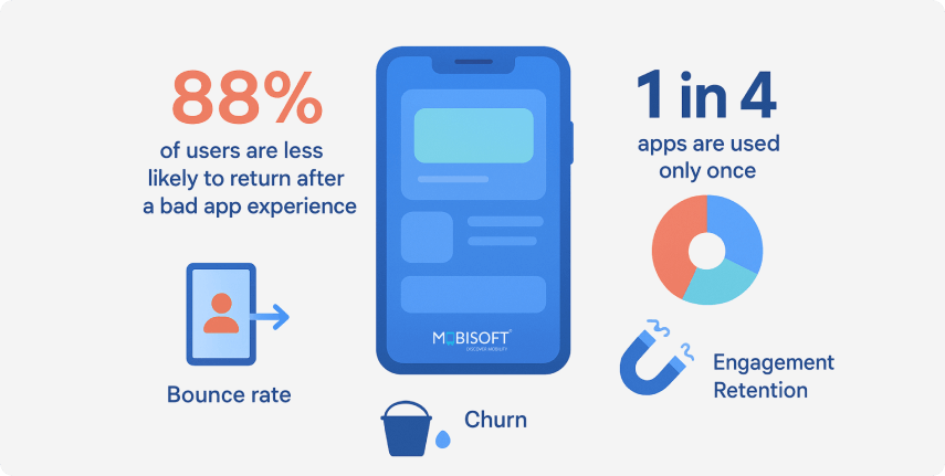
- Mobile UX is critical: Over 60% of global web traffic comes from mobile; every tap, swipe, and scroll affects engagement, retention, and conversions.
- Tiny touch targets kill flow: Buttons smaller than 44–48 points frustrate users; well-sized, thumb-friendly controls improve usability and trust.
- Speed drives survival: Pages taking 3 seconds to load see bounce probability rise by 32%; at 5 seconds, abandonment risk jumps by 90%.
- Clunky navigation overwhelms: Too many options increase decision time (Hick’s Law), creating cognitive overload and higher abandonment.
- Thumb zones matter: Designing for natural reach zones improves comfort; ergonomic layouts can raise conversions dramatically.
- Overstuffed forms lose leads: 68% of users abandon forms that are too complex; shorter, smarter inputs with validation reduce drop-offs.
- Accessibility is business-critical: 1.3+ billion people live with significant disabilities, ignoring them cuts reach and damages reputation.
- Pop-ups must be strategic: Poorly timed pop-ups repel users; well-timed ones after user actions can lift conversions by over 100%.
- Visual consistency builds trust: Strong design systems ensure cohesion, speed development, and reinforce brand credibility.
- Real-world testing is non-negotiable: 88% of users don’t return after poor experiences; testing in messy conditions prevents failures.
- Micro-interactions matter: Small feedback cues (animations, haptics, confirmations) build confidence and loyalty.
- User-first design wins: Designing for personal taste is a vanity trap: data, personas, and testing should guide decisions.


 September 1, 2025


