Tips to design innovative
digital products for Senior Citizens
(As continued from Volume 1)

“If you can get senior citizens to say that your company is good, their loyalty level is so much higher than younger peoples’. If you make things easy for them, they’ll keep coming back to you again and again.”
Senior citizens are the largest-growing consumer group with the maximum amount of money to spend as they represent an expanding population segment with a lot of buying power.
However, they are usually overlooked at when it comes to mobile app ideas/ user interface design or are considered only as an afterthought by most of the technology companies.
Not all old people are vulnerable and in need of help: particularly the younger old who are active and are engaged in giving back to society. Senior citizens are a heterogeneous lot and to stereotype them as needy is not right. Mobile devices being manufactured for them should focus on age-appropriate designs that reflect their interests and to enable them to actively feel, and be better connected.
For senior citizens, the basic idea that you can access almost any piece of information, from almost anywhere is a mind-boggling concept, which is the innovative apps’ features all the tech specialists and application designers must make maximum use of.
Before we get into User Interface guidelines for the senior citizen, let’s take a look at their age-related functional limitations and what are its implications:
| Visual Decline with aging: |
|
| Hearing Loss with age: |
|
| Motor Skill Diminishment: | Arthritis and Parkinson’s Disease affecting 50% of Americans over 65 leads to difficulty in:
|
| Cognitive Decline: | Among the elderly, Alzheimer’s Disease, dementia or even subjective memory loss can lead to:
|
| Multiple impairments and recognition: | Many senior citizens deny acknowledging the natural ageing process and disguise any sort of functional or sensory impairment such as difficulties in performing daily activities such as using a telephone, watering the plants, using the Internet etc. |
Let’s take a look at the basic considerations a design specialist must keep in mind before creating a device or implementing mobile app ideas for senior citizens:
- Create your design in accordance with various screen sizes
- It should be usable without an active Internet connection (note-taking or calculator apps)
- Integration with other parts of the mobile operating system
- Readable and understandable text
- Audible voice commands
- Identifiable links
- Clear Headings
- Good orientation and Navigation

“Seniors need to be treated with respect and dignity, so ensure that your design does not patronize or talk down to them!”
While designing the user interface for the older adults, the designer must purely focus on the social, psychological and mental needs of the user to guarantee maximum digital participation from their side. The key to the brilliant user experience for people catering to all age groups is sheer simplicity.
| Font: |
|
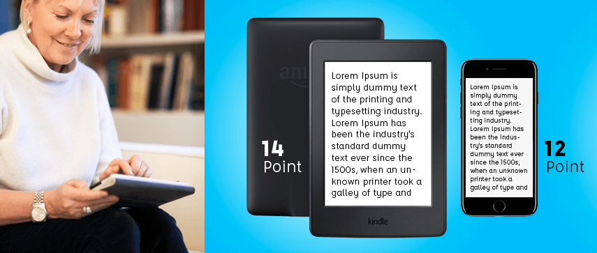
| Visual Design: | Experienced older users can scan pages as well as younger users, but newer elderly users can find pages with irrelevant material (such as advertisements) highly distracting. Older users generally prefer larger text and for those who have vision-deficits require suitable contrast along with headings to help them narrow their visual search.
|
| Animation & Graphic Elements: | Flashing or blinking graphics are highly distracting. For both new users and those with diminished peripheral vision, such as glaucoma or cataracts, such animation can be the difference between viewing a site and not. Excessive popup windows and ads banners have this same impact, distracting the reader and drawing attention to everything else but the app.
|
| Color: | Color is a critical consideration in web and interface design. Partial sight, aging and congenital color defects all produce changes in perception that reduce the visual effects of certain color combinations.
|
Certain Must-Knows:
- Avoid the use of complex interactions
- Key function unity (one key one function)
- Page function unity (one page one task)
- Place confirmations every possible time
- Make use of Coloring
- Make use of Labeling
- Make use navigation bar/menu
- Provide feedback continuously
- Distinct feedback from each action
- Minimize Errors
- High Recoverability
- On-screen help
- Make use of proper size interface components
- Touch sensitive area/Size of the button should be 16.5 mm to 19.05 mm
- Spacing size between button/touch sensitive 3.15 mm to 12.7 mm
- Avoid using the scroll bar
- Present text the simplest way
- Make use of black font on white
Tech specialists need to ensure that they go an extra mile when it comes to accommodating the human aging process so as to make the innovative apps or mobile device easier and faster to use.
Contrary to what many people believe, older people don’t have much time to waste. If they find the UI/UX too difficult, they will go elsewhere-just as all other users do.