Let’s be honest. We’ve all seen it: a sleek website that looks like a piece of digital art. . . and leaves you completely confused about where to click. Or the other extreme, a tool that works like a charm but looks like it was built in 2002 by someone allergic to fonts and whitespace.
Balancing aesthetics and usability in UX design is how you build digital products people actually want to use and keep using. For CTOs, CROs, and business leaders, this balance directly impacts customer retention and conversions.
We’re here to help you create UI UX designs that look good, deliver seamless functionality, and drive measurable business results. If you’re looking for expert support, explore our UI/UX design services.
Aesthetics vs Usability in UX Design: Stop Picking a Favorite
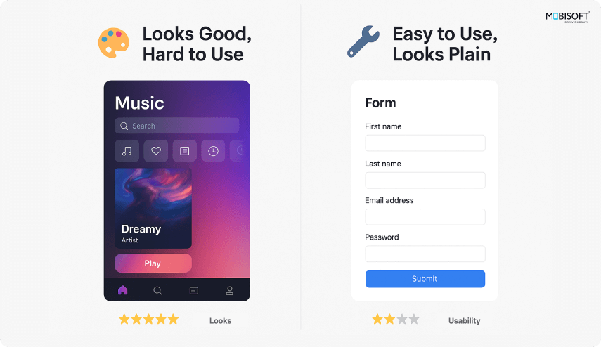
Let’s get this out of the way. Design aesthetics vs usability are not in a fight. They’re not rivals. They’re a team. And when one overshadows the other, users pay the price.
- Design aesthetics make your product visually appealing, build trust, and create a professional vibe.
- Usability in UX ensures your product works smoothly and intuitively. It answers the question: “Can users get stuff done without rage-clicking?”
You need both. You wouldn’t buy a gorgeous coffee machine that spits out mud. And you wouldn’t proudly display a reliable coffee machine that looks like a microwave from the '80s. To ensure this balance, many businesses rely on specialized web UX design services.
Why You Should Care About UX Design
This is about outcomes.
First impressions happen fast.
We’re talking milliseconds. Your users decide whether your product feels “worth their time” before they even scroll.
Aesthetics shape perception.
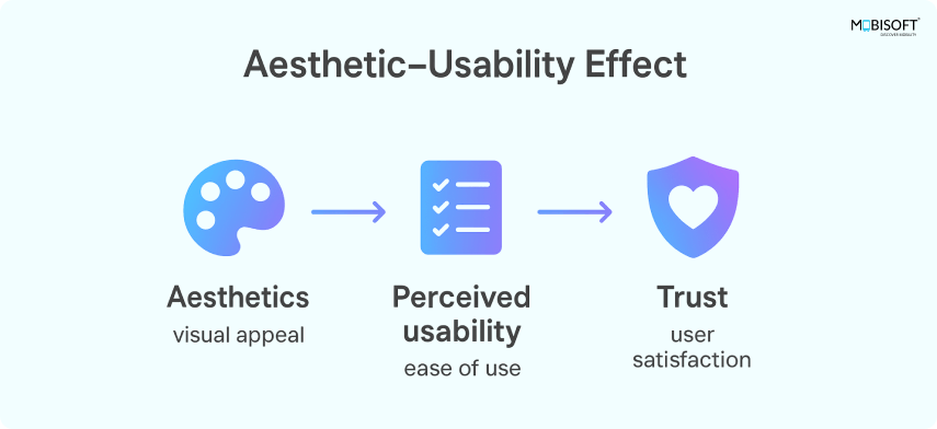
Aesthetic-Usability Effect is true, but that doesn't mean you can compromise on usability. People trust and like pretty things. But they stay for usefulness.
Poor usability costs money.
If people can’t figure out your interface, they won’t convert. And they definitely won’t come back.
There’s a proven Aesthetic-Usability Effect: users often perceive aesthetically pleasing designs as more usable. That doesn’t mean you can compromise usability. People may trust and like pretty things, but they stay for usefulness.
Poor usability costs money. If people can’t figure out your user interface design, they won’t convert, and they definitely won’t come back.
A study by Google showed that visually complex websites are rated as less beautiful than simpler ones, even if both are professionally designed. Less is more. Except in pizza toppings. For a deeper evaluation of usability gaps, consider running a UX audit.

Start With Clarity in Mobile UX Design, Not Just Colors
Here’s where most teams go off-track in mobile UX design or web applications: they start with the color palette, typography, or mood boards titled “Vibes.”That’s not how you build usable products.
Start asking the right questions
- Why do users want this service, product, or feature?
- Who is our target audience?
- What is the user trying to achieve?
- How can we design a system that is useful to the user?
- What is the geography, demography & situation of the user when he/she will use the app?
- Can they figure it out without calling support or crying?
Build clear flows before decoration. Keep navigation clean. Use obvious labels. Guide users with visual cues and UI hierarchy to reduce cognitive load in design. Businesses focusing on mobile-first strategies can benefit from dedicated mobile app UI design.
Make sure the flow makes sense before you decorate it.
- Keep navigation clean.
- Use obvious labels.
- Guide users with visual cues.
Let Aesthetics in UX Design Pull Their Weight
Aesthetics in UX serve usability, too.
- Use color to highlight key actions. Your primary CTA shouldn’t blend in like camouflage.
- Use typography to create hierarchy. Bigger fonts say “look here.” Smaller fonts say “this can wait.”
- Use spacing to reduce visual clutter. Let things breathe. Your users will thank you (silently).
Also, make sure your UI doesn’t look like it was built in four different decades. Consistency is key.
Example: Let’s take “Slack”. Slack uses color and spacing not just for looks, but to make chats readable and channels easy to scan. It’s pleasant and practical. That’s the sweet spot. The future of aesthetics will also be shaped by AI in UX design.
Be Familiar with UI Design Principles, Not Just Fancy
Innovation is great. Until it confuses people.
Stick to familiar UI design principles:
- A menu icon should open a menu.
- A button should look like a button, not a decorative rectangle.
- Forms should behave like. . . well, forms.
You’re not being boring you’re being efficient. Good intuitive design makes users comfortable, just like doors that always open in expected ways. Strong design familiarity often starts with robust UX research.
Design for Everyone with UX Accessibility in Mind
If your product only works for 80% of your users, it doesn’t work. UX accessibility is non-negotiable.
- Use color contrast that people with vision issues can still read.
- Make your app navigable via keyboard.
- Label your icons and form fields properly.
- Don’t rely on color alone to convey meaning.
You don’t need to make your app grayscale and boring. Just make sure it's usable by your grandma, your nephew, and your colleague who still uses Internet Explorer. A truly inclusive approach helps maximize user experience impact on conversion rates.
Follow UX Best Practices: Data, Not Gut Feelings
Designers have taste. Developers have opinions. Business leaders have goals. But what matters is what users actually do.
Leverage data to refine UX best practices:
- Use heatmaps to see where users click.
- Record user sessions to watch friction points.
- Run A/B tests with different UI UX design options.
- Check your analytics. Do users drop off at checkout? Find out why.
Example: A booking platform had a clean and beautiful calendar view. But users rarely completed bookings. They tested a step-by-step wizard with clear visuals and text. Bookings rose by 22%. Guess which one they kept?
Get Your Team Talking for Better Functional vs Visual Design
Design disasters usually come from silence or silos.
Involve designers, developers, and decision-makers from the outset.
- Share goals clearly. Is it priority conversions? Engagement? Something else?
- Get feedback before you’re too deep into design.
- Don’t show up last minute, saying, “Can we just make it pop?”
Collaboration ensures a balance of beautiful vs usable UI without last-minute chaos.
Build Once, Scale with a Consistent UI UX Design System
A design system helps scale UI UX design efficiently. It saves time, ensures consistency, and prevents fragmented user experiences.
Include:
- Your brand colors and how to use them.
- Typography rules: headers, body text, everything in between.
- Components like buttons, modals, inputs, and alerts.
- Interaction patterns: hover states, click behavior, loading animations.
Think of it like IKEA instructions, but without the mystery bolts.
Keep Testing, Iterating, and Improving UX Design
Your user experience design doesn’t end at launch it’s an ongoing process.
- Watch how people use it.
- Ask real users what confuses them.
- Fix the little things. They matter.
- Try new ideas, test them, and move on if they flop.
Strong UX design practices are more like hygiene than one-time projects.
Final Thoughts: Balancing Aesthetics and Usability in UX Design
A great product balances functional design vs visual design. One without the other is incomplete.
Your role as a business leader is to make sure they work together.
Ask yourself:
- Does our product look trustworthy and modern?
- Can a new user figure it out without a manual?
- Are we designing for users, or for designers?
If you’re not sure, that’s your answer.




 June 26, 2025


