React 19 pairs seamlessly with Shadcn UI, a utility-based React UI component library known for its flexibility and reusability. Shadcn UI React leverages Tailwind CSS, enabling developers to easily customize and create responsive, accessible components. Unlike traditional React UI libraries, Shadcn UI adds component files directly to your codebase, granting full access to modify styles and props as needed. Theming in Shadcn UI is straightforward, making it highly adaptable to various UI design React requirements.
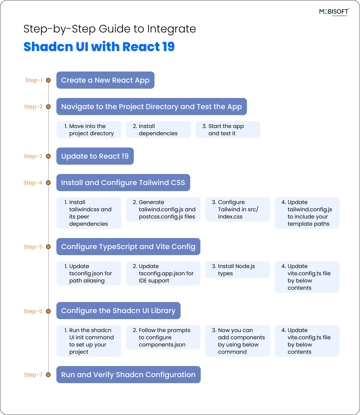
Step-by-Step Guide to Integrate Shadcn UI with React 19

Step 1: Create a New React App
Run the following command to create a new React Vite app with the TypeScript template:
npm create vite@latest react-shadcn-app -- --template react-tsStep 2: Navigate to the Project Directory and Test the App
1. Move into the project directory:
cd react-shadcn-app2. Install dependencies:
npm install
3. Start the app and test it:
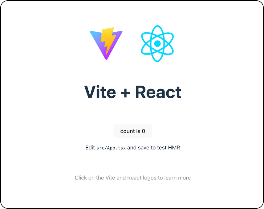
npm run devOpen the app in your browser, e.g., http://localhost:5174. Ensure the default Vite app screen loads successfully.

Step 3: Update to React 19
By default, Vite installs React 18. Update to React 19 using the following command:
npm install react@latest react-dom@latest @types/react@latest @types/react-dom@latestStep 4: Install and Configure Tailwind CSS
1. Install tailwindcss and its peer dependencies,
npm install -D tailwindcss postcss autoprefixer2. Generate tailwind.config.js and postcss.config.js files:
npx tailwindcss init -p3. Configure Tailwind in src/index.css: Replace the content with:
@tailwind base;
@tailwind components;
@tailwind utilities;
Remove the default styles from index.css to prevent overriding:
:root {
 font-family: Inter, system-ui, Avenir, Helvetica, Arial, sans-serif;
 line-height: 1.5;
 font-weight: 400;
 color-scheme: light dark;
 color: rgba(255, 255, 255, 0.87);
 background-color: #242424;
 font-synthesis: none;
 text-rendering: optimizeLegibility;
 -webkit-font-smoothing: antialiased;
 -moz-osx-font-smoothing: grayscale;
}

a {
 font-weight: 500;
 color: #646cff;
 text-decoration: inherit;
}

a:hover {
 color: #535bf2;
}

body {
 margin: 0;
 display: flex;
 place-items: center;
 min-width: 320px;
 min-height: 100vh;
}

h1 {
 font-size: 3.2em;
 line-height: 1.1;
}

button {
 border-radius: 8px;
 border: 1px solid transparent;
 padding: 0.6em 1.2em;
 font-size: 1em;
 font-weight: 500;
 font-family: inherit;
 background-color: #1a1a1a;
 cursor: pointer;
 transition: border-color 0.25s;
}

button:hover {
 border-color: #646cff;
}

button:focus,
button:focus-visible {
 outline: 4px auto -webkit-focus-ring-color;
}

@media (prefers-color-scheme: light) {
 :root {
 color: #213547;
 background-color: #ffffff;
 }

 a:hover {
 color: #747bff;
 }

 button {
 background-color: #f9f9f9;
 }
}
4. Update tailwind.config.js to include your template paths:
/** @type {import('tailwindcss').Config} */
module.exports = {
 content: ["./index.html", "./src/**/*.{ts,tsx,js,jsx}"],
 theme: {
  extend: {},
 },
 plugins: [],
}
Step 5: Configure TypeScript and Vite Config
1. Update tsconfig.json for path aliasing:
{
 "files": [],
 "references": [
  {
   "path": "./tsconfig.app.json"
  },
  {
   "path": "./tsconfig.node.json"
  }
 ],
 "compilerOptions": {
  "baseUrl": ".",
  "paths": {
  "@/*": [ "./src/*"]
  }
 }
}
2. Update tsconfig.app.json for IDE support:
{
  "compilerOptions": {
   // ...
   "baseUrl": ".",
   "paths": {
    "@/*": [
     "./src/*"
    ]
   }
    // ...
 }
3. Install Node.js types:
npm install -D @types/node4. Update vite.config.ts file by below contents
import path from "path"
import react from "@vitejs/plugin-react"
import { defineConfig } from "vite"

export default defineConfig({
 plugins: [react()],
 resolve: {
  alias: {
   "@": path.resolve(__dirname, "./src"),
  },
 },
})
Step 6: Configure the Shadcn UI Library
1. Run the shadcn UI init command to set up your project:
npx shadcn@latest init2. Follow the prompts to configure components.json:
Style: New York
Base color: Zinc
CSS variables for colors: Yes/No (based on preference)
If you encounter the warning: 'Some packages may fail to install due to peer dependency issues in npm,' simply use the --legacy-peer-deps flag. This is necessary because not all supporting packages have been updated yet.
For more information you can check here: https://ui.shadcn.com/docs/react-19
3. Now you can add components by using below command
npx shadcn@latest add buttonIf you find the deprecated React.ElementRef in any Shadcn UI component from the Shadcn library, you can replace it with React.ComponentRef.
4. The command above will add the Shadcn UI Button component to your project. You can then import it like this:
import { Button } from "@/components/ui/button"
export default function Home() {
 return (
  <div>
   <Button>Click me</Button>
  </div>
 )
}
5. You can customize the theme to match your project's styles. Here is a detailed Shadcn UI tutorial: You can customize the theme and copy it in the index.css file. Learn More

Step 7: Run and Verify Shadcn Configuration
1. Start the application:
npm run dev2. Check if Shadcn UI is configured correctly by adding some components and observing their appearance on the web.
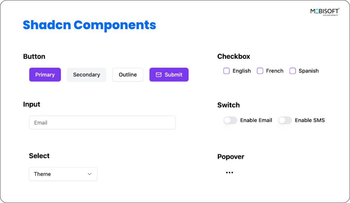
To showcase Shadcn’s capabilities, we have integrated some example components into the project. You can find the complete codebase and examples on our GitHub repository
Components Integrated for Demonstration
1 Button
Shadcn provides a customizable Button component with variants like primary, secondary, and outline. You can also add icons and manage states like disabled
Command: npx shadcn@latest add button
Example:
<Button>Primary</Button>
<Button variant={"secondary"}>Secondary</Button>
<Button variant={"outline"}>Outline</Button>
<Button className="items-center gap-2">
 <Mail className="w-5 h-5" />
 Submit
</Button>
- The
variantprops control the button's appearance. - Icons like
Mailcan be added inside the button.
2 Input
The Input component is used for various input types, while Textarea provides multi-line input capabilities.
Command: npx shadcn@latest add input
Input Example:
<Input type="email" placeholder="Email" />
<Input type="password" placeholder="Password" />
<Input type="file" placeholder="Select Picture" />
TextArea Example:
Command: npx shadcn@latest add textarea
<Textarea placeholder="Type your message here." />3 Checkbox
The Checkbox component allows the creation of labeled checkboxes using the Label component.
Command:
npx shadcn@latest add checkboxnpx shadcn@latest add label
Example:
<div className="flex items-center space-x-2">
 <Checkbox id={label} />
  <label
   htmlFor={label}
   className="text-sm font-medium leading-none peer-disabled:cursor-not-allowed peer-disabled:opacity-70">
  {label}
 </label>
</div>
4 Switch
The Switch component allows the creation of a toggle switch with a label.
Command: npx shadcn@latest add switch
Example:
<div className="flex items-center space-x-2">
  <Switch id={label} />
  <label htmlFor={label}
    className="text-sm font-medium leading-none peer-disabled:cursor-not-allowed peer-disabled:opacity-70">
    {label}
  </label>
</div>- The checked prop specifies the current state of the switch.
- The onCheckedChange callback handles state updates.
5 Select
The Select component provides a powerful dropdown selection experience with customizable elements such as SelectTrigger, SelectContent.
Command: npx shadcn@latest add select
Example:
<Select>
 <SelectTrigger className="w-[180px]">
  <SelectValue placeholder="Theme" />
 </SelectTrigger>
 <SelectContent>
  <SelectItem value="light">Light</SelectItem>
  <SelectItem value="dark">Dark</SelectItem>
  <SelectItem value="system">Default</SelectItem>
 </SelectContent>
</Select>SelectTrigger: Defines the dropdown trigger element.SelectContent: Contains the dropdown content.SelectItem: Represents individual selectable items.
6 Popover
The Popover component allows the creation of a customized pop-up trigger and container component.
Command: npx shadcn@latest add popover
Example:
<Popover>
 <PopoverTrigger className="flex w-8 justify-center">
  <Ellipsis />
 </PopoverTrigger>
 <PopoverContent className="flex flex-col w-36">
  <Label className="mb-4">Send Email</Label>
  <Label>Send SMS</Label>
 </PopoverContent>
</Popover>- PopoverTrigger: Specifies the element that triggers the popover (e.g. an icon).
- PopoverContent: Contains the popover's main content
7 Accordion / Collapsible
The Accordion component allows for the creation of collapsible sections. Below is a guide to implementing the Accordion.
Command: npx shadcn@latest add accordion
Example:
<Accordion type="single" collapsible className="w-full">
 <AccordionItem value="item-1">
  <AccordionTrigger>Personal Information</AccordionTrigger>
   <AccordionContent>
    John Doe is a 28-year-old male with the email
    john.doe@example.com and phone number +1-234-567-890.
   </AccordionContent>
  </AccordionItem>
</Accordion>- AccordionTrigger: Acts as the trigger for the accordion item.
- AccordionContent: Contains the content that will be shown or hidden.
8 Custom Dialog
The Custom Dialog in Shadcn UI serves as a versatile dialog component for the web platform, featuring a custom dialog trigger and customized content.
Command: npx shadcn@latest add dialog
Example:
<Dialog open={isDialogVisible} onOpenChange={setDialogVisible}>
  <DialogTrigger asChild>
    <Button className="w-36 ml-4" variant="outline">
      Change Password
    </Button>
  </DialogTrigger>
  <DialogContent className="sm:max-w-[475px]">
    <DialogHeader>
      <DialogTitle>Change Password</DialogTitle>
      <DialogDescription>
        Change your password here. Click save when you're done.
      </DialogDescription>
    </DialogHeader>
    <div className="grid gap-4 py-4">
      <div className="grid grid-cols-3 items-center gap-4">
        <Label htmlFor="password" className="text-right">
          Password
        </Label>
        <Input id="password" type="password" className="col-span-2" />
      </div>
      <div className="grid grid-cols-3 items-center gap-4">
        <Label htmlFor="confirmPassword" className="text-right">
          Confirm Password
        </Label>
        <Input id="confirmPassword" className="col-span-2" />
      </div>
    </div>
    <DialogFooter>
      <Button type="submit" onClick={()=> {
        setDialogVisible(false);
        }}
        >
        Save changes
      </Button>
    </DialogFooter>
  </DialogContent>
</Dialog>- DialogTrigger: Triggers the dialog when a button is clicked.
- DialogContent: Contains the main content of the dialog, including the title, description, and footer buttons.
- DialogHeader: Contains the dialog header.
- DialogFooter: Contains the dialog footer buttons.
9 Tabs
The Tabs component allows for tabbed navigation, providing an organized way to switch between different views or sections.
Command: npx shadcn@latest add tabs
Example:
<Tabs defaultValue="account" className="w-[400px]  ml-4">
 <TabsList>
  <TabsTrigger value="account">Account Info</TabsTrigger>
  <TabsTrigger value="password">Billing Info</TabsTrigger>
 </TabsList>
 <TabsContent value="account">
  Account Info
 </TabsContent>
 <TabsContent value="password">
  Billing Info
 </TabsContent>
</Tabs>- TabsList: Manages the tab headers with optional separators.
- TabsTrigger: Represents an individual tab title.
- TabsContent: Contains the content displayed based on the selected tab.
10 Table
The Table component allows you to build more complex data tables. By combining it with @tanstack/react-table, you can create tables with sorting, filtering, and pagination.
Command: npx shadcn@latest add table
<Table>
 <TableHeader>
  <TableRow>
   <TableHead className="w-[100px]">Invoice</TableHead>
    <TableHead>Status</TableHead>
    <TableHead className="text-right">Amount</TableHead>
  </TableRow>
 </TableHeader>
 <TableBody>
  {invoices.map((invoice) => (
   <TableRow key={invoice.invoice}>
    <TableCell className="font-medium">{invoice.invoice}</TableCell>
    <TableCell>{invoice.paymentStatus}</TableCell>
    <TableCell className="text-right">
     {invoice.totalAmount}
    </TableCell>
   </TableRow>
  ))}
 </TableBody>
 <TableFooter>
  <TableRow>
   <TableCell colSpan={3}>Total</TableCell>
   <TableCell className="text-right">$2,500.00</TableCell>
  </TableRow>
 </TableFooter>
</Table>- TableHeader: Defines the header section of the table.
- TableRow: Represents a row in the table.
- TableHead: Defines a header cell within a row.
- TableBody: Contains the body rows with data.
- TableCell: Represents a cell within a row.
- TableFooter: Adds a footer row at the bottom of the table.
Here is the sample Shadcn components screen:

Conclusion:
Integrating Shadcn UI with React 19 provides a powerful way to build flexible, reusable, and customizable UI components. With seamless support for Tailwind CSS and a wide variety of utility-based components, Shadcn UI simplifies the creation of responsive and accessible React UI components. From buttons and inputs to complex dialogs and popovers, Shadcn empowers developers to efficiently manage UI elements while maintaining full control over styles and functionality.
By following the step-by-step setup and integration process outlined above, developers can quickly get started with Shadcn UI in their React 19 projects, enhancing the overall development experience and ensuring a smooth, adaptable design system tailored to various project needs.


 January 21, 2025


