So, your product is live. It looks sleek. Buttons are clicking. Animations are smooth.
But here’s the real question: Is your UX working?
I’m not talking about your gut feeling or that one email from a happy user.
I mean real proof. Something you can track, measure, and improve on.
That’s where UX metrics come in. They help you see what’s working, what’s not, and what’s just kind of. . . there.
In this post, I’m breaking down the UX metrics that matter. No fluff. No jargon. Just the stuff that helps you design smarter and make better decisions.
Let’s dig in.
What Are UX Metrics and How Do They Help Measure User Experience?
UX metrics are basically how you measure user experience. These are part of broader UX KPIs used by teams to ensure product performance aligns with user needs.
They answer questions like:
- Are users able to complete tasks easily?
- Are they getting stuck or confused?
- Do they like using your product?
- Will they come back?
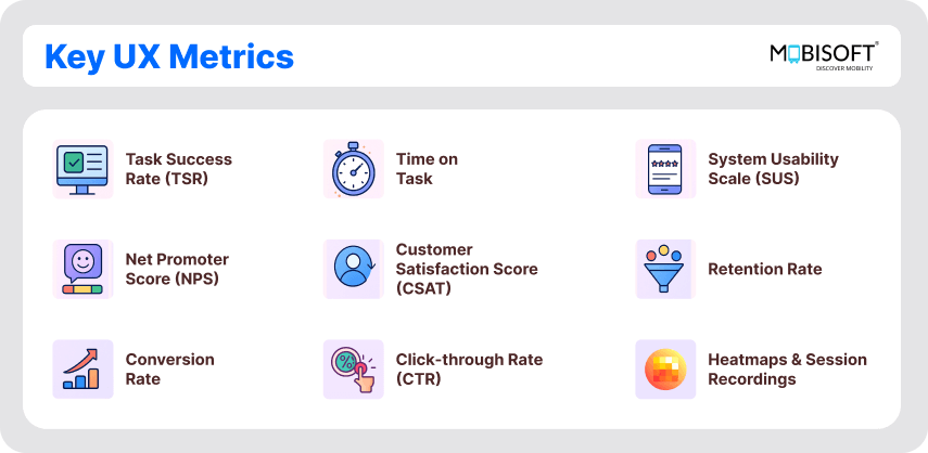
You can group these UX performance metrics into three buckets:
- Behavioral: What people do (like clicks, time spent, or drop-offs).
- Attitudinal: What people feel (like satisfaction or frustration).
- Business-y stuff: How UX impacts the bottom line (like conversions or retention).
For a structured approach, many companies rely on a defined UX design process to collect and act on these metrics effectively.
The best teams don’t just pick one. They mix and match to see the whole picture and create actionable UX success metrics.

Why UX Performance Metrics Should Be Your New Best Friend
Let me put it this way: if you’re investing time, money, and sleep into building a product, you deserve to know how it’s doing.
UX metrics help you:
- Find friction before your users start ghosting
- Justify design decisions with actual data (not just “it looks cool”)
- Show the ROI of UX to stakeholders who only speak in spreadsheets.
- Make improvements that actually improve things.
If you're looking to enhance usability on digital platforms, solid UX design for web ensures these metrics are not just collected but converted into action.
It’s not about tracking everything. It’s about tracking what matters, key UX metrics for websites that align with real business goals.
Key UX Metrics to Track for Smarter Design Decisions

Alright, here’s the fun part. Let’s walk through the UX metrics to track that will help you build better experiences.
Task Completion Rate UX: How to Know If Users Get Things Done
This one’s simple: Did the user do what they came to do?
Example: Out of 100 users who tried to reset their passwords, 80 managed to do it. That’s an 80% success rate.
If that number’s low, your flow probably needs some changes. Track it during usability tests or with in-product analytics. Even a simple goal funnel can do the trick.
Dwell Time in UX: Understanding Time on Task to Identify Friction
Now, how long did it take?
If it takes someone 12 minutes to book a table at a restaurant, they might just call instead.
Dwell time in UX helps you spot inefficiencies. But don’t jump to conclusions.
Short isn’t always good. If someone breezes through a setup because they skipped all the important steps, that’s not a win.
This becomes especially important when analyzing mobile-first workflows. For that, a focused UX design for mobile apps approach helps refine user paths.
Context matters here. Pair it with task success and you'll get the full story.
Error Rate Analysis Using UX Analytics Tools

Are users making mistakes? If so, where?
Example: Everyone’s selecting the wrong shipping method because the labels are confusing.
That’s on the design. Not the user.
Track this by watching session replays or logging failed attempts (like form errors or abandoned carts). This is where UX analytics tools like Hotjar and Smartlook shine.
A well-executed UX audit service often uncovers such issues before they become conversion blockers.
System Usability Scale (SUS): Benchmarking UX Design Success Metrics
Sounds fancy, but it’s just a 10-question survey that gives you a usability score out of 100.
Example: You launch a new dashboard. You run a SUS survey. You get a 70. Not bad, not amazing.
Anything above 65 is decent. If you hit 80+, go ahead and celebrate.It’s super useful for benchmarking before and after changes and adds to your UX design success metrics toolkit.
Net Promoter Score (NPS)
You’ve probably seen this one: “How likely are you to recommend this to a friend?”
If people score you 9 or 10, that’s a good sign. If they’re giving you 6s. . . you’ve got some work to do.
Use NPS to gauge loyalty. But don’t stop there. Always follow up with “Why?”
This is known as Net Promoter Score (NPS) UX, and it’s a loyalty signal you can’t ignore
Customer Satisfaction Score (CSAT)
This one’s great right after an interaction.
You ask: “How satisfied are you with this feature?” Users rate it 1 to 5 or pick a smiley face.
Just rolled out dark mode? Ask how it feels. If 90% say they love it, you’re on the right track.
It’s quick. It’s easy. And it gives you an immediate read on how people feel an essential part of how to measure UX success.
Retention Rate
This one’s a biggie. It tells you how many users stick around.
Example: 1,000 users signed up last month. Only 300 came back this month. That’s 30% retention. Ouch.
Great UX brings people back. Poor UX sends them packing.
User experience metrics for e-commerce websites often focus heavily on retention. Great UX brings people back. Poor UX sends them packing.
Staying on top of UI/UX design services that focus on lifecycle engagement can help raise those retention numbers.
Conversion Rate UX Design: Linking User Experience to Business Goals
Another business-critical metric.
How many users take the action you want them to take?
Let’s say 5,000 people see your pricing page. Only 200 sign up. That’s a 4% conversion rate UX design metric.
A weak conversion rate might mean confusing CTAs, too many steps, or poor value communication.
Test, tweak, repeat. The small changes here can lead to big wins.
Click-through Rate (CTR)
Are people clicking where you want them to?
You add a “Try Now” button above the fold. It gets 0.5% CTR. Hmm. That’s. . . quiet.
Try changing the copy, color, or position. CTR helps you understand if your interface is actually engaging or just sitting there looking pretty.
Heatmaps & Session Recordings

This one’s like watching your users over their shoulder without the awkwardness.
UX metrics examples, like heatmaps, show where users click. Session recordings reveal how they interact with the page.
Example: Users keep clicking an icon that doesn’t do anything. That’s a missed expectation.
Want more on what’s coming in the UX world? Check out our insights on UX trends for 2025 to align your metrics strategy with future-ready practices.
These tools (Hotjar, Crazy Egg, Smartlook) are pure gold when you want to fix subtle issues.
Which UX KPIs and Metrics Should You Track First?

You don’t need all of them at a time. Just start with a few.
Here’s a good starter pack:
- Use TSR to check usability
- Run SUS to benchmark
- Track retention and conversion to tie UX to business goals
- Sprinkle in CSAT and NPS to capture how people feel.
As your product evolves, mix in heatmaps, error rates, and dwell time.
The goal? Know what’s working, fix what’s not, and keep your users happy (and coming back).
Final Thoughts on UX Metrics and Continuous Improvement
Great UX doesn’t just happen.
It’s tested. Measured. Iterated. And the only way to do that well is with UX metrics that tell you what’s going on.
Turn UX insights into real results.
From improving task completion rates to boosting user satisfaction, our UX experts help you measure what matters and act with clarity. Learn how our custom UI/UX design services can drive measurable success for your product.
Contact us today to get started.


 May 16, 2025


