Google unveiled Android 12, the most expressive OS featuring personalization, enhanced privacy, security, location, and other appealing features that transform the user experience. It is available for Google’s own Pixel devices right now. It has made the phone better in terms of usability, functionality, accessibility, stability, and performance.
With over 100 new user-centric functions and usability tweaks, Android 12 has upgraded the entire user interface (UI) with a more comfortable, dynamic, and personal operating system. You can find the list of prominent features from our previous blog – Android 12, Its New Features, And APIs and explore meaningful UI/UX changes for your phone.
Today, we will discuss how this significant OS would bring a change to your smartphone UI, what is new, what’s changed, how the latest update of Google would affect your mobile applications UI, etc. So, let’s get started with major UI changes after the Android 12 update.
#1 New and Always-on-Display Lock screen
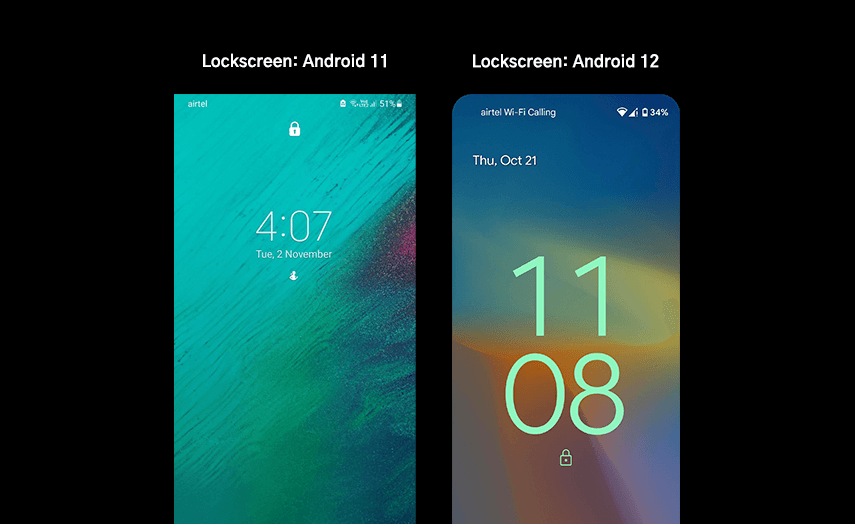
Once you are done with the Android 12 installation in your Pixel device, the Lock screen is the first thing you will come across. Google has changed the design and layout of the screen. It shows time, date, weather, camera, smart home controls, conversations, and other timely information from your always-on-display lock screen.
The clock is the epicenter of this screen. It is bigger and bolder, with a subtle variation to the animation effect on the display. The animations on this screen are triggered with some gestures such as lifting your phone, tapping your phone, putting the phone on charge, or pressing the power button. You can find a fresh new design of pin code keys when you swipe to unlock your phone – round and large buttons with pastel shades per your system theme. In short, Android 12 has improved the lock screen UI with substantial changes.
Lock screen in Android 12 vs. Android 11:
Android 12 has completely revamped the look of the lock screen with a bigger clock in the middle of the display and other important displayable information, which was not there in Android 11.
#2 Completely Revamped Notification Panel
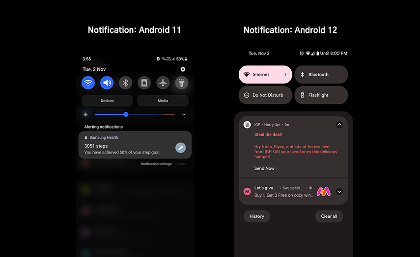
Experience the new design of your notification panel with an opaque background that matches the system theme. Android 12 has redesigned this space with significantly larger, rectangular, easy to manage quick tiles with smooth motion effects, separating the conversations from regular app notifications. You can control the entire OS with a simple swipe and tap functionality from this panel. In fact, you can easily edit and rearrange the order of these tiles the way you want.
Just a quick tip to reorganize the quick-setting tiles:
- Simply swipe down the panel.
- Tap the pencil icon in the bottom left corner.
- Tap and hold on to any quick setting tile where you want it to appear.
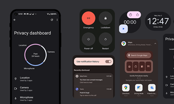
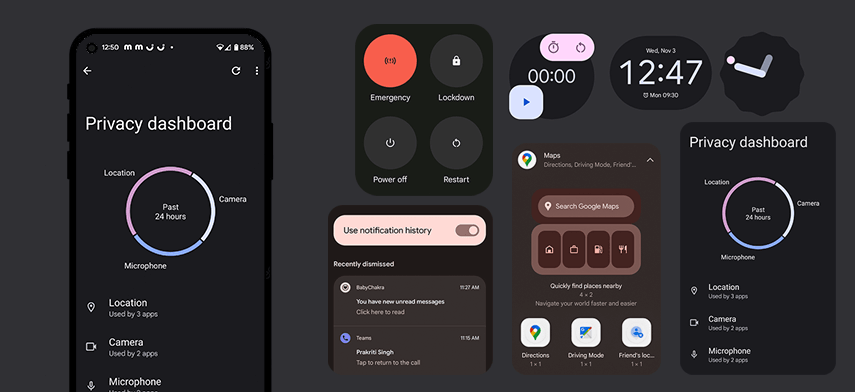
The Notification History feature, available on the bottom left corner of the panel, allows you to read past, dismissed, or unread notifications. You can view all the recently cleared notifications or alerts from the last 24 hours. This feature is important for those users who generally end up swiping left or right to dismiss any notifications they have not read. This feature gives a brief history of all notifications. Clicking on any dismissed notifications takes you to that message in an app.
If you’ve turned your notification history off, then you will see Manage instead of History. You need to tap on Manage, and then you will be redirected to Notification History. Slide the switch to turn it on. Also, experience multi-media player support in one place. Just swipe inside the notification panel to play between music apps.
Android 11 vs. Android 12 Notification UI Comparison:
Android 11 launched notification history, but Android 12 improved the entire UI of the notification panel. The latest OS offers more personalization to users based on their usage. Furthermore, it features an organized quick-tile panel, separated notification shade, fluid motion, larger and round-cornered tiles, and in short, there’s more room for customization.
#3 Custom UI with Google Material You
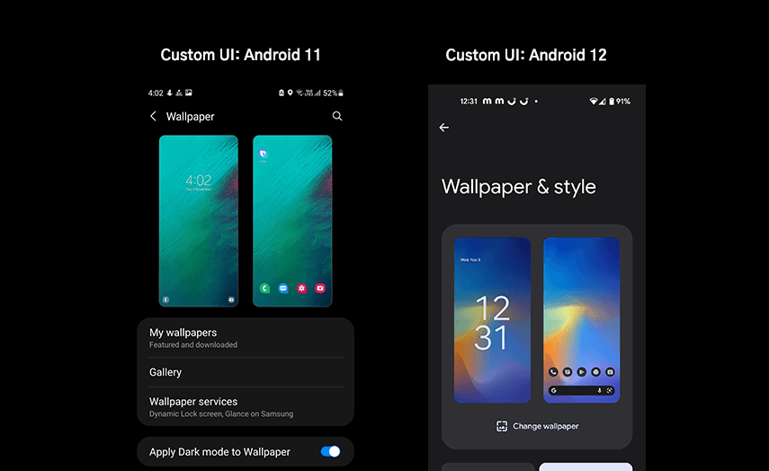
Google has refined its OS with visual effects in the last seven years and has introduced a new design paradigm, enabling dynamic color capabilities and adaptive styling – accessible for all.
This is the most visually appealing feature of Android 12, bringing great UI for smartphone users. All the menus, widgets, app icons, panels, and most of the UI elements have rounded edges; in short, their design is tweaked along with faster animation effects. Google has simplified interactions of all Android UI elements in the latest update and redesigned this comprehensive theming system to provide personalized user experiences.
Using Wallpaper & Style, you can create your own custom theme selecting a wallpaper from a bunch of categories. You can change the entire system based on your phone’s wallpaper. The color extraction feature allows customizing the Android device drastically by changing the wallpaper and selecting suitable colors from the dynamic color pallet. You can also pick an appropriate color from the basic color pallet and use it consistently across the system. It can change everything in your smartphone, including the lock screen clock, app launcher, volume controls, system widgets, quick setting tiles, app icons, app UI, etc., making Android 12 by far the best-looking OS of Google.
Themed Icons: Scrolling to the bottom of the Wallpaper display, toggle on Themed Icons (Beta) to create custom app icons. Apps that support this feature will get changed automatically based on your selected theme. But this is a Google-only feature. That’s why all Google apps will change as of now, with the same colors. Further, you can make your background dark or light by toggling the dark theme on and off from the same display.
Themed Apps: Material You is not limited to system theming! It also changes the theme of mobile applications. Once you implement auto themes, you will see changes in Google apps. For example, Google’s keyboard app receives a new theme when you change your wallpaper in line with the system theme. Similarly, Gmail, Calendar, Clock, Calculator, Keep, Drive, Chrome, Camera, Docs, and other Google apps magically change colors and look every time you change wallpaper. It changes the UI of apps, grabbing the same color hue to make the overall user experience consistent and pleasing. The system-wise font is also bold and bigger, making it readable for the user.
Android 11 vs. Android 12 UI Comparison:
Compared to Android 11, Google has taken personalization to the next level with Android 12. The latest OS update is considered the biggest visual overhaul in Google’s history. In Android 11, users have to pick a wallpaper and set the theme style of their devices. This time, Google has made it possible to personalize system OS for users with end-to-end customization – from app icons, widgets, lock screen, quick-setting tiles to resize UI elements, everything users can personalize the way they want. With more customization options, responsive motion, dynamic color capabilities, Google has made Android 12 more futuristic and appealing for users with Material You.
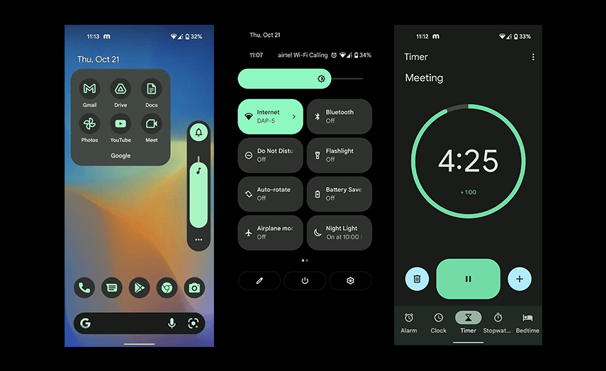
#4 New and Redesigned Widgets
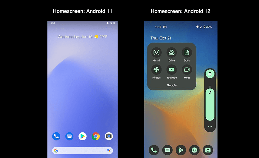
Android 12 has created and revamped a bunch of app widgets to improve the user experience by bringing the best of Material You to users’ devices. It is possible for you to use the device theme – from radio buttons, sliders, switches, checkboxes, background to other UI components, enabling smoother transitions across the system. You can experience a consistent look across your system UI with a dynamic color pallet as well. You can personalize your Home screen by simply adding your favorite widgets.
Android 12 widgets are beautiful, adaptive to the system theme, useful, categorized, and round-cornered with faster transitions. It gives four different styles for the clock – analog, digital, stacked, and world clock design with two time zones side by side. Furthermore, a digital stopwatch will keep you on time. You can also pin your favorite conversations to the Home screen using newly introduced conversation widgets.
Android 12 vs. Android 11 Widgets Comparison:
Android 12 has made widgets better in terms of app usage, functionality, performance, look and feel than Android 11 widgets. Users can bring helpful content directly on the Home screen using just one tap like to-do lists, clock, favorite memories, conversations, Maps, etc. Users can view more categorized and organized widgets when they search from the search section.
#5 Novelties – Look and Feel with More Animations
Google has released Android 12 with redesigned UI and UX elements, using dynamic color capabilities, refreshing, and playful animations across the system. The design elements of the OS, like buttons, menus, widgets, etc., are more visible, bigger, and brighter, making the entire Android system more legible.
The UI of the brightness panel and the volume key is also tweaked a little. Both can change colors based on the system theme. The wave of shadow (animation) and faded light screen when you unlock your phone or put it on a charge, brighter app icons on a single screen, expanded or collapsed views of quick-setting and notification shade, easy to hit down arrow to expand notifications, etc. make the user experience more pleasing. In short, Google has made it simple to use such elements, which are part of everyday usage.
Android 11 vs. Android 12 Comparison:
Compared to Android 11, this time, Google has focused more on noticeable changes in UI to enhance user experience. All the design elements are more prominent with appealing visuals and animation effects.

Other Behavioral And UI Improvements of Android 12 Update
Privacy Dashboard: The look and feel of the privacy dashboard has changed totally in Android 12 with more transparency options. You can simply monitor your privacy data used by apps. Google has given control to all users – what to share and what to keep private.
Location Access: You can better manage the access to your location. Android 12 brings an option to choose regarding the location information provided to the app by selecting an approximate location or precise location.
App splash screen: Experience faster and theme-based animation while launching an app on your device. Android 12 has standardized the design elements and functionality of the splash screen across the system.
System-wide On-device Search: Search everything in one place from the Pixel launcher app drawer – from pictures, contacts, tips, widgets, apps, files, settings, etc.
One-handed Mode Gesture for Reachability: Google has given the long-awaited option in the core build of Android 12 for those who can not reach the top of the screen – enabling them to use smartphones with larger screens. With the one-handed mode feature, you can scale down the screen and make it possible to operate with just one hand.
Quick Tap: This gesture lets you double-tap the back of the Pixel to do things like activating google assistant, screenshots, etc.
Scrollable Screenshot: Android 12 has made it easy to take scrolling screenshots on your Android smartphones before sharing or saving further.
Android 12 for Game UI: Game dashboard, a floating pop-up menu with extra controls on your device, is designed to improve your gaming experience.
Improved Accessibility with new visibility features like area magnification, extra dim, bold, and greyscale.
Microphone and camera Access: If any app is accessing an on-device camera or microphone, you can see a small green icon or dot on the upper right corner of the display. This is a helpful indicator for you if any application or service has accessed either hardware on your smartphone. You can just expand the notification shade or tap on the green icon to see which application has used your microphone or camera in your device. You can quickly disable the same from the quick-setting tiles with a tap.
Get Ready to Experience A Totally Changed UI with Android 12
Google has launched Android 12 with the biggest design change, keeping in mind the ever-evolving user needs and cutting-edge technologies. The entire focus of this latest OS is on providing a personalized user experience, as Android 12 is packed with useful features and notable UI and UX changes. All the discussed Android 12 features are available for Pixel devices only right now. Other smartphone owners have to wait a bit longer. Keeping in mind the futuristic perspective related to Android versions, it will be really exciting to use new versions in the coming years.
Author's Bio:

Pritam Barhate, with an experience of 14+ years in technology, heads Technology Innovation at Mobisoft Infotech. He has a rich experience in design and development. He has been a consultant for a variety of industries and startups. At Mobisoft Infotech, he primarily focuses on technology resources and develops the most advanced solutions.