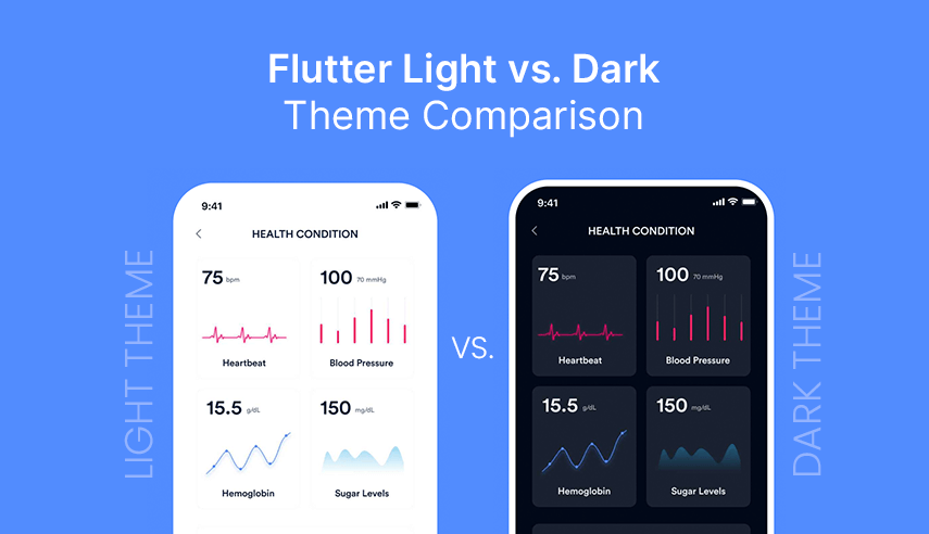
Flutter's Theme Management enables developers to centralize and streamline the control of an app's visual appearance and styling within Flutter consulting services. By leveraging themes, you can efficiently manage elements like colors, typography, icons, and other UI components across the entire app, ensuring a unified and cohesive user experience. The ThemeData class in Flutter offers powerful capabilities for dynamic theming, allowing users to easily toggle between light mode and dark mode or customize color schemes to fit their preferences. This flexibility helps create a polished, adaptable UI that enhances both usability and aesthetics.
In this tutorial, I'll guide you step-by-step through the process of implementing a Flutter Theme Manager with custom color schemes. Let’s dive in!
Step 1: Setting Custom Colors for the App
import 'package:flutter/material.dart';

class AppColors {
  static const primary1 = Color(0xFF181823);
  static const secondary1 = Color(0xFFFFFFFF);
  static Color tertiary3(BuildContext context) {
    return Theme.of(context).brightness == Brightness.light
        ? const Color(0xFF69C0FF)
        : const Color(0xFF0094FF);
  }
}
AppColorsis a utility class that centralizes color definitions for the app, ensuring uniform color usage throughout the application.- The
tertiary3method is unique because it adapts to the app's theme. By usingTheme.of(context), it detects whether the app is in light mode or dark mode. It returns a lighter blue(0xFF69C0FF)for the light theme and a darker blue(0xFF0094FF)for the dark theme.
Usage:
Static constants can be accessed directly, such as AppColors.primary1. However, for tertiary3, you must pass the context: AppColors.tertiary3(context). This approach ensures consistent color usage across the app while supporting both light and dark themes.
Step 2: Generating Configuration Files for Theme Setup
- Setting up ThemeConfig
import 'package:custom_theme_sample/constants/constants.dart';
import 'package:flutter/material.dart';

class ThemeConfig {
  static ThemeData lightTheme = ThemeData(
      useMaterial3: true,
      brightness: Brightness.light,
      primaryColor: AppColors.primary1,
      scaffoldBackgroundColor: AppColors.secondary1);
  static ThemeData darkTheme = ThemeData(
      useMaterial3: true,
      brightness: Brightness.dark,
      primaryColor: AppColors.secondary1,
      scaffoldBackgroundColor: AppColors.primary1);
}
ThemeConfig is a class that holds theme-related configurations for the app. This class contains two static properties:
lightTheme: Defines the appearance for light mode.darkTheme: Defines the appearance for dark mode.
Both themes utilize ThemeData, which is Flutter's method for defining visual properties. Key properties include:
useMaterial3: Activates Material Design 3, Google's latest design system.brightness: Defines whether the theme is light or dark.primaryColor: Sets the primary color used throughout the app.scaffoldBackgroundColor: Specifies the default background color for app screens.
Setting up ThemeConfig
import 'package:custom_theme_sample/constants/app_global.dart';
import 'package:flutter/material.dart';
import 'package:custom_theme_sample/constants/constants.dart';

abstract class ThemeManager {
  static ThemeManager of(BuildContext context) {
    final brightness = Theme.of(context).brightness;
    return brightness == Brightness.light ? LightModeTheme() : DarkModeTheme();
  }
  // Primary Colors
  Color get primary1;
  // Secondary Colors
  Color get secondary1;
  // Tertiary Colors
  Color get tertiary1;
}

class LightModeTheme extends ThemeManager {
  // Primary Colors
  @override
  Color primary1 = AppColors.primary1;
  // Secondary Colors
  @override
  Color secondary1 = AppColors.secondary1;
  // Tertiary Colors
  @override
  Color tertiary1 = AppColors.tertiary3(AppGlobal.navigatorKey.currentContext!);
}

class DarkModeTheme extends ThemeManager {
  // Primary Colors
  @override
  Color primary1 = AppColors.secondary1;
  // Secondary Colors
  @override
  Color secondary1 = AppColors.primary1;
  // Tertiary Colors
  @override
  Color tertiary1 = AppColors.tertiary3(AppGlobal.navigatorKey.currentContext!);
}
Theme Manager Overview

The ThemeManager is a Flutter theme management system that offers distinct color schemes for light mode and dark mode.
Here's a breakdown:
The ThemeManager abstract class provides a factory method of() that returns the appropriate theme based on the system's brightness.
Defines abstract color getters that subclasses must implement.
- Light Mode Implementation: LightModeTheme
class LightModeTheme extends ThemeManager {
  @override
  Color primary1 = AppColors.primary1;
  Color secondary1 = AppColors.secondary1;
  Color tertiary1 = AppColors.tertiary3(...);
 ...
}
This class defines the light theme colors, where:
- primary1 uses the default primary color
- secondary1 uses the default secondary color
- tertiary1 is dynamically determined based on the current context.
- Dark Mode Implementation: DarkModeTheme
class DarkModeTheme extends ThemeManager {
  @override
  Color primary1 = AppColors.secondary1;
  Color secondary1 = AppColors.primary1;
  Color tertiary1 = AppColors.tertiary3(...);
...
}
The dark theme implementation:
- Swaps the primary and secondary colors
- Uses the same dynamic tertiary color calculation as the light mode
Usage Example:
You would typically use this in your widgets like this:
Widget build(BuildContext context) {
  final theme = ThemeManager.of(context);

  return Container(
    color: theme.primary1,
    // ... rest of the widget
  );
}
Setting up ThemeModeManager
import 'package:flutter/material.dart';
import 'package:shared_preferences/shared_preferences.dart';

class ThemeModeManager {
  static const String _themeKey = 'theme_mode';
  final ValueNotifier<ThemeMode> themeMode = ValueNotifier(ThemeMode.system);
  final SharedPreferences _prefs;
  ThemeModeManager(this._prefs) {
    _loadTheme();
  }

  void _loadTheme() {
    final savedTheme = _prefs.getString(_themeKey) ?? 'system';
    themeMode.value = _getThemeMode(savedTheme);
  }

 ThemeMode _getThemeMode(String theme) {
    switch (theme) {
      case 'dark':
        return ThemeMode.dark;
      case 'light':
        return ThemeMode.light;
      default:
        return ThemeMode.system;
    }
  }

  Future<void> setTheme(String theme) async {
    await _prefs.setString(_themeKey, theme);
    themeMode.value = _getThemeMode(theme);
  }
}
- Reactive Theme Updates with ValueNotifier: The class employs ValueNotifier to provide reactive updates for the theme. When the themeMode changes, any widget listening to this ValueNotifier will automatically rebuild and reflect the updated theme.
- Widget Subscriptions to Theme Changes: Other widgets in the app can subscribe to themeMode changes. This enables dynamic theme adjustments throughout the app, ensuring the user interface stays in sync with the selected theme.
- Persistent Theme Preference with SharedPreferences: The class saves the user's theme preference using SharedPreferences, allowing the selected theme to persist across app restarts. This ensures that the user's theme choice is remembered each time the app is launched.
- Support for Three Theme Modes:
- Light Mode: A bright, high-contrast theme for better visibility in well-lit environments.
- Dark Mode: A darker, more muted theme to reduce eye strain in low-light conditions.
- System Mode: Automatically adapts to the device's system-wide theme setting, providing a consistent experience with the system's default theme preferences.

Key Components of the Class:
Theme Loading:
void _loadTheme() {
  final savedTheme = _prefs.getString(_themeKey) ?? 'system';
  themeMode.value = _getThemeMode(savedTheme);
}
- Retrieves the saved theme from SharedPreferences
- Defaults to 'system' if no theme is saved
- Converts the string to a ThemeMode enum
ThemeMode conversion:
ThemeMode _getThemeMode(String theme) {
  switch (theme) {
    case 'dark': return ThemeMode.dark;
    case 'light': return ThemeMode.light;
    default: return ThemeMode.system;
  }
}
- Returns the Theme mode (light, dark or system) based on the theme
Future<void> setTheme(String theme) async {
  await _prefs.setString(_themeKey, theme);
  themeMode.value = _getThemeMode(theme);
}
- Saves the new theme preference to SharedPreferences
- Updates the current theme mode
Step 3: Creating AppGlobal file for defining global-level variables
import 'package:flutter/material.dart';
import '../theme_manager/theme_mode_manager.dart';

class AppGlobal {
  AppGlobal._();
  static GlobalKey<NavigatorState> navigatorKey = GlobalKey<NavigatorState>();
  static late final ThemeModeManager themeManager;
}
This is a utility class that holds global-level variables and objects that need to be accessed throughout our Flutter application
Navigator Key:
static GlobalKey<NavigatorState> navigatorKey = GlobalKey<NavigatorState>();- This is a global key for the app's navigator
- It allows navigation actions from anywhere in the app without context
Theme Manager:
static late final ThemeModeManager themeManager;- This is a static reference to a ThemeModeManager instance
- The late keyword means it will be initialized after the app starts but before it's first used
- Used for managing the app's theme (light/dark mode)
Step 4: Configuring the MaterialApp for Theme Integration
import 'package:custom_theme_sample/constants/app_global.dart';
…
import 'package:shared_preferences/shared_preferences.dart';

void main() async {
  WidgetsFlutterBinding.ensureInitialized();
  final prefs = await SharedPreferences.getInstance();
  AppGlobal.themeManager = ThemeModeManager(prefs);
  runApp(const MyApp());
}
class MyApp extends StatelessWidget {
  const MyApp({super.key});

  @override
  Widget build(BuildContext context) {
    return ValueListenableBuilder<ThemeMode>(
        valueListenable: AppGlobal.themeManager.themeMode,
        builder: (context, themeMode, child) {
          return MaterialApp(
            title: 'Flutter Demo',
            navigatorKey: AppGlobal.navigatorKey,
            theme: ThemeConfig.lightTheme,
            darkTheme: ThemeConfig.darkTheme,
            themeMode: themeMode,
            home: const HomeScreen(),
          );
        });
  }
}
The class above performs the following functions:
- Acts as the root widget of the application.
- Utilizes
ValueListenableBuilderto listen for theme changes, allowing the app to switch between light and dark themes at runtime. The current theme mode is managed byThemeModeManager. - Configures the
MaterialAppwith:- Light and dark themes provided by
ThemeConfig. - A dynamic theme mode that can be toggled.
- Navigation setup for routing.
- The home screen as the initial route.
- Light and dark themes provided by
Step 5: Changing the App Theme Based on User Selection
import 'package:custom_theme_sample/constants/app_global.dart';
...

class HomeScreen extends StatefulWidget {
  const HomeScreen({super.key});
...

class _HomeScreenState extends State<HomeScreen> {
  String selectedTheme = 'System Default';

  @override
  Widget build(BuildContext context) {
    final theme = ThemeManager.of(context);
    return Scaffold(
      appBar: AppBar(
      body: Padding(
        padding: const EdgeInsets.all(16.0),
          ...
              child: ListTile(
                leading: const Icon(Icons.palette),
                title: const Text('Change Theme'),
                trailing: DropdownButton<String>(
                  value: selectedTheme,
                  onChanged: (String? newValue) {
                    if (newValue != null) {
                      setState(() {
                        selectedTheme = newValue;
                        _handleThemeChange(selectedTheme, context);
                      });
                    }
                  },
                  items: const [
                    DropdownMenuItem(
                      value: 'System Default',
                      child: Text('System Default'),
                    ),
                    DropdownMenuItem(
                      value: 'Light',
                      child: Text('Light'),
                    ),
                    DropdownMenuItem(
                      value: 'Dark',
                      child: Text('Dark'),
                    ),]

     ...
  }

 void _handleThemeChange(String theme, BuildContext context) {
    final themeValue = theme.toLowerCase();
    AppGlobal.themeManager.setTheme(themeValue);
  }
}
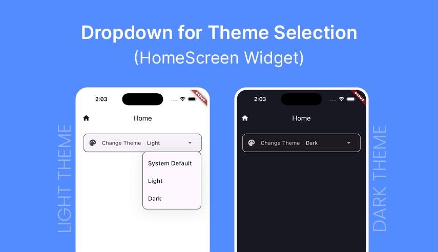
The HomeScreen is a Flutter widget that demonstrates theme switching functionality using a custom theme management system. Here’s a breakdown of its key components:
1. Theme Selection UI

The screen includes a dropdown button that allows users to choose from three theme options:
- System Default
- Light
- Dark
2. Theme Application
The screen uses the ThemeManager to access and apply theme colors across the UI:
final theme = ThemeManager.of(context);
// Example usage:
color: theme.primary1,
backgroundColor: theme.secondary1,
3. Theme Switching Logic
When the user selects a new theme, the change is handled by the _handleThemeChange method:
void _handleThemeChange(String theme, BuildContext context) {
  final themeValue = theme.toLowerCase();
  AppGlobal.themeManager.setTheme(themeValue);
}
Once the theme is changed, the appropriate theme colors are applied throughout the application UI, as defined in ThemeManager above.
Summing It Up
I hope you found this tutorial on implementing Theme Management with Custom Color Schemes in your Flutter apps useful. To download the source code for the sample app, click here.


 December 26, 2024


