In the first part of the article series, we discussed what is accessibility, why it is important and its benefits. In this article, we are going to dwell more into web accessibility.

There is a myth that it is difficult to make a website and web applications accessible. Though it requires a proper planning and execution, but still making websites accessible is not that difficult. In this article, we are going to discuss about 7 guidelines which will help you to make your web products more accessible and accepted by a wider audience.
Before we jump to the guidelines it is necessary to understand a few basics things about web accessibility. Web Accessibility Initiative (WAI) is a vision by World Wide Consortium (W3C) whose main aim is to improve web accessibility for disabled and visually impaired people. These people often require some form of assistive technologies to help them like screen readers or braille hardware. People with low to medium visual impairment have a hard time reading the content if it has low contrast or too small to read.
To make sure that our websites are compatible with this hardware and accessible to all visually impaired people certain measures are needed to be taken care of. WAI has published a guideline called Web Content Accessibility Guidelines (WCAG), which can help in achieving good web accessibility. WCAG guidelines have 3 levels of compliance:
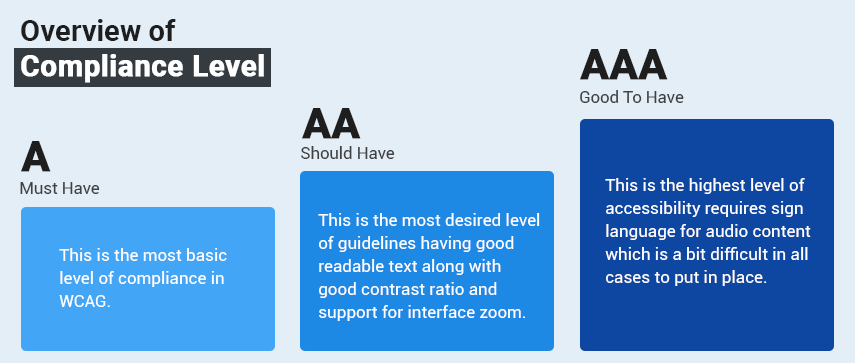
- Level A (Must have): This is the most basic level of compliance in WCAG. Few basic things included in this level are providing text alternative of images, websites should be navigable by using keyboards (used in case of screen readers) and not using color as the only medium of communication, it should always be used along with some label, icon, pattern or shape.
- Level AA (Should have): This is the most desired level of guidelines and most of the accessible websites consider this level for their platforms. Few basic things included in this level are having good readable text along with good contrast ratio and support for interface zoom
- Level AAA (Good to have): This is the highest level of accessibility and not required in most of the cases. It requires sign language for audio content which is a bit difficult in all cases to put in place.
Here are the 7 guidelines which can give you a great start for making your website more accessible and will take your website somewhat closer to AA level of accessibility.
Don’t use only colors to convey information

People with color blindness cannot distinguish between certain colors. Using only colors to show any information will not be understood by these people. It is recommended to use any pattern, icon or label along with the color. Pay a little extra attention to graphs, charts and other graphical components where colors are used very often.Don’t replace labels with placeholders
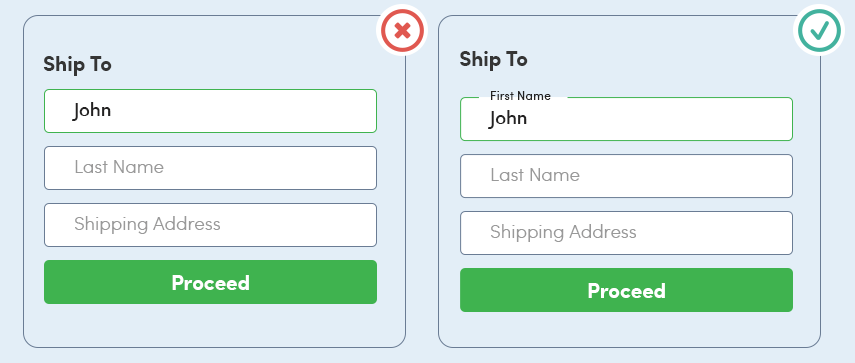
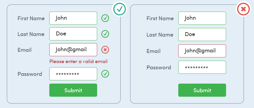
Not using labels in forms has very known hazards, despite that, they are missed a lot of the times from form fields. People replace labels with placeholders resulting forms suffer from bad accessibility. In case of any error, people face difficulty in relating input field to its relevant label. Using label tag and binding it with input makes it a lot easier for people to access and screen readers to read. Tapping on the label should put the focus on respective fields like input box, radio buttons, checkboxes, etc.Sufficient Contrast
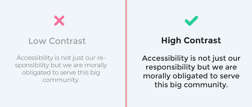
Good contrast between text color and background makes the copy more legible and accessible to a wide audience. People with low vision find it difficult to read low contrast text. WCAG suggests to have a contrast ratio of 4.5:1 between text and background color. If the text size is 18 points or 14 points with bold weight then the contrast ratio can be 3:1 or more.Using Focus Indicators
Focus Indicators are little visual cues in the form of ring or outline, which helps the user in navigating the interface. Their primary purpose is to show the user which element is in focus at that moment. Elements like links, form fields, widgets and menu items should use focus indicators to make navigation accessible and user-friendly. While navigating the interface using the keyboard tab button, focus indicators should communicate clearly where the current focus state is on the interface.Write the useful alternative text for images or non-text content
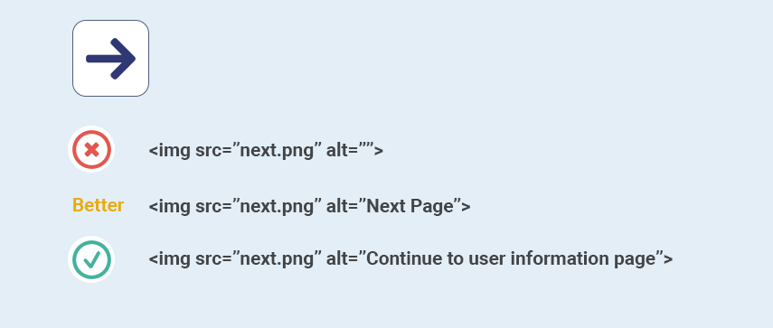
People who can’t see or have low vision, can not see or interpret images on the web. Alternative text in these scenarios helps people in understanding the context of the image. Screen readers can not read out what’s in the image (this might be possible in coming years with the rise of deep learning and AI) so using Alt attribute does the job. It is also used by search engines for image search results. Alt attribute content shows up if image is not loaded because of slow internet connection or some other reasons to help user what image is all about.Write semantic HTML markup
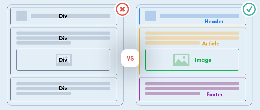
This is the main reason why most of the websites are not accessible. Teams put a lot of time in styling the document and making it pixel perfect (which is good) but everything is achieved using div and few other tags. Screen readers and browsers read semantic tags in order to make sense of the document, in the absence of these tags, people using screen readers will have a hard time in understanding the purpose of content in the document. Tags like h1-h6, ul, form, p, button, etc have a very specific meaning and behavior, imitating their look and feel using CSS by implementing non-semantic tags will result in bad accessibility.Logical and intuitive keyboard navigation

People with motor disabilities or blindness can not use point and click hardware and rely on a keyboard. Having good keyboard navigation is important in these scenarios. Navigation order is deciding the item to be focused with it’s sequence. This must be planned upfront while designing the interface and should be logical and intuitive. Developers should primarily focus on planning their HTML and after laying it out can style it using CSS.

What Next: Study web content accessibility guidelines
We recommend you to go through these comprehensive guidelines for web accessibility written by W3C. They have marked each guideline as A, AA or AAA. Achieving AA level for the web platform is the prime objective.
Make it a part of your culture:
Make sure everyone in the product team understand the importance and basic accessibility. Designers, engineers, and QAs should understand and aware of accessibility guidelines and follow them in their day to day work. Most importantly, the leadership team should be well aware of the benefits of accessible products.