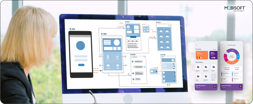
Picture this. You download a new app, eager to try it out. But within seconds, you are lost in a cluttered interface. Frustrated, you uninstall it and move on to another option.
This happens all the time. Your idea might be great. But if the UI is not intuitive, users won’t stick around. 88% of users delete apps because of poor user experience.
Mobile UI design isn’t just about aesthetics. It is about providing smooth interactions that keep users engaged.
We'll walk you through the essentials of mobile app UI design. Let's jump into the key principles, best practices, common mistakes, and emerging trends.
The Foundations of Mobile UI Design

Before we get into the details, let’s start with some core UI principles for Mobile App Design:
Simplicity and Clarity
Remember, less is more. Users want an uncluttered interface. A simple UI makes navigation effortless. Google report indicates that visitors make an opinion about the design of a website within 50 milliseconds. The same holds true for mobile apps.
To keep things simple:
- Focus only on the essential features on each screen.
- Enhance readability for a better mobile app usability design.
- Avoid unnecessary design features.
Consistency is The Key
Users prefer familiarity. When they see the same fonts, colors, and navigation patterns across the app, they know how to interact with it. This lowers the learning curve and enhances the user experience.
To ensure consistency:
- Stick to the brand colors and typography throughout the app.
- Make button placements consistent and easy to find.
- Follow platform-specific guidelines. For example, Google’s Material Design or Apple’s Human Interface Guidelines.
Accessibility and Inclusivity
The mobile interface should be usable by everyone, including people with disabilities. Designing with accessibility in mind ensures that your app serves a broader audience.
Consider these important accessibility features:
- High contrast mode
- Screen reader compatibility
- Adjustable text sizes
- Touch friendly design
Responsiveness and Adaptability
Studies show that almost 40% of smartphone users also own a tablet. Therefore, your UI should adapt smoothly to different screen sizes and orientations.
To make the app more responsive:
- Apply fluid grids and flexible UI components that resize depending on screen size.
- Make sure all elements scale appropriately for different resolutions.
- Test your app on various devices to find layout problems.

Key Elements of Mobile UI Design
Below are the essential factors that you should prioritize during mobile application development:
Make Navigation Effortless
Frustrating navigation is one of the biggest reasons users uninstall apps. A simple navigation system eliminates confusion.
Here's how to design a smooth navigation experience:
- Use clear menus and tabs to structure content.
- Avoid hiding key options behind hamburger menus unless necessary.
- Offer gesture-based navigation, such as swipe gestures. But always provide visual cues so users understand how to use them.
Typography and Readability
Text plays a major role in how users consume information. Yet many apps overlook readability. If text is too difficult to read, users will struggle to engage with the content.
To enhance readability:
- Choose clean fonts such as Roboto, Open Sans, or Lato. These fonts are popular for their clarity on digital screens.
- Set a minimum font size of 16 pixels for body text to ensure readability.
- Ensure appropriate line spacing and contrast between the background and text.
Color Psychology
Colors influence emotions, create brand associations, and impact user decisions. Research estimates that 90% of first impressions are determined by color alone.
For example:
- Blue gives the impression of trust and reliability. That's why financial and banking apps like PayPal and Chase use it.
- Red generates a sense of urgency and enthusiasm. Red is widely found in e-commerce app designs and food-ordering apps.
- Green evokes success, prosperity, and health. It's widely used in finance and health-related apps.
Buttons and Call-to-Actions (CTAs)
Buttons have a big responsibility to take users to important actions. If the buttons are too tiny, badly positioned, or not visually different, users will find it hard to accomplish actions.
To create effective buttons:
- Ensure buttons are large enough for easy tapping. Research suggests that button sizes between 42 to 72 pixels provide the best tap experience for mobile users.
- Put buttons where the user expects to find them naturally. For instance, at the bottom of the screen or next to pertinent content.
- Use contrasting colors for buttons to make them stand out.
Icons and Visuals
Icons and visuals improve the user experience by making interactions more intuitive. However, poorly designed icons can create confusion instead of improving usability.
To make icons effective:
- Use commonly recognized icons that users can understand at a glance.
- Maintain visual consistency by using a uniform icon style throughout the app.
- Avoid excessive reliance on icons without text labels.
Instagram's A/B testing also found that well-positioned, simple icons boosted engagement by 10 percent, but only when they were easily understood.
Best Practices for a Seamless User Experience

A well-designed UI goes beyond aesthetics. Here are some best practices UI designers must follow:
- Optimize for various screen sizes
- Design an intuitive onboarding process
- Make smooth animations and transitions
- Improve interactivity and feedback
Common Mistakes to Avoid
Even the best designers make mistakes. Here are some common ones you should steer clear of:
- Cluttered Interfaces
- Poor Contrast and Visibility Issues
- Overuse of Animations
- Ignoring Platform-Specific Guidelines
Tools & Resources for UI Designers
Following are some of the versatile tools to create UI designs.
- Figma: Excellent for collaboration and prototyping.
- Sketch: A favorite among macOS users.
- Adobe XD: Provides robust design and prototyping capabilities.
- Dribbble & Behance: Sites to source UI inspiration.
- Google's Material Design & Apple's Human Interface Guidelines: Imperative to adhere to best practices on both platforms.
Examples of Great Mobile UI Design
Let’s take a look at apps that have nailed UI design:
Airbnb
Airbnb is an excellent app that gets simplicity and functionality right. The UI keeps navigation seamless for users.
Here’s what Airbnb does right:
- Simple design that leaves the spotlight on gorgeous property photos.
- Streamlined navigation with a well-defined search box and simple filtering that enables swift locating of listings by users.
- Easy booking experience that makes every transaction seem natural.
Airbnb’s UI is a perfect example of how clean layouts and visuals can create a premium user experience.
Duolingo
Duolingo is a great example of how UI can make learning enjoyable and interesting. The playful interface of the app, vibrant colors, and gamification aspects keep learners engaged to proceed with their learning process.
Here’s why Duolingo’s UI stands out:
- Tracking of progress with visual rewards such as streaks and badges to motivate day-to-day learning.
- Friendly and clear typography that makes lessons easy to follow.
- Interactive sound effects and engaging animations that make it more immersive.
Duolingo's redesign of its UI resulted in a 30 percent boost in daily streak success, showing that good UI design can have a direct effect on behavior and retention.
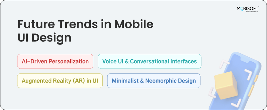
Future Trends in Mobile UI Design

UI design is always evolving. Here are some trends to watch out for:
AI-Driven Personalization
Apps that adjust to user behavior in real time. AI enablement and personalization have been shown to boost retention levels by 25%. Consider partnering with the AI development company to leverage the potential of AI.
Voice UI & Conversational Interfaces
Making interactions hands-free. Voice search is expected to account for 50% of all online searches by 2025.
Augmented Reality (AR) in UI
Bringing immersive experiences to mobile, seen in apps like IKEA Place and Snapchat.
Minimalist & Neomorphic Design
Clean, futuristic aesthetics gaining traction. Neomorphism combines skeuomorphism and flat design for a modern feel.
Conclusion
A great mobile UI is what makes an app feel effortless. If users can find what they need, navigate smoothly, and take action without frustration, they will stick around.
The best apps keep things simple, consistent, and adaptable. They evolve with new trends, prioritize accessibility, and make every interaction feel natural.
If you're looking to take your Mobile UI Design to the next level, consider leveraging UI UX Design Services from experienced professionals.
At the end of the day, good design is invisible. Users should not have to think about it, they should just enjoy the experience.


 February 5, 2025


