React Native Expo allows you to build web and mobile applications using a single codebase. By tamagui integration, a powerful React native UI framework, you can create shared components that work seamlessly across both React native web and mobile. Tamagui ensures consistent styling, and optimized performance, and simplifies cross-platform app development by reducing the need for maintaining separate designs for React native web and mobile apps.
Let’s dive into how to create an app with React Native Expo and Tamagui integration.
Step 1: Create a New Expo App
Run the following command to create a new React Native Expo app with a TypeScript template: npx create-expo-app -t expo-template-blank-typescript
Step 2: Navigate to the Project Directory and Test the App
1. Move into the project directory:
cd projectDir
2. Start the app and test it on the emulator:
- For Android:
npm run android
Press a to launch the Android emulator (ensure it's running).
- For iOS:
npm run ios
Press I to launch the iOS simulator (ensure it's running).
3. If the app is running fine, you should see this default Expo app screen in your emulator/simulator.
Step 3: Install Web Packages and Run the Web Application
1. Install required web packages:
npx expo install react-dom react-native-web @expo/metro-runtime
2. Run the web application:
npm run web
3. If successful, you should see the default Expo app screen in your browser.
Step 4: Install and Configure Babel
1. Install the Tamagui Babel plugin:
npm install @tamagui/babel-plugin
2. Create a new file named babel.config.js and add the following configuration:
module.exports = function (api) {
  api.cache(true)
  return {
    presets: ['babel-preset-expo'],
    plugins: [
      [
        '@tamagui/babel-plugin',
        {
          components: ['tamagui'],
          config: './tamagui.config.ts',
          logTimings: true,
          disableExtraction: process.env.NODE_ENV === 'development',
        },
      ],

      // NOTE: this is only necessary if you are using reanimated for animations
      'react-native-reanimated/plugin',
    ],
  }
}
Step 5: Configure the Tamagui UI Library
1. Install required packages:
npm install @tamagui/config tamagui
2. Create a new configuration file named tamagui.config.ts and add the following content:
import { config } from '@tamagui/config/v3'
import { createTamagui } from 'tamagui'

export const tamaguiConfig = createTamagui(config)

export default tamaguiConfig

export type Conf = typeof tamaguiConfig

declare module 'tamagui' {
  interface TamaguiCustomConfig extends Conf {}
}
3. You can customize the theme to match your project's styles. Here is a detailed tutorial:
https://tamagui.dev/docs/intro/themes
Step 6: Update App.tsx to Use TamaguiProvider
A Tamagui integration into your app, wrap your components with TamaguiProvider.
1. Update your App.tsx file:
import { StatusBar } from 'expo-status-bar';
import { StyleSheet, Text, View } from 'react-native';
import { Button, TamaguiProvider, Theme } from 'tamagui';
import tamaguiConfig from './tamagui.config';

export default function App() {
  return (
    <TamaguiProvider config={tamaguiConfig} defaultTheme="light">
      <Theme name="light">
        <Theme name="blue">
          <View style={styles.container}>
            <Button>Button</Button> {/* Tamagui button */}
            <Text>Open up App.tsx to start working on your app!</Text>
            <StatusBar style="auto" />
          </View>
        </Theme>
      </Theme>
    </TamaguiProvider>
  );
}

const styles = StyleSheet.create({
  container: {
    flex: 1,
    backgroundColor: '#fff',
    alignItems: 'center',
    justifyContent: 'center',
  },
});
Step 7: Run and Verify Tamagui Configuration
1. Start the application:
npm run start
2. Test on the desired platform:
- Press a for Android.
- Press w for Web.
3. Check if Tamagui is configured correctly by adding some components and observing their appearance on both platforms.
To showcase Tamagui's capabilities, we have integrated some example components into the project. You can find the complete codebase and examples on our GitHub repository: https://github.com/mobisoftinfotech/tamagui-react-web-native-tutotial
Here Are the Components We’ve Integrated Into the Project for Demonstration:
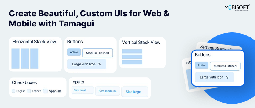
1. Horizontal Stack View
The XStack component allows you to arrange inner components horizontally without the need to manually set the flexDirection property to a row for each wrapper component.
Example -
<XStack gap="$2">
  <View width={40} height={100} />
  <View width={40} height={100} />
  <View width={40} height={100} />
</XStack>
In this example, each View component is aligned horizontally with a gap defined by the $2 variable.
2. Vertical Stack View
The YStack component arranges inner components vertically, eliminating the need to set flexDirection to column for wrapper components.
Example:
<YStack gap="$2">
   <View width={100} height={20} />
   <View width={100} height={20} />
   <View width={100} height={20} />
</YStack>
Here, each View component is stacked vertically with consistent spacing defined by the $2 variable.
3. Button
Tamagui provides a Button component with customizable variants such as active, outlined, and more. You can also include icons and manage states like disabled.
Examples:
<Button theme="active">Active</Button>
<Button variant="outlined" />Outlined</Button>
<Button iconAfter={Activity}>Large with Icon</Button>- The theme and variant props control the button's appearance.
- Icons can be added using the iconAfter or iconBefore props.
4. Input
The Input component allows the creation of various types of text inputs. The TextArea component is also available for multi-line inputs.
Input Example:
<Input
 size="$3"
 placeholder="Size small"
/>
TextArea Example:
<TextArea placeholder="Enter your details..." />
Both components support placeholder text and can be customized with size and styling props.
5. Checkbox
The Checkbox component allows the creation of labeled checkboxes with a customizable indicator and alignment options.
Example:
<XStack alignItems="center" gap="$2">
   <Checkbox id={“label”} size={size}>
     <Checkbox.Indicator>
      <CheckIcon />
     </Checkbox.Indicator>
   </Checkbox>
   <Label size={size} htmlFor={“label”}>
    {“Label”}
   </Label>
</XStack>
6. Switch
The Switch component allows the creation of a toggle switch with a customizable indicator and alignment options.
Example:
<Switch
 padding={0}
 size={props.size}
 checked={isActive}
 onCheckedChange={(checked) => setIsActive(checked)}
 >
  <Switch.Thumb />
</Switch>- The checked prop specifies the current state of the switch.
- The onCheckedChange callback handles state updates.
- The Switch.Thumb defines the thumb element for the toggle switch.
7. Select
The Select component provides a powerful dropdown selection experience with customizable elements such as Select.Trigger, Adapt, and Sheet for creating a bottom sheet.
Example:
<Select
  value={selectedValue}
  onValueChange={setSelectedValue}
  ...
 >
  <Select.Trigger>
    <Select.Value placeholder="Select an option" />
  </Select.Trigger>
  <Adapt ...>
   <Sheet ...>
    <Sheet.Frame>
     <Sheet.ScrollView>
      <Adapt.Contents />
     </Sheet.ScrollView>
    </Sheet.Frame>
    <Sheet.Overlay ... />
   </Sheet>
  </Adapt>
  <Select.Content>
   <Select.Viewport>
    <Select.Group>
     <Select.Label>Country</Select.Label>
      {items.map((item, i) => (
       <Select.Item … />
      ))}
     </Select.Group>
    </Select.Viewport>
   </Select.Content>
  </Select>
- Select.Trigger: Defines the dropdown trigger element.
- Adapt and Sheet: Create a responsive bottom sheet interface for mobile platforms.
- Select.Content: Contains the dropdown content.
- Select.Viewport: Acts as the parent view for dropdown items.
- Select.Item: Represents individual selectable items.
8. Popover
The Popover component allows the creation of a customizable pop-up container with various alignment and content options.
Example:
<Popover size="$5" allowFlip placement={placement}>
  <Popover.Trigger asChild>
   <Button icon={Icon} />
  </Popover.Trigger>
  <Popover.Content
   borderWidth={1}
   borderColor="$borderColor"
   padding={0}
  >
  <Popover.Arrow borderWidth={1} borderColor="$borderColor" />
    <YStack padding={"$3"} gap={"$3"}>
      <Text>{"Send Email"}</Text>
      <Text>{"Send SMS"}</Text>
    </YStack>
   </Popover.Content>
</Popover>- Popover.Trigger: Specifies the element that triggers the popover (e.g., a button).
- Popover.Content: Contains the popover's main content and styling.
- Popover.Arrow: Adds an arrow indicator pointing to the trigger element.
- allowFlip and placement: Control the positioning behavior of the popover.
9. Custom Alert Dialog
The AlertDialog component allows the creation of accessible, modal dialogs for user actions or confirmations. With the native prop, it displays native dialogs on Android and iOS, ensuring a seamless and consistent experience across platforms.
Example:
<AlertDialog native>
 <AlertDialog.Trigger asChild>
  <Button>Show Alert Dialog</Button>
 </AlertDialog.Trigger>

 <AlertDialog.Portal>
  <AlertDialog.Overlay ... />
  <AlertDialog.Content ...>
   <YStack>
    <AlertDialog.Title>Accept</AlertDialog.Title>
    <AlertDialog.Description>
     By pressing yes, you accept our terms and conditions.
    </AlertDialog.Description>

    <XStack justifyContent="flex-end">
     <AlertDialog.Cancel asChild>
      <Button>Cancel</Button>
     </AlertDialog.Cancel>
     <AlertDialog.Action asChild>
      <Button theme="active">Accept</Button>
     </AlertDialog.Action>
    </XStack>
   </YStack>
  </AlertDialog.Content>
 </AlertDialog.Portal>
</AlertDialog>- AlertDialog.Trigger: The element that opens the dialog.
- AlertDialog.Content: Contains the dialog content, including the title and description.
- AlertDialog.Action: Represents a primary action (e.g., accept or confirm).
- AlertDialog.Cancel: Represents a secondary action (e.g., cancel or close).
10. Custom Dialog
The Custom Dialog in Tamagui serves as a versatile dialog component for both web and mobile platforms. Depending on the platform (web vs. mobile), it adapts its behavior using the Adapt component. Below is a guide to using the Custom Dialog.
Example:
<Dialog modal>
   <Dialog.Trigger asChild>
      <Button width={200}>Show Custom Dialog</Button>
   </Dialog.Trigger>
   <Adapt when="sm" platform="touch">
      <Sheet …>
      </Sheet>
   </Adapt>
   <Dialog.Portal>
      <Dialog.Overlay … />
      <Dialog.Content ….>
         <Dialog.Title />”Title”</Dialog.Title>
         <Dialog.Description>”Description”</Dialog.Description>
         {…content}
         <XStack>
            <Dialog.Close displayWhenAdapted asChild>
               <Button theme="active" aria-label="Close">
                  “Button Title”
               </Button>
            </Dialog.Close>
         </XStack>
         <Unspaced>
            <Dialog.Close asChild>
               <Button icon={X} />
            </Dialog.Close>
         </Unspaced>
      </Dialog.Content>
   </Dialog.Portal>
</Dialog>- Dialog.Trigger: Triggers the dialog when the button is clicked.
- Adapt: Manages the mobile experience, switching between Sheet and Dialog.
- Dialog.Content: Contains the main content of the dialog including title, description, and close buttons.
11. Accordion / Collapsible
The Accordion component allows for the creation of collapsible sections. Below is a guide to implementing the Accordion.
Example:
<Accordion overflow="hidden" width="$20" type="multiple">
 <Accordion.Item value="a1">
  <Accordion.Trigger flexDirection="row" justifyContent="space-between">
   {({ open }: { open: boolean }) => (
    <>
     <Paragraph>Personal Information</Paragraph>
     <Square animation="quick" rotate={open ? "180deg" : "0deg"}>
      <ChevronDown size="$1" />
     </Square>
    </>
   )}
  </Accordion.Trigger>
  <Accordion.HeightAnimator animation="medium">
   <Accordion.Content animation="medium" exitStyle={{ opacity: 0 }}>
    <Paragraph>
     John Doe is a 28-year-old male with the email
     john.doe@example.com and phone number +1-234-567-890.
    </Paragraph>
   </Accordion.Content>
  </Accordion.HeightAnimator>
 </Accordion.Item>
</Accordion>
- Accordion.Trigger: Acts as the trigger for the accordion item.
- Accordion.Content: Contains the content that will be shown or hidden.
12. Tabs
<Tabs …>
 <Tabs.List …>
  <Tabs.Tab flex={1} value="tab1" borderWidth={0}>
   <SizableText fontFamily="$body">Profile</SizableText>
  </Tabs.Tab>
  <Tabs.Tab flex={1} value="tab2" borderWidth={0}>
   <SizableText fontFamily="$body">Connections</SizableText>
  </Tabs.Tab>
 </Tabs.List>
 <Separator />
 <TabsContent value="tab1">
  <H5>Profile</H5>
 </TabsContent>
 <TabsContent value="tab2">
   <H5>Connections</H5>
 </TabsContent>
</Tabs>
The Tabs component allows for tabbed navigation, providing an organized way to switch between
- Tabs.List: Manages the tab headers with optional separators.
- Tabs.Tab: Represents an individual tab with content.
- TabsContent: Contains the content displayed based on the selected tab.
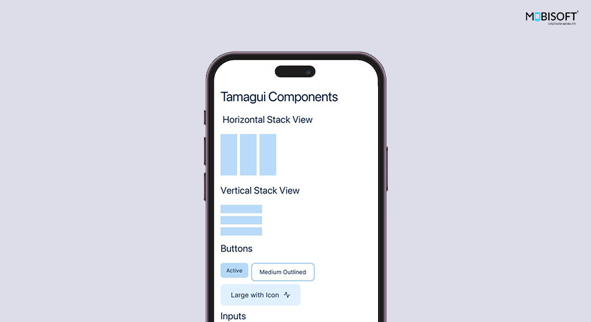
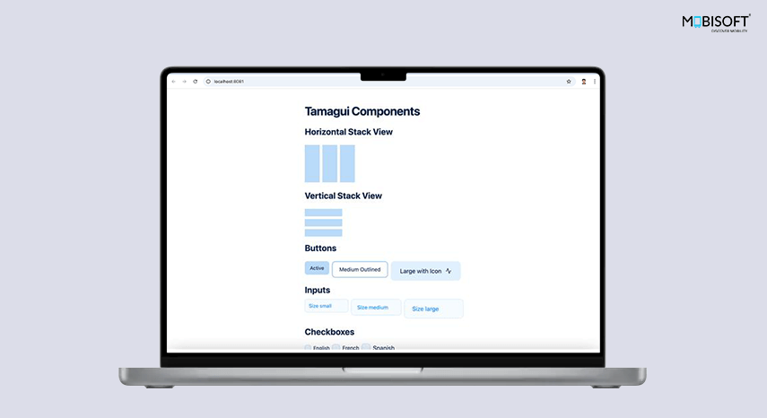
Here Is the Sample Tamagui Components Screen:
Tamagui Components Screen for Mobile:
Tamagui Components Screen for Web:
Conclusion:
By integrating React Native Expo and Tamagui, you've created a powerful, efficient development setup that allows you to write code once and deploy it across web, Android, and iOS platforms. This approach leverages the simplicity of Expo app development and the flexibility of Tamagui's UI components to deliver a seamless, cross-platform experience with minimal overhead.
For projects that involve advanced UI frameworks and cross-platform architecture with tools like Expo and Tamagui, many teams collaborate with experienced React Native consultants to ensure scalable and maintainable application development.
With this setup, you can focus on building features and refining user experiences rather than worrying about maintaining separate codebases for different platforms. Tamagui's theming and responsive design capabilities further ensure your app looks and performs consistently on all devices.
Now that your environment is ready, you can start developing complex components by using example components like Custom Dialog, Accordion, and Tabs, and explore advanced features such as custom themes, animations, and performance optimizations. The possibilities are endless, and this foundation ensures you're well-equipped to create scalable and maintainable cross-platform applications with Tamagui and React Native Expo.




 January 14, 2025


