When questioned what the word “Interaction” means to you, I am sure there would be multiple responses. Here is what we have:
Interaction means Communication between two or more people where everyone is actively involved.
Result oriented information at your finger tips.
Dividing information chunk by chunk to add value to the information presented.
These definitions finally make us think about the word meaning and its origin. The term “inter – action” is quite self explanatory. The action and /or communication between things, people etc.
In general, Interaction refers to the connection of the physical world to the Digital world. Now-a-days people around are quite obsessed with their technology know-how. Interactions between humans and technology need to feel more natural and conversational to keep the viewer involved. Design helps to bridge the gap between the physical and digital world to get both ends connected.
To get things going the way they should, a designer needs to understand the human behaviors… His way of doing things… the way He reacts in situations… His expectations…
Shaping Digital Things for People’s Use
By using the knowledge of visual metaphor, but not literally imitating, many of the interactions can be designed to accomplish the expected output and make it easy for the user to react thus keeping him engaged!
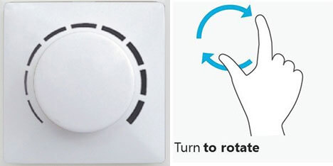
For e.g. the volume regulator: The user is generally used to holding the regulator and rotating it right or left to adjust the volume. When it comes to using the same action in a mobile application or web, the surface is 2 dimensional. The effect the designer gives can be 3 dimensional but the physical touch and feel definitely cannot be the same. Here the challenge of converting a cognitive response to a motor response can be achieved by using the same principle.
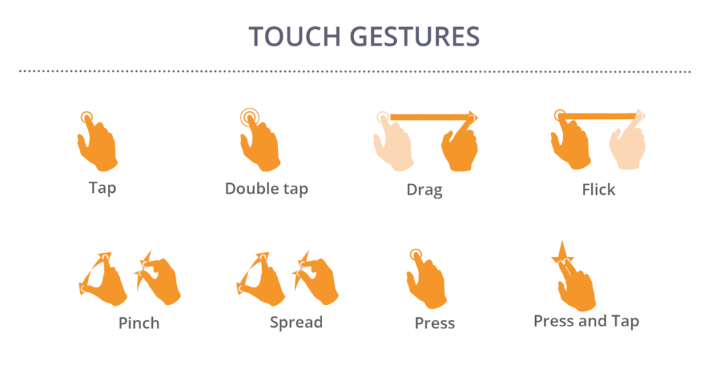
This forces designers to consider ergonomics, gestures, transitions, and finally, mobile-specific interaction patterns.

Interaction is a point where a visual design is processed (cognition) and a human action (motor response) is initiated. The three main components of interaction are:
- Visual Design
- Cognitive Processing
- Motor Response
When dealing with any interaction design, which is a living system in UX, the challenge is to think about the pattern, desire and behavior you want to achieve, which is more natural and easy to understand.
Interaction is about giving a stage to react and perform, but having no control over the actions and reactions of the user. A designer cannot set a path for the user to follow, but can definitely guide him to finally achieve what the designer expects and the user wants.
Dealing with everyday objects can give a user a different experience every time. Even the everyday objects react differently depending on different situations.

Does Visual Design provide sufficient clues?
The appearance (color, shape, size, etc.) gives the user a clue about how it may function. This help the user understand how it can be used. The visual hierarchy is what makes the user perform one action after the other making his task simple. Also it helps the designer achieve the expected user reaction.
Are UI controls appropriate?
The UI controls should be selected to support user’s tasks. The designers need to keep in mind certain things when choosing an interaction control, which depends on:
- What is the user trying to accomplish?
- Whether the user is novice or expert?
- How frequently do they use the interface?
- Is the task complex?
- How important is efficiency?
- How likely are users to make mistakes?
- What are the consequences of user errors?
- How much space is available?
Is interaction intuitive? Is interaction easy to perform?
This depends on how close the interaction is to the natural behavior of the user. For instance zoom in zoom out are quite close to the natural gestures a user might use. So it is not something a user needs to learn and adjust to.

Does user expect it?
Giving a user what he is not expecting may annoy the user, which may result into avoidance to use the app or the website. The user needs to have control of the situations that he is going through so that he can decide what he wants and avoid the ones that annoys him. For an instance, if a user opens a website and music starts to play, the user might have not expected this to happen and it might take a few seconds for him to figure out how to stop it. This situation may lead the user not to use the website the next time.
The notification you provide to a user before they perform an action will keep them posted of its consequences letting them decide if they wish to move forward with the action. These notifications include meaningful label on a button, instructions before the final submission, etc.
Do all the interactions work elegantly together?
Too many interactions on the same screen may distract the user leading to frustration, inefficiency and even abandonment.
Are error messages, feedback and instructions meaningful and useful?
Whenever a user taps, clicks or performs any interaction, he expects a reaction as a response. If in a situation the user taps on a button and nothing moves or happens for a few seconds, the user may feel that the device is malfunctioning. There are situations when the action might take some time to get the expected reaction, but to avoid the user’s attention or let him know that his task is being performed in the backend, there needs to be an indication on the screen like a loading sign.
The secret to designing an intuitive user experience is making sure that the conceptual model of your product matches, as much as possible, with the mental models of your users. If you get that right you might as well create a positive and useful user experience. Also, interaction does not necessarily have to be always the way it is expected by the user. The challenge lies when a designer comes up with an interaction model which is subtle and meaningful and serves the purpose more efficiently and the user doesn’t even have to put extra effort to achieve the result.
 January 15, 2015


