So, you’ve got a great-looking site. Clean layout, fast load times, even your grandma calls it “very modern.” Nice work.
Here’s the problem: no one’s hitting that “Buy Now” button. Your conversion rate is sitting flat. Think pancake-under-a-steamroller flat.
You’re not the only one. I’ve seen companies throw serious money at user experience design and dev, only to watch users bounce like they’re allergic to the checkout page. The culprit? UX. It’s always there in the background, quietly deciding whether people stick around or leave. If your user experience is off, your conversions will be too. Discover how our UI/UX Design Services can turn browsers into loyal customers.
Let’s dig into how user experience and conversion rates connect and talk, with examples.
What Do We Mean by User Experience (UX) in Web and App Design?
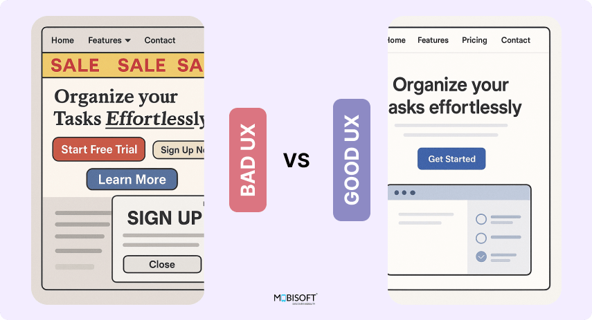
User experience (UX) is the impression a user forms while interacting with your product, whether it’s a website, an app, or any digital tool. Does the page load quickly, or do they end up waiting? Can they locate what they need without unnecessary clicks? Can they complete their task smoothly, without frustration creeping in?
That’s the benchmark for good user experience design services. It’s easy, natural, almost invisible.
Bad user experience? That’s when your site is confusing, slow, the kind of thing that makes users give up halfway and slam their laptop shut.
If people can complete their task without frustration, maybe even with a little satisfaction, then you’ve done your job. That’s the goal of user experience consulting and user experience services. See how our web UI/UX design services can make every click effortless.
What Are Conversion Rates and Why UX Matters for Them?
A conversion is when a user completes a desired action on your site. This could be:
- Buying a product
- Signing up for a newsletter
- Booking a demo
- Downloading an ebook
- Requesting a quote
Conversion rate = (Number of conversions ÷ Number of visitors) x 100
So if 100 people visit your site and 5 buy your lemon-scented beard oil, your conversion rate is 5%.
Sounds simple. But getting that number up? That’s where UX and conversion optimization enter like a hero in a hoodie.

Why UX and Conversions Are Secretly Best Friends
Here’s the truth. People don’t convert because your site is “pretty.” They convert because your site is:
- Easy to use (usability and navigation)
- Helpful and clear (clear CTA design and conversion)
- Fast and frustration-free (page load speed and conversion rates)
- Designed with their needs in mind (mobile responsiveness conversion)
Imagine this: You walk into a grocery store looking for cereal. The lights are flickering, the signs are missing, and the shelves are a mess. You leave. No cereal, no conversion. That’s what a bad user experience design company or poor user experience (UX) design feels like.
When users struggle to find what they need or get stuck halfway, they bounce. Your site search and conversion rates take the hit. Simple as that. Learn how designing trust-driven user experiences can turn casual visitors into confident buyers.
Key UX Elements That Directly Affect Conversion Rates
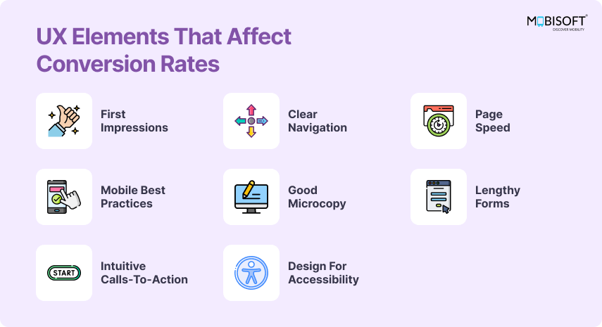
Let’s break down the specific parts of UX that move the conversion needle. And yes, we’re getting into the needs, but the fun kind.
First Impressions (A.K.A. "The 5-Second Rule" in UX Performance)
Studies show you have less than 5 seconds to make a good impression.
If your homepage is cluttered, confusing, or takes too long to load, users leave faster than you can say “404 error.”
Example: A software startup redesigned its landing page to highlight one clear value proposition and CTA. Bounce rate dropped 30%. Boom.
Action tip: Ask someone who’s never seen your site to describe what it’s about in 5 seconds. If they say “uhh…” you’ve got work to do.
Track the right UX performance metrics to see if your design changes are boosting conversion
Navigation That Improves UX and Conversions
If users need a treasure map to find your product page, they’re not buying anything.
Good navigation is like a GPS. It tells users where they are, where they can go, and how to get there without backtracking through 17 tabs.
Example: A B2B SaaS site simplified its mega menu into 4 clear categories. Conversions increased by 18%.
Action tip: Stick to clear labels. Use breadcrumbs. Highlight your main CTA in every menu.
Page Speed and Conversion Rates in UX
47% of users expect a website to load in 2 seconds or less. Every second of delay reduces conversion rates by 7%.
Let that sink in. 7% per second.
Example: Walmart found that for every 1-second improvement in page load speed, they saw a 2% increase in conversions. See the full Walmart case study on page speed and conversions
Action tip: Use tools like Google PageSpeed Insights or GTmetrix. Optimize your images. Kill unnecessary scripts.
Mobile UX Best Practices for Better Conversions
Mobile traffic now makes up over half of all web visits. If your site’s not mobile-friendly, you’re missing out. Literally.
Bad mobile UX leads to tiny buttons, text you need a magnifying glass for, layouts that break, and unnecessary horizontal scrolls.
Example: A retail brand optimized its mobile checkout and saw a 32% boost in mobile conversions.
Action tip: Test every page on different devices. Can you complete a purchase with one hand and a coffee in the other?
Explore our mobile app UI/UX design services to create seamless experiences on any device.
Microcopy That Boosts UX and User Trust
Microcopy includes the tiny bits of text, button labels, error messages, and form hints that guide users.
Done right, it removes friction. Done wrong, it creates confusion.
Example: Changing a button from “Submit” to “Get My Free Report” increased signups by 20%.
Action tip: Be specific. Be clear. Don’t be boring. “Create Account” is better than “Next.”
Forms That Remove Conversion Barriers
Forms are often the last step before conversion. Don’t ruin it with a 12-field monster form asking for your user’s blood type.
Example: Expedia removed just one unnecessary field and gained $12 million in revenue.Read how Expedia’s form optimization boosted revenue.
Action tip: Only ask for what’s essential. Use autofill. Show progress bars if it’s multi-step.
Calls-to-Action That Drive Conversions
Your CTA should be obvious, urgent, and user-focused.
“Learn More” is fine. “Get Your Free Guide” is better.
“Submit” is meh. “Start Saving Today” is money.
Example: A fitness app changed its CTA from “Sign Up” to “Start Your 30-Day Transformation” and saw a 45% increase in conversion rates.
Action tip: Test your CTAs like your revenue depends on it. Because it does.
Accessibility as a UX Success Indicator
A site that’s accessible to people with disabilities isn’t just ethical. It’s smart business. Accessible design improves SEO, expands your audience, and often results in cleaner, simpler UX.
Example: UK retailer Tesco made its site accessible and saw an increase in online grocery orders.
Action tip: Use alt text. Provide keyboard navigation. Use proper contrast. Accessibility gives inclusivity, which leads to higher conversion rates.
Build a scalable, inclusive brand with our design system consulting expertise.
Real-World Examples of UX Boosting Conversions
Let’s make this real. Here are a few brands that got it right:
- Airbnb streamlined its search interface. Result? Bookings went up by 30%.
- Amazon’s one-click purchase is legendary UX. You barely think. You just buy.
- HubSpot reduced form fields from 15 to 3. Their conversion rates doubled.
- Slack’s onboarding user experience design feels like chatting with a friend. Engagement skyrockets.
These companies didn’t rely on luck. They tested, tweaked, and tailored UX design services to meet real user needs.
The Cost of Bad UX (It’s Not Just a Few Lost Sales)
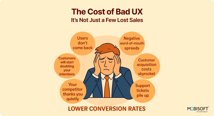
Bad user experience doesn’t just lower conversion rates:
- Users don’t come back.
- Negative word-of-mouth spreads.
- Customer acquisition costs skyrocket.
- Support tickets pile up.
- Customers will start doubting your intentions
- Your competitor thanks you quietly.
Think of UX like the foundation of a house. If it’s cracked, you can’t just paint over it and call it a day.
Actionable Tips to Improve UX for Better Conversions
Ready to roll up your sleeves? Here’s what you can do today:
- Run usability and navigation tests with real users.
- Simplify your navigation. Remove extra menu items.
- Speed up your site. Compress images. Remove junk.
- Optimize for mobile. Say no to pinch-zooming or content that horizontally overflows.
- Revamp your CTAs. Make them benefit-driven.
- Cut down form fields. Ask only what you need.
- Improve microcopy. Use real, helpful, human language.
- Make accessibility a priority. Follow WCAG guidelines.
- Use heatmaps to see where users click and where they don’t.
- A/B test everything. Never assume you know what works best.
Follow these mobile UX best practices for better conversions to ensure your mobile visitors get an experience that drives action.
Closing Thoughts: UX Is a Strategy
If there’s one thing to take away from this blog, it’s this:
Good user experience is the secret sauce of high conversion rates.
It impacts how users behave, decide, and spend. Stop treating UX like a coat of paint; it’s the architecture, plumbing, lighting, and layout of your digital house.
Invest in user experience design services, test, and keep improving. Your users and your bottom line will thank you.
Ask yourself this. If I were a first-time visitor to my site, would I convert? If the answer is no, your UX has some explaining to do.
Let’s fix that.


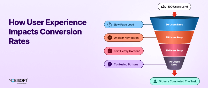


 June 17, 2025


