Pictures speak louder and quicker than words. One of the examples proving this is a graphical representation of data. From management’s perspective, charts play an important role in making quick decisions.
Charts In Flutter:
For the Flutter apps built through flutter development services, FL Chart provides a very easy and attractive way to create Flutter charts, The FL Chart library is not only easy to use but also highly customizable. We can create interactive charts that respond to user interactions, such as touch events. Here, we are going to see how to build the charts with fl_chart.
The data used for the examples is simple and easy to understand the implementation.
Prerequisites:
Before the ignition, let's confirm the supplies. You need the following.
- Flutter SDK
- Android Studio, VS Code, or any other relevant code editor
- Basic Flutter knowledge.
To develop apps efficiently using Flutter, especially when implementing data visualizations like charts, Flutter App Development Services is highly recommended. This will help you understand how Flutter can be used to create responsive and high-performing applications, making it easier to integrate features like charts into your projects.
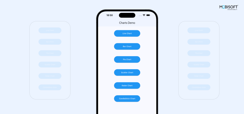
The most used chart types in Flutter are Line charts, Bar charts, and Pie charts. Here, we have also covered the Scatter chart, Radar chart, and Candle chart. The code is arranged as follows: from the landing home screen, we have options to navigate to a particular chart. In the code, there is a controller that embeds a widget of that particular chart, which is the main code you would be interested in. Let’s go one by one.

Line Charts In Flutter
Overview:
To represent the data graphically, Line charts are considered to be one of the most useful ways in Flutter for data visualization. Here, we are going to see the data of demand per month between two products in a Flutter line chart.
Check the following code block.
child: LineChart(
    LineChartData(
      borderData: FlBorderData(
        border: Border(
          bottom: BorderSide(),
          left: BorderSide(),
        ),
      ),
      gridData: FlGridData(
    show: true,
    drawHorizontalLine: true,
    drawVerticalLine: false,
   ),
      titlesData: FlTitlesData(
        topTitles: AxisTitles(
          sideTitles: SideTitles(showTitles: false),
        ),
        rightTitles: AxisTitles(
          sideTitles: SideTitles(showTitles: false),
        ),
   bottomTitles: AxisTitles(
    sideTitles: bottomTitles,
   ),
      ),
      lineBarsData: [
        LineChartBarData(
            spots: changeState ? getTheSpots(1) : getTheSpots(0),
            isCurved: true,
            barWidth: 3,
            color: Colors.blue),
        LineChartBarData(
            spots: changeState ? getTheSpots(2) : getTheSpots(0),
            isCurved: true,
            barWidth: 3,
            color: Colors.green),
      ],
      lineTouchData: LineTouchData(
        enabled: true,
        touchTooltipData: LineTouchTooltipData(
          getTooltipItems: (touchedSpot) {
            return touchedSpot
                .map(
                  (spot) => LineTooltipItem(
                    spot.y.toString(),
                    TextStyle(color: Colors.white),
                  ),
                )
                .toList();
          },
          getTooltipColor: (touchedSpot) => Colors.grey,
        ),
      ),
    ),
   )
LineChart is the widget provided by fl_chart to create the line chart. It takes LineChartData as a key parameter that defines how the data is going to be represented.
Now, let's see the properties inside it.
- borderData: It defines how the borders of the chart should look or even not to show at all. If you want to hide it, just pass false as
borderData: FlBorderData(show: false)By default, it is “true,” and we can further specify how the borders should be shown with the BorderSide widget.
- gridData: By passing the FlGridData to this property we can decide the look of the grid on the chart. We can hide the grid by passing false to the “show” property of this widget. You can play with other properties of FlGridData like drawHorizontalLine, drawVerticalLine, horizontalInterval, verticalInterval, etc.
- titlesData: This property takes a FlTitlesData widget, which takes an AxisTitles widget that defines how the titles on the axis need to be shown. We can customize these with SideTitles widget.
Now for the part that plots the line, refer to the below code block.
lineBarsData: [
    LineChartBarData(
        spots: getTheSpots(1),
        isCurved: false,
        barWidth: 3,
        color: Colors.blue),
    LineChartBarData(
        spots: getTheSpots(2),
        isCurved: false,
        barWidth: 3,
        color: Colors.green),
],- lineBarsData: This property takes an array of LineChartBarData. One LineChartBarData will plot one line on the chart. This enables the developer to plot multiple lines. Let's check this widget's properties.
- spots: This takes a list of FlSpot. Each FlSpot has x and y coordinates through which the line goes.
- isCurved: This property defines whether the line should be a curved line or a spot-to-spot straight line. If set “true”, it curves the corners of the line on the spot's position.
- barWidth: We can define the width of the line with this property.
- color: To distinguish between lines and/or give a cosmetic effect, we can set different colors to the lines.
These are the basics of plotting the line chart.
Now FlChart provides a very useful facility of handling the touch events. Check the following code block.
lineTouchData: LineTouchData(
    enabled: true,
    touchTooltipData: LineTouchTooltipData(
      getTooltipItems: (touchedSpot) {
        return touchedSpot
            .map(
              (spot) => LineTooltipItem(
                spot.y.toString(),
                TextStyle(color: Colors.white),
              ),
            )
            .toList();
      },
      getTooltipColor: (touchedSpot) => Colors.grey,
    ),
)- lineTouchData: This property takes a LineTouchData widget that can be used to show tool tips. We have the facility to disable the touches also by setting
- enabled: false.
- getTooltipItems: This property in the LineTouchTooltipData widget retrieves data to show in the tooltip. We can define the appearance of the tooltip view with the widget LineTooltipItem.
Now for the gimmick.
You can apply animations to the chart as per your need. Here, we are animating the chart with the help of a timer. As the specified timer value hits, the state is rendered, changing the value of a boolean variable changeState, which then gets referred to pass the data to spots: of each LineChartBarData as follows.
spots: changeState ? getTheSpots(1) : getTheSpots(0),Check DemandPerMonth class for the getTheSpots function.
child: LineChart(
 duration: Duration(milliseconds: 300),
 curve: Curves.easeInOut,
duration defines the animation duration.
curve defines the type of animation.
Output:
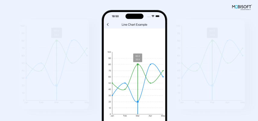
Here is the Video of Line charts in Flutter :
Bar Chart In Flutter
Overview:
Bar Charts are great for comparing values or scales of different categories like the example we are using of the prospects and clients converted in referred months. Here, for each month, one bar represents the prospects, and the other represents the converted clients. The length of the bar represents the quantity.
You may want to consider Customizing Flutter App with Flavors for Different Environments when working on Flutter apps. This is especially helpful if you need to differentiate between development, staging, or production environments while developing these complex data visualizations.
Code and explanation:
You can see that most of the structural properties here are similar to that of LineChart.
The code is arranged in BarChartWidget which is added in the BarChartExample class. A List of BarChartGroupData is passed to this widget as a parameter.
Now, let's check the code blocks.
child: BarChart(
 BarChartData(
   titlesData: FlTitlesData(
     bottomTitles: AxisTitles(
       sideTitles: bottomTitles,
     ),
     topTitles: AxisTitles(

       sideTitles: SideTitles(
         showTitles: false,
       ),
     ),
     rightTitles: AxisTitles(
       sideTitles: SideTitles(
         showTitles: false,
       ),
     ),
   ),
   backgroundColor: Colors.white,
   alignment: BarChartAlignment.spaceEvenly,
Here, the parent widget BarChart takes a BarChartData widget that has the following properties.
- titlesData: We can define the style and data of the titles in the FlTitlesData widget. In this widget, we can handle the title of each side with the properties as shown in the code. Here, we have set the bottom titles by passing the textual data of SideTitles to the bottomTitles property through AxisTitles widget. Similarly, you can set the titles for the top, right, and left sides. If you don't want to show titles on a side, for example, the top or right side, simply set
- showTitles: false in the SideTitles widget for the respective property of that side.
- backgroundColor: Set the background color of the chart.
- alignment: Sets the alignment of the bars in the chart.
Now, let's see the property that takes the bar data.
- barGroups: This property takes the List of BarChartGroupData, which is the bar data to be represented.
Here, we have passed it through the following function in the parent class.
List<BarChartGroupData> _chartGroupsMultiRods() {
 final points = [
   SalesPerMonth(month: 1, leads: 100, sales: 50),
   SalesPerMonth(month: 2, leads: 50, sales: 50),
   SalesPerMonth(month: 3, leads: 90, sales: 70),
   SalesPerMonth(month: 4, leads: 80, sales: 30),
   SalesPerMonth(month: 5, leads: 60, sales: 50)
 ];
 return points
     .map((point) => BarChartGroupData(
     x: point.month.toInt(),
     barRods: [
 BarChartRodData(
     toY: point.leads,
     color: Colors.blue,
     borderRadius: BorderRadius.circular(5),
     width: 15),
 BarChartRodData(
     toY: point.sales,
     color: Colors.green,
     borderRadius: BorderRadius.circular(5),
     width: 15),
],
     barsSpace: 0))
     .toList();
}
In the BarChartGroupData widget, we can configure the x-axis value point and the respective bar rod.
- barRods: In this property, an array of BarChartRodData is passed. The number of BarChartRodData defines the number of bars on the graph on the respective value of the x-axis. We can set the value of the bar and its cosmetics in the BarChartRodData.
- barsSpace: Value set to this property defines the space between the bars under comparison on the respective x-axis value.
Now, coming back to the BarChartWidget class, check the barTouchData property of the BarChartData widget.
Just like LineChart we also have the facility of modifying tooltips in the BarChart. Check the following code block.
touchTooltipData: BarTouchTooltipData(
    getTooltipItem: (group, groupIndex, rod, rodIndex) {
      String weekDay = rod.toY.toString();
      return BarTooltipItem(
        weekDay,
        TextStyle(color: Colors.white),
      );
    },
    getTooltipColor: (touchedSpot) => Colors.black,
   ),
To show the animation, here we are using a timer in the BarChart Example class. Initially we pass one set of data, and when the referred timer value is reached, the changeState value is set true, and another set of data is passed when the state gets rendered as follows.
child: BarChartWidget(
    spotsData:
        changeState ? _chartGroupsMultiRods() : _chartGroupsInitialData(),
In the BarChartWidget,
child: BarChart(
    swapAnimationDuration: Duration(milliseconds: 300),
swapAnimationCurve: Curves.easeInOut,- swapAnimationDuration: defines the animation duration.
- swapAnimationCurve: defines the type of animation.
Output:
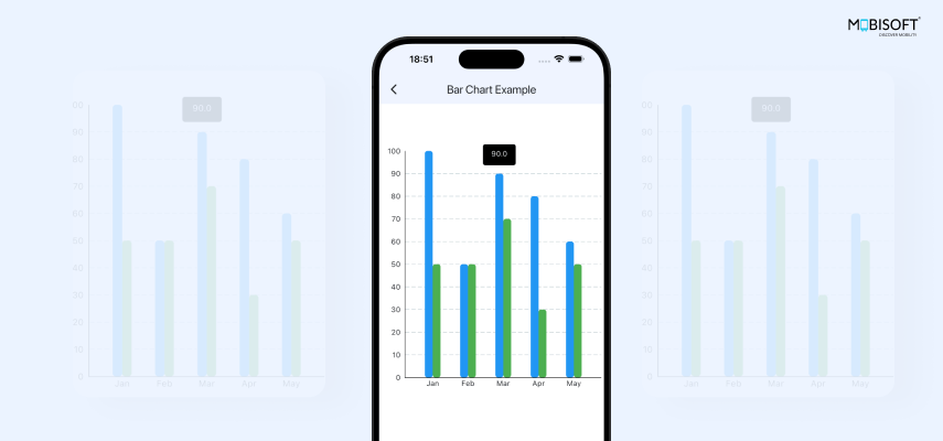
Here is the Video of Bar Chart in Flutter :
Pie Chart In Flutter
Overview:
A Pie Chart is a very effective way to represent the data in easily understandable format and in a visually pleasing way.
It presents data in sections each of which represents a certain portion of the data to compare with others. Like in our example here, the data of the resource strength in each department of a company.
Code and explanation:
Let's dive into the code.
child: PieChart(
 PieChartData(
   sections: getSectionData(),
   centerSpaceRadius: 10.0,
   sectionsSpace: 2,
   startDegreeOffset: 0,
PieChart is the main widget that renders the chart.
PieChartData defines its appearance and behaviour with the following properties.
- centerSpaceRadius: This value determines the radius of the hollow part in the center. As you increase this value, the Pie gets transformed into a Donut shape.
- sectionsSpace: This value determines the space between sections.
- startDegreeOffset: It draws sections from zero degrees, that i,s the right side of the circle, clockwise.
- sections: This property takes the List of PieChartSectionData each of which defines one slice of the Pie. It provides a visual representation control over each slice.Check the getSectionData function in the code. The list of PieChartSectionData is prepared from departmentsShare data list.
Now first let's check the basic properties referring to the below code.
return PieChartSectionData(
    color: department.color,
    value: department.value,
    title: textToShow,
   titleStyle: TextStyle(
    color: Colors.white,
    fontWeight: FontWeight.bold,
    fontSize: 15,
   ),
    radius: (touchedIndex == indexValue) ? 200.0 : 180,
    titlePositionPercentageOffset: 0.5,
    borderSide: (touchedIndex == indexValue)
        ? BorderSide(
            style: BorderStyle.solid,
            width: 2.0,
            color: Colors.black,
          )
        : BorderSide(
            style: BorderStyle.solid,
            width: 2.0,
            color: Colors.white,
          ),
);- color: sets the color of the section.
- value: the numerical value represented by the section.
- title: sets the text of the label displayed on the section.
- radius: sets the size of the section’s arc.
- titlePositionPercentageOffset: By default, the text is drawn in the middle of the section. But you can change the position with this value. It should be between 0.0 to 1.0 where 0.0 means near the center and 1.0 means near the outer side of the.
Now let’s add some effect on tapping one of the slices of this Pie. This is achieved with touch handling events with the help of PieTouchData. Please refer to the following code.
pieTouchData: PieTouchData(
    enabled: true,
    touchCallback: (FlTouchEvent event, touchResponse) {
      setState(
        () {
          if (touchResponse == null ||
              touchResponse.touchedSection == null) {
            touchedIndex = -1;
            return;
          }
          touchedIndex =
              touchResponse.touchedSection!.touchedSectionIndex;
        },
      );
    },
   ),
The state can be altered in the touchCallback where we can refer to the touched slice with touchResponse.
For example we have modified the radius of the touched slice in the chart and applied a black border to it. The variable touchedIndex is set in this touchCallback, and the state is refreshed. This value gets referred to in the getSectionData function to render the touched slice as follows.
radius: (touchedIndex == indexValue) ? 200.0 : 180,
 borderSide: (touchedIndex == indexValue)
     ? BorderSide(
         style: BorderStyle.solid,
         width: 2.0,
         color: Colors.black,
       )
     : BorderSide(
         style: BorderStyle.solid,
         width: 2.0,
         color: Colors.white,
       ),
);
You can see the radius value is handled for the touched slice. Also, the borderSide property is set with the BorderSide widget, changing the respective color of the border to highlight the change.
The following lines add animation to this effect.
child: PieChart(
    swapAnimationDuration: const Duration(milliseconds: 300),
    swapAnimationCurve: Curves.easeInCirc,
Output:
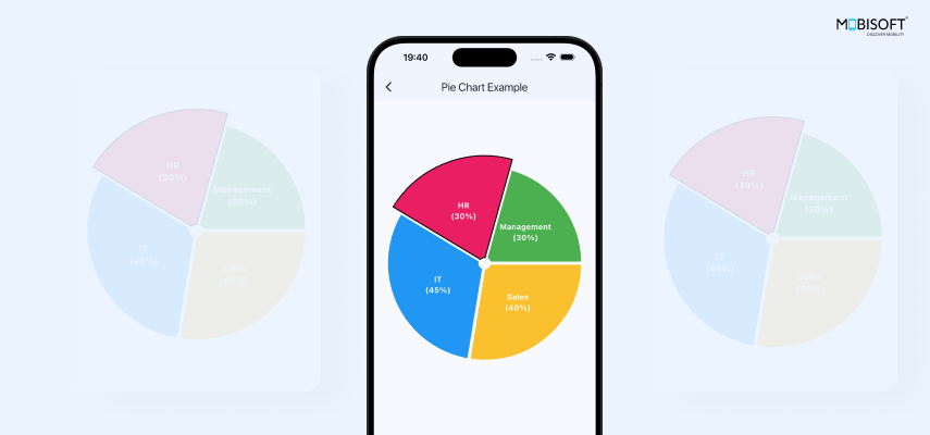
Here is the Video of Pie Chart in Flutter :
To manage your Flutter app’s overall theme and maintain consistency across all chart widgets, you can learn more about Flutter Theme Management: How to Implement Custom Colors. This guide will help you create a cohesive look for your app's visual elements, including charts.
Scatter Chart In Flutter
Overview:
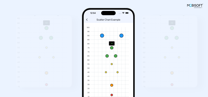
Scatter Charts are useful to plot several points anywhere on the graph by providing x and y coordinate values along with color and radius without connecting them via lines. For instance, when developing responsive web applications using Flutter, a scatter chart can be an effective way to visualize data points with precision.
Code and explanation:
Check the following code to add ScatterChart.
return ScatterChart(
 ScatterChartData(
   minX: 0,
   minY: 0,
   maxX: 100,
   maxY: 100,
   scatterSpots: getScatterSpots(),
 ),
);- ScatterChart is the main widget that renders the scatter chart. It requires ScatterChartData.
- ScatterChartData defines the appearance and behavior of the chart.
Following are its properties.
minX and maxX define the range of values on the X-axis.
minY and maxY define the range of values on the Y-axis.
scatterSpots property takes the data to plot in the form of a List of ScatterSpot widgets. In our code, check the getScatterSpots() function that returns it.
List<ScatterSpot> getScatterSpots() {
 return [
     ScatterSpot(
       55,
       17,
       dotPainter: FlDotCirclePainter(
         radius: 8,
         color: Colors.red,
         strokeWidth: 2,
         strokeColor: Colors.black,
       ),
     ),
     ...
   ];
}- ScatterSpot defines individual data points to be plotted on the chart.
The first two properties take x and y coordinates.
- dotPainter property defines mainly the color and radius of the spot. strokeWidth and strokeColor are other cosmetic properties you can set.
In ScatterChartData other basic properties like the rest of Axis-based charts are also available to handle.
gridData: FlGridData(show: true),
borderData: FlBorderData(
 show: false,
 border: Border(
   top: BorderSide.none,
   right: BorderSide.none,
   left: BorderSide(),
   bottom: BorderSide(),
 ),
),
titlesData: FlTitlesData(
 show: true,
 topTitles: AxisTitles(
   sideTitles: SideTitles(
     showTitles: false,
   ),
 ),
 rightTitles: AxisTitles(
   sideTitles: SideTitles(
     showTitles: false,
   ),
 ),),
You can handle the touch in ScatterChartData as follows with the ScatterTouchData widget in scatterTouchData property.
scatterTouchData: ScatterTouchData(
    enabled: true,
    touchTooltipData: ScatterTouchTooltipData(
      getTooltipColor: (touchedSpot) => Colors.black,
    ),
   ),
You can add more conditional logic in the getTooltipColor property referring to the touchedSpot in ScatterTouchTooltipData widget.
Output:
Radar Chart In Flutter
Overview:
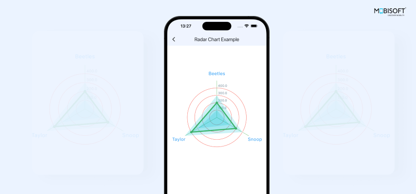
A Radar Chart is used to graphically represent data from a set of three or more data points in a two-dimensional graph. It is useful for comparing multiple quantitative variables. This makes the chart useful for seeing which variables have similar values or if there are any outliers amongst each variable. Radar Charts are also useful when visualizing performance analysis or survey data. If you're working on a fundamental guide for developing a startup mobile app with Flutter, integrating a radar chart can give your app a polished look by easily displaying diverse data sets.
Code and explanation:
Now let's see the code to add the Radar Chart.
child: RadarChart(
    RadarChartData(
      radarShape: RadarShape.circle,
      dataSets: getDataSets(),
      radarBorderData: BorderSide(color: Colors.transparent),
      tickCount: 4,
      ticksTextStyle: const TextStyle(color: Colors.blueGrey),
      tickBorderData: BorderSide(color: Colors.red),
      gridBorderData: const BorderSide(color: Colors.green),
      getTitle: (index, _) => RadarChartTitle(text: titles[index]),
titleTextStyle: TextStyle(color: Colors.blue, fontSize: 20.0),- RadarChart widget is the main widget that renders the chart. It takes RadarChartData widget which defines the appearance and behaviour of the chart with following properties.
- radarShape: This defines the shape of the radar chart as either circle or polygon.
- tickCount: These define the number of visual markers, ticks, that indicate the values along the radial axes. Its default value is 1.
- ticksTextStyle: It sets the style of the text.
- tickBorderData: Defines the border cosmetics of the ticks.
- gridBorderData: Defines the border cosmetics of the grid.
- getTitle: It is a callback function to set custom titles for each axis with RadarChartTitle widget.
- dataSets: It takes the List of RadarDataSet objects that define each data set on the chart. In the code, the getDataSets() function is returning the transformed RadarDataSet list.
List<RadarDataSet> getDataSets() {
 return myDataSetList.asMap().entries.map((entry) {
   final index = entry.key;
   final data = entry.value;
   final isSelected = (index == selectedDataSetIndex) ? true : false;


   final List<RadarEntry> dataEntries = data.values.map(
     (value) {
       return RadarEntry(value: value);
     },
   ).toList();

   return RadarDataSet(
     borderColor: isSelected ? Colors.green : Colors.white30,
     borderWidth: isSelected ? 5.0 : 2.0,
     dataEntries: dataEntries,
   );
 }).toList();
}
- RadarDataSet: Now each RadarDataSet takes data in dataEntries.
- dataEntries: The RadarChart uses this set of dataEntries to draw the chart. This is a list of RadarEntry widget.
- RadarEntry: Each RadarEntry widget represents one value in a dataset related to one axis.
- borderColor: sets border color of RadarDataSet.
- borderWidth: sets border width of RadarDataSet.
In the example, we are changing the color and the width of the border of touched RadarDataSet in the getDataSets() function when the state renders.
Touches are handled in RadarTouchData.
Check the following code.
radarTouchData:
   RadarTouchData(touchCallback: (FlTouchEvent event, response) {
 if (!event.isInterestedForInteractions) {
   setState(() {
     selectedDataSetIndex = -1;
   });
   return;
 } else {
   setState(() {
     selectedDataSetIndex =
         response?.touchedSpot?.touchedDataSetIndex ?? -1;
   });
 }
})
- radarTouchData: We can handle the touch events in this property with the RadarTouchData widget. RadarTouchData takes a callback function in touchCallback.
Here event.isInterestedForInteractions excludes exit or up events to show interactions on charts.
If event.isInterestedForInteractions is true, then we set the selectedDataSetIndex variable value to the index value of the touched spot as given by touchedDataSetIndex.
setState() call renders the state and referring to selectedDataSetIndex value the color and the width of the border of touched RadarDataSet in the getDataSets() function is set.
Output:
CandleStick Chart In Flutter
Overview:
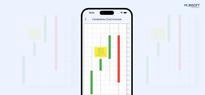
One of the most famous charts is a Candlestick Chart in the financial charts category. Though fl_chart does not have a built-in widget to directly support CandleStick charts, yet, we have managed to customize it with the help of BarChart. See, that is the beauty of fl_chart when we say it is highly customizable. We are using this CandleStick chart in its basic form to display the price movements over the time period.
Each candle represents a unit of time, and it is formed using four data points.
- Open: The price when the market opens.
- Close: The price when the market closes.
- High: The highest price point during the respective time period.
- Low: The lowest price point during the respective time period.
Code and explanation:
As stated, the basic chart used is the BarChart. Lets skip the basics of BarChart that you can refer to in the BarChart section of this document. We will directly dissect the logic of how a candle is formed which is in the below code.
A list of custom model StockPriceData is the main source of data that we store in variable stockPricesDataList.
List<StockPriceData> stockPricesDataList = stockPricesList;
var barChartGroups = List<BarChartGroupData>.empty(growable: true);
int minY = stockPricesDataList[0].low;
int maxY = stockPricesDataList[0].high;
minY and maxY are the variables used to define the vertical scope of the chart considering the lowest low value and the highest high value of the available data set. Initially, they store the respective values of the first StockPriceData in the list.
Now, a loop is used on the list to create each pair of bar rods, which collectively form a candle.
int i = 0;Variable int i is used as a loop index and the x coordinate of each candle.
var barChartGroups = List<BarChartGroupData>.empty(growable: true);We have defined a growable list that will contain the BarChartGroupData objects, which are our candles.
Now, let's check what is going on in the loop.
for (var stockPrice in stockPricesDataList) {
 barChartGroups.add(
   BarChartGroupData(
     x: i,
     groupVertically: true,
     barRods: [
       BarChartRodData(
           fromY: stockPrice.open.toDouble(),
           toY: stockPrice.close.toDouble(),
           width: 20,
           color:
               stockPrice.open < stockPrice.close ? positiveColor : negativeColor,
           borderRadius: BorderRadius.zero),
       BarChartRodData(
         fromY: stockPrice.low.toDouble(),
         toY: stockPrice.high.toDouble(),
         width: 1,
         color:
             stockPrice.open < stockPrice.close ? positiveColor : negativeColor,
       )
     ],
   ),
 );
 i++;
 minY = min(minY, stockPrice.low);
 maxY = max(maxY, stockPrice.high);
}
Here, each BarChartGroupData consists of 2 BarChartRodData that will overlap each other.
- One BarChartRodData represents the span of open and close values of a stock, which are set to fromY and toY properties, respectively. This, in traditional convention, is the thick bar in the candle.
- Second BarChartRodData represents the span of low and high values of the same stock, which are set to fromY and toY properties, respectively.
In traditional convention, the thick part of the candle is the open-close bar, and the thin part is the low-high bar. So, the width property is set accordingly.
The color for the candle is defined based on the respective stockPrice.open and stockPrice.close values.
minY = min(minY, stockPrice.low);
maxY = max(maxY, stockPrice.high);
In each loop, the low and high values are checked to update the minY and maxY.
The final stockPricesDataList is passed to the barGroups property to render the chart.
As for the bottomTitles, we are showing the day value of the StockPriceData object and for the rightTitles, we are showing the price value.
barTouchData: BarTouchData(
 touchTooltipData: BarTouchTooltipData(
   getTooltipColor: (touchedSpot) => Colors.yellow,
   getTooltipItem: (group, groupIndex, rod, rodIndex) {
     var stockChartData = stockPricesDataList[groupIndex];
     int day = stockChartData.day;
     var date = DateTime.parse(day.toString());
     String touchData =
         'open: ${stockChartData.open}\n close: ${stockChartData.close}\n high: ${stockChartData.high}\n low: ${stockChartData.low}\n day:${date.year % 100} . ${date.month} . ${date.day}';
     return BarTooltipItem(
       touchData,
       TextStyle(
         color: stockChartData.open < stockChartData.close
             ? positiveColor
             : negativeColor,
         fontWeight: FontWeight.bold,
         fontSize: 10,
       ),
     );
   },
 ),
),
To show the tooltip on each candle, the touches are handled in barTouchData.
BarTooltipItem is formed and returned from the callback function in the getTooltipItem property.
The basic output of all our work is shown below.
Output:
Summing It Up:
Being an excellent tool for handling rich data visualizations in a Flutter app with minimum effort, fl_chart offers a variety of customizable options. You can easily mold charts to fit your application’s theme that will result in keeping consistency in the UI and a happy client.
There is enormous scope to imagine and customize these charts, both individually and in combination, according to your requirements. Stretch your imagination to create beautiful representations, and most importantly, have fun.
I hope you found this tutorial on how to create charts in Flutter using fl_chart useful. You can download the source code from here.




 April 7, 2025


