Introduction
In today’s digital landscape, users access web applications across various devices with different screen sizes and resolutions. Responsive web design ensures that a web application offers the best possible view on all devices, from mobiles to desktops. Achieving this can be challenging as it involves layout considerations, scaling content, and user interaction. If you need expert assistance in creating such applications, check out our Web App Development Services.
Introduction to Flutter
Flutter is a popular open-source mobile app development framework created by Google. Initially designed for building native mobile apps for both iOS and Android, Flutter has evolved into a powerful tool for developing responsive web applications.
One of Flutter’s key features is its ability to create a consistent user experience across different platforms, including web, mobile, and desktop. Flutter's core philosophy is to provide a single codebase that can be used to build high-performance, visually appealing applications for multiple platforms.

Using Flutter for Web Development Offers Several Advantages:
Cross-platform Compatibility
Flutter's web support allows you to build a single web application that runs seamlessly on various devices and screen sizes. The same codebase can also be used to build native apps for iOS and Android.Faster Development
Flutter development services hot reload feature and declarative UI model enable faster development and iteration cycles.Native-like Performance:
Flutter's rendering engine and optimized widget library ensure that web applications built with Flutter perform as well as native applications.
For more information on Flutter and its capabilities, you can explore our Flutter App Development Services.
Setting Up Flutter for Web Development
Installing Flutter
To start developing with Flutter, you need to install the Flutter SDK on your system.
System Requirements:
- Operating System: Windows, macOS, or Linux
- Disk Space: 1.64 GB (does not include disk space for IDE/tools)
- Tools: Git, Flutter SDK
Installation Guide:
- Download Flutter SDK from the official Flutter website.
- Extract the ZIP file to a desired installation location.
- Add Flutter to your PATH by updating your system's environment variables.
Setting Up the Development Environment:
- Install an IDE like Visual Studio Code or Android Studio.
- Install Flutter and Dart plugins for your chosen IDE.
With the Flutter setup complete, let's create a basic project. Before creating a project, check the Flutter version and web platform to see if they're configured.
First, ensure you have selected a Stable Flutter channel. Use the command:
``flutter channel``

A * sign denotes the currently selected channel. If the Stable channel is not selected, switch to it using:
``flutter channel stable``

Next, check your Flutter version with:
``flutter --version``

If needed, upgrade your Flutter version using:
``flutter upgrade``

After upgrading, the terminal will display the Flutter version, channel, and tools version (Dart and Dart tool version). Now, enable the web platform for Flutter with:
``flutter config --enable-web``

The terminal will confirm setting the "enable-web" value to "true".
To start our first web project, open Android Studio, click on "New Flutter Project," and ensure the Flutter path is correct. Configure your project by specifying the project name, package name, and selecting "Android," "iOS," and "Web" as the supported platforms.
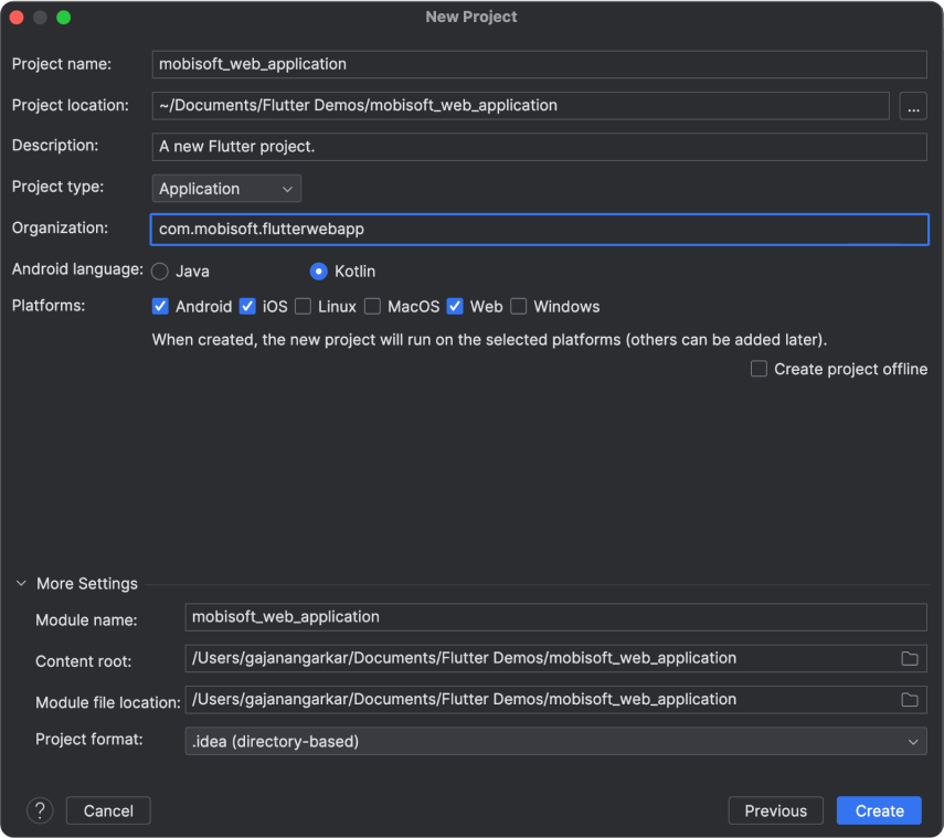
After configuring, click "Create." Your project will look something like this.
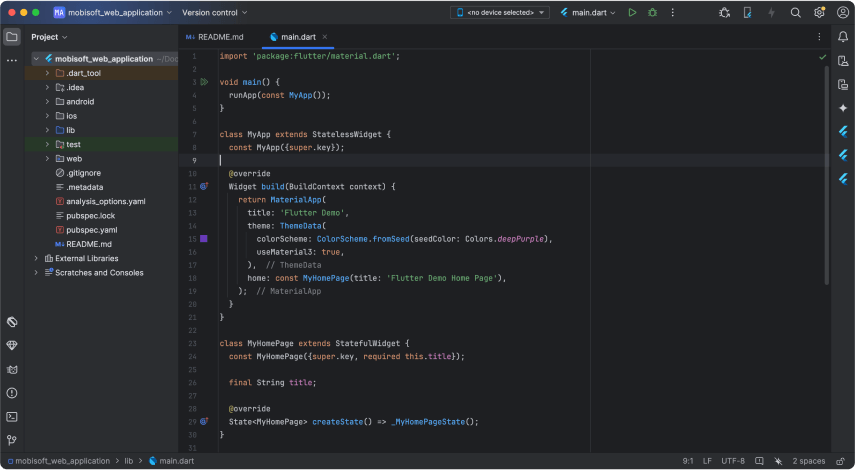
Check the project's "Web" directory. Inside, the "index.html" file indicates a successful web project creation. Now, let's run the app on a web browser. Ensure "Chrome Browser" is installed. List available devices using:
``flutter devices``
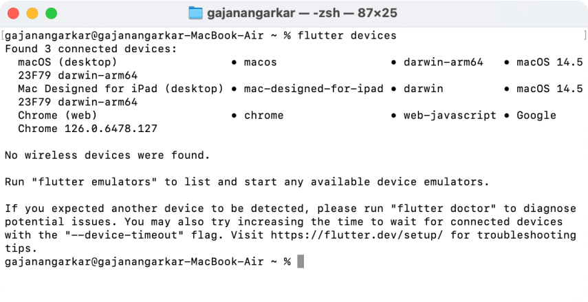
Ensure Chrome is available for the web.
Run the web application with:
``flutter run -d chrome``
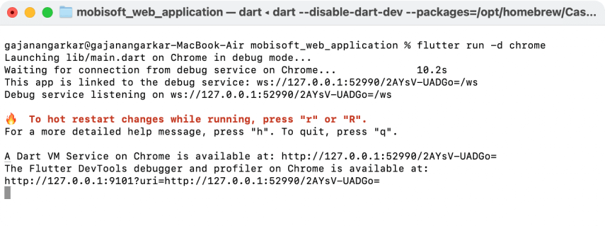
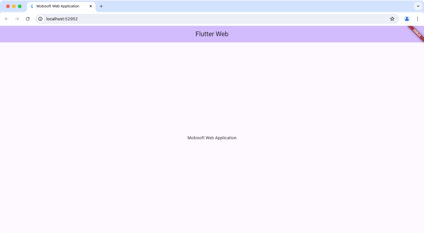
Android Studio compiles your application and opens it in the Chrome browser.
Designing a Responsive Application
Before designing a responsive application, understand the basics used in Flutter consulting projects: MediaQuery and LayoutBuilder.
MediaQuery
Provides information about the device's screen size, orientation, and other properties.Size size = MediaQuery.of(context).size;LayoutBuilder
Builds a widget tree based on the parent widget's constraints, allowing for dynamic layouts.LayoutBuilder(builder: (context, constraints) {
if (constraints.maxWidth > 600) {
return _buildWidgetContainer();
} else {
return _buildNormalContainer();
}
},
);
Implementing Responsive Design
Responsive Layout Techniques:
- Adaptive Design
Uses different layouts for different screen sizes.- Responsive Design
Adjusts the layout dynamically based on screen size.FractionallySizedBox and AspectRatio:
FractionallySizedBox
Sizes its child to a fraction of the total available space.FractionallySizedBox(
widthFactor: 0.5,
child: Container(color: Colors.red),
);
AspectRatio
Maintains a specified aspect ratio for its child widget.AspectRatio(
aspectRatio: 16 / 9,
child: Container(color: Colors.blue),
);
Handling Different Screen Sizes:
- Breakpoints
Define specific screen width ranges for different layouts (e.g., mobile, tablet, desktop).
- Scaling
Adjust widget sizes and positions proportionally to the screen size.

Responsive Text and Images:
- Responsive Text
Adjusts text size based on screen dimensions.Text(
'Responsive Text',
style: TextStyle(fontSize: MediaQuery.of(context).size.width * 0.5),);
- Scaling Images
Use the BoxFit property to fit images within their containers.Image.network('https://example.com/image.jpg',fit: BoxFit.cover);
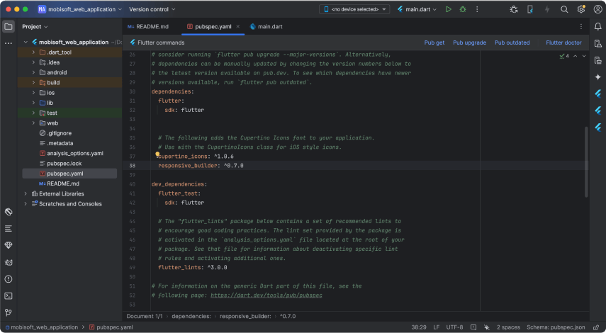
For responsive design, use the "responsive_builder" package. Open your "pubspec.yaml" file and add the responsive builder package. Then, run:
``flutter pub get``
Create a separate "HomePage" file and import the package:
class HomePage extends StatelessWidget {
 const HomePage({super.key});
 @override
 Widget build(BuildContext context) {
   return ScreenTypeLayout.builder(
     mobile: (BuildContext context) => const MobileHomePage(),
     desktop: (BuildContext context) => const DesktopHomePage(),
     tablet: (BuildContext context) => const MobileHomePage(),
   );
 }
}
Design the logo and navigation menu options. Create a dart file named "navigation_logo_view.dart":
import 'package:flutter/material.dart';
class NavigationLogoView extends StatelessWidget {
 const NavigationLogoView({super.key});
 @override
 Widget build(BuildContext context) {
   return SizedBox(
     width: 100,
     height: 50,
     child: Image.asset('assets/images/mobi_logo.png'),
   );
 }
}
Create another file named "navigation_menu_options_view.dart":
import 'package:flutter/material.dart';
class NavigationMenuOptionView extends StatelessWidget {
 final String menuItemText;
 const NavigationMenuOptionView({super.key, required this.menuItemText});
 @override
 Widget build(BuildContext context) {
   return Text(
     menuItemText,
     style: const TextStyle(
         fontSize: 18, color: Colors.black, fontWeight: FontWeight.w900),
   );
 }
}
Design a ‘Contact’ button in a separate widget:
import 'package:flutter/material.dart';
class ContactButtonView extends StatelessWidget {
 const ContactButtonView({super.key});
 @override
 Widget build(BuildContext context) {
   return Container(
     decoration: BoxDecoration(
       borderRadius: BorderRadius.circular(5),
       color: Colors.blue,
     ),
     child: const Padding(
       padding: EdgeInsets.symmetric(horizontal: 16.0, vertical: 8),
       child: Text(
         "Contact",
         style: TextStyle(color: Colors.white, fontSize: 18),
       ),
     ),
   );
 }
}
With this, you have designed the complete web page with various elements such as logo, menu options, and buttons.
Running the Application
To test the responsive behavior of your application, run it in a web browser and resize the window to see how the layout adapts to different screen sizes.

By following these steps, you can develop responsive web applications using Flutter, ensuring a seamless user experience across various devices and screen sizes.
Conclusion
Flutter is an excellent choice for developing responsive web applications due to its cross-platform capabilities, fast development cycle, and native-like performance with Flutter services. By leveraging responsive design techniques and tools, you can create web applications that provide a consistent user experience on any device. Start exploring Flutter today and build responsive web applications that stand out in the digital landscape.
Download Source Code
Download the source code for the sample application discussed in this blog from here.




 July 30, 2024


