Estimated read time: Long enough to enjoy your coffee and rethink your UX strategy.
You’ve got a shiny new product. It solves a real problem. It’s smarter than your competitors. It’s got buzzwords like AI, blockchain, or “seamless integration.” Great! But here's the question nobody wants to answer honestly:
Ever feel like your users are sneaking out the back door without saying goodbye?
They signed up, poked around for a few minutes, maybe even clicked a button or two. . . and then disappeared. No note. No warning. Just vanished like free samples at a tech conference.
Sound familiar?
If your churn rate is higher than your caffeine intake, it’s time we talked about the one thing that could be silently sabotaging your growth: UX design.
That’s right. Not your pricing. Not your features. Not even your marketing. It’s your user experience that could be scaring people off faster than a 10-step signup form. Investing in high-quality UI/UX design services can have a direct impact on customer retention and business growth.
First Impressions Matter: How UX Design Shapes User Experience
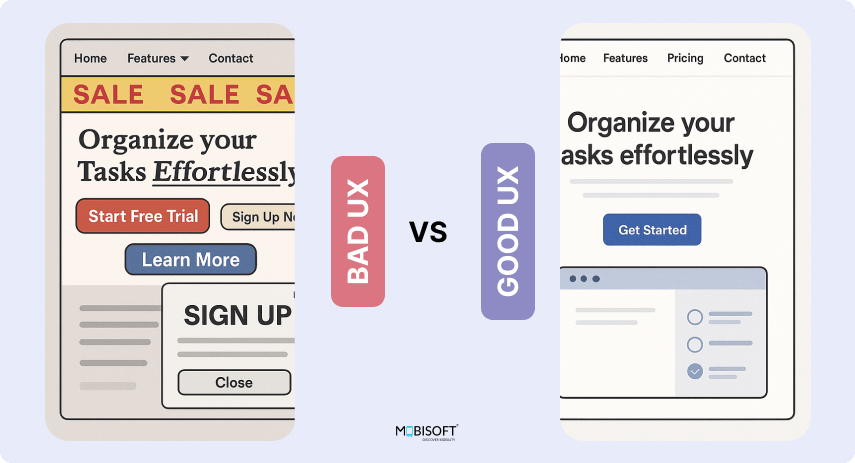
You’ve got 50 milliseconds to make a good impression. Yes, milliseconds. That’s less time than it takes to sneeze.
When a user lands on your site or app, they’re subconsciously deciding if they’ll stay or bounce. Clunky user interface design? Confusing navigation? Unreadable text? It’s a no.
Great UX feels like:
- A clean home page that loads quickly
- Clear hierarchy (headlines > subheadings > buttons)
- Logical navigation that even your grandma could figure out
Bad UX feels like:
- Flashing banners, popups, and mystery meat navigation
- Too many CTAs asking you to “Start Free Trial” before you even know what the product is
- Fonts that scream "designed by my cousin in 2005"
Real-world example: Ever landed on a site that starts playing a video automatically at full volume? That’s not a first impression. That’s a jump scare.
Simplify User Journeys with Effective UX and UI Design
This one's simple. The less your users have to think, the happier they’ll be.
Good UX removes friction. It turns complicated tasks into simple flows. If someone can order a pizza, pay a bill, or edit their profile in three steps or fewer, you’re doing it right.
What simplicity looks like:
- Fewer clicks to complete a task
- Clear icons with text labels (no mystery buttons)
- A search bar that finds what people are looking for
Case in point: Dropbox. Its mobile UX design is so straightforward, you’d think it was designed by someone who once lost an important file and cried about it.
Improve Customer Retention with Fast, Frictionless User Experience
If your site or app is slow, people leave. No, they don’t “consider leaving.” They leave.
Every second your platform delays, conversion rates drop. Google says even a 1-second delay in page load time can reduce conversions by 7%. Ouch.
Conversion rate increases are observed by companies after improving page load speeds.

Source: Cloudflare - How Website Speed Affects Conversion
This goes beyond theory; real-world results show that even small improvements in load times can lead to higher revenue and stronger user engagement.
What to do:
- Optimize images (please, no 4MB stock photo of a handshake)
- Minimize scripts and third-party plugins
- Use performance monitoring tools (Lighthouse, GTmetrix, etc.)
Your user experience design can be beautiful, but if it's wrapped in molasses, it won’t matter.
Emotional Design in UX: How to Build Loyalty Through Empathy
Want users to stay? Make them feel something.
Humans aren’t rational creatures. We stay loyal to brands that make us feel understood, empowered, or even just entertained. Emotional design in UX can tap into that emotion with small touches.
How to create emotional UX:
- Celebrate user milestones (like Duolingo’s streaks)
- Add playful microcopy ("You're all caught up.. Time to stretch!")
- Use color and typography to create mood and tone
Fun fact: Studies show that users who feel an emotional connection are three times more likely to recommend a brand. Make them feel seen.
Personalized UX Design Strategies That Drive Customer Loyalty
People love feeling like something was made just for them. Personalized experiences make users feel valued. That value turns into trust. Trust becomes loyalty.
Good personalization:
- Recommending content based on user history
- Sending relevant notifications at the right time
- Customizing UX onboarding best practices depending on user roles
Bad personalization:
- “Hey [FirstName], check out our new product!”
- Spammy notifications every 10 minutes
Example: Netflix not only recommends shows based on your taste, but even changes the thumbnail art to appeal to your behavior. Creepy? A bit. Effective? Totally.
Intuitive Navigation: Where the Heck Am I?
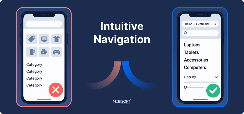
Have you ever gotten lost in an app like a digital corn maze? Not fun.
Navigation is one of the most critical elements in UX design. If users can’t find what they need, they’re gone. Navigation should be so intuitive that people don’t have to stop and think.
Tips:
- Stick to known patterns (hamburger menus, top nav bars)
- Limit main navigation to 5–7 items
- Use breadcrumbs if there are multiple layers
Example: Amazon has a complex site, but its categories and filters make finding products easy. You don’t need a map or a magnifying glass.
Microinteractions in UX: Small Details That Improve User Experience
It’s the little things that make users smile.
A subtle animation, a satisfying button click, or a friendly message when there’s no content yet, these details improve the perceived quality of your product and enhance user experience.
Examples of great microinteractions:
- LinkedIn's “Congratulations” animation when you endorse someone
- Trello's satisfying “card drop” sound
- Slack’s cheeky loading messages (“Cleaning up spilled coffee. . .”)
They seem minor, but they’re major in how users perceive your brand.
Clear Onboarding: Don’t Leave Users Hanging
Onboarding is like a first date. If it’s confusing, overwhelming, or unhelpful, there won’t be a second one.
Great UX onboarding looks like:
- Shows users around with tooltips or short tours
- Helps them achieve one quick win
- Offers help without being annoying
- Provide sample data to visualize the output.
This is useful in systems where multiple master data entries are needed to generate specific results.
Poor onboarding is like dropping someone in a cockpit and yelling, “Figure it out!” Don’t do that.
Inclusive UX Design: Accessibility That Enhances User Experience
Your user interface design should be usable by all people, regardless of ability, age, or device.
Accessibility isn’t just a “nice-to-have.” It’s essential. And frankly, it’s good business. 15% of the world’s population lives with some form of disability.
Simple Accessibility Wins:
- Use proper contrast between text and background
- Add alt text to all images
- Make sure your app is navigable by keyboard
Bonus: Accessibility features often contribute to a frictionless user experience, like captions in noisy environments or dark mode for late-night browsing.
Build Customer Loyalty with Feedback-Driven UX Design
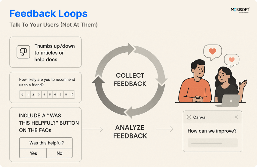
UX isn’t a one-time event. It’s a relationship. And healthy relationships require communication. A thorough UX audit to identify retention issues can uncover pain points and guide strategic improvements that keep users engaged.
Let users talk to you. Let them rate your features, submit feedback, or even complain. Then act on it.
How to build customer feedback loops:
- Add thumbs up/down to articles or help docs
- Run NPS and UX correlation surveys after key experiences
- Include a “Was this helpful?” button on the FAQs
Example: Canva actively solicits user feedback and iterates rapidly. No wonder they’re a UX design favorite.
Trust and Transparency: Show Your Face
Users are skeptical. They’ve been burned before. With bad UX decisions, shady practices, and hidden fees, people are cautious.
Trust-building UX emphasizes transparency, honesty, and humanity.
Trust-building elements:
- Clear pricing pages (no surprise fees)
- Visible privacy policies and terms
- Human-sounding copy and support
Hint: Add real team photos and contact options. Nobody wants to talk to a faceless corporation.
Mobile UX Design: Why Mobile-First UX Drives User Engagement
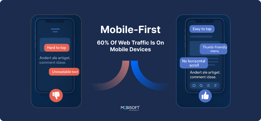
We’re living in a mobile world. Over 60% of web traffic is on mobile devices. If your UX design only works on desktop, you’re alienating a majority of users.
Mobile-friendly UX means:
- Buttons big enough to tap without a magnifying glass
- Menus optimized for thumbs
- No horizontal scrolling (please)
- Content is fitting with readable text on mobile devices.
Example: Instagram is a masterclass in responsive design and retention. Everything is built for mobile behavior.
Prioritizing mobile UX design for customer loyalty ensures a consistent and satisfying experience on smartphones and tablets.
UX Design Tips for Better Loading States and User Retention
People don’t mind waiting as long as they know what’s going on. Loading screens are an opportunity, not a design afterthought.
Good UX during loading includes:
- Spinners with friendly copy (“Warming up the awesomeness. . .”)
- Skeleton screens (previews of what’s to come)
- Progress bars that progress
Avoid just freezing the screen. That’s how you get uninstalls. To measure impact, focus on key UX metrics to track retention, such as task success rate, time on task, and user satisfaction.
Empty States: Use the Blank Canvas but not blank
An empty state is what users see when there’s no content yet. Maybe they haven’t uploaded anything, created a project, or followed anyone.
This is a moment to improve customer journey optimization, educate, and encourage.
Good empty states:
- Explain what the user should do next
- Provide an example or tutorial
- Stay fun and brand-aligned
- Show some illustration or microanimation that resonates with the content
Bad empty states? Just. . . nothing. White screen. Awkward silence.
Consistent Design Language: Brand Cohesion Matters
Inconsistent UX is like watching a movie where the characters change names halfway through. Confusing, jarring, and untrustworthy.
Your UI/UX design trends should reflect cohesion across platforms and devices.
Design language includes:
- Consistent button shapes and styles
- Unified color palette
- Common iconography
Example: Airbnb uses a unified design system (DLS) that ensures every interaction feels consistent and intentional.
Implementing design systems for a consistent user experience helps maintain brand integrity across all user touchpoints.
Loyalty Loops: Designing for Return Visits
You want users to come back, right? Then give them a reason to return.
UX design strategies for repeat customers:
- Emailing personalized content or updates
- Offering gamification in UX design (badges, points)
- Delivering continuous value (like new features or content)
Avoid dark UX patterns at all costs.
Duolingo does well with streaks, reminders, and friendly owl guilt trips.
Wrapping Up: UX Design That Builds Customer Loyalty and Long-Term Engagement
UX design isn’t just about making things pretty. It’s about:
- Making things work
- Making them feel good
- Make them feel that they are in the right place
- Making people want to come back
Customer retention and loyalty don’t happen by accident. They’re the direct result of thoughtful, user-centered design aimed at boosting loyalty. Staying ahead also means staying informed about emerging UX trends for user retention that can future-proof your design strategy.
You’re not just designing screens. You’re designing relationships.
User-Centered Design Starts with Empathy: The Foundation for Customer Retention
At the core of every great user experience is a deep principle: empathy.
Stop and consider for a moment:
- What is my user attempting to accomplish?
- Where would they be frustrated, lost, or uncertain?
- How do I remove friction and lead them confidently?
When you design with empathy, you create experiences that are intuitive, functional, and downright human.
Users can sense it; they feel understood. They come back not out of duty, but because they want to. And when they are properly taken care of, they do not just stick around; they become your advocates.
That type of loyalty is established, not purchased.



 May 19, 2025


