Crafting a great user experience design for mobile isn’t just about visuals it defines how users connect with your app. People use apps in motion. They scroll during a commute, check orders in store lines, and swipe through screens between tasks. Some relax with apps on the couch. Others tap with one hand while multitasking. Mobile UX must support both moments.
It needs to do more than work. It must feel natural. Every screen, icon, and tap should guide users with ease. Mobile app interfaces are small. Attention spans are shorter. So, your mobile-first app design must be simple, fast, and useful from the very first interaction.
Good UX reduces guesswork. It shows users what to do next. It helps them accomplish tasks without friction. When your mobile app UX design just works, users stay focused on what matters, whether that’s checking out, booking a ride, or browsing content.
This playbook blends mobile UX best practices with practical UX principles. It helps you build apps that people can trust and enjoy. From layouts that work on the smallest screens to flows that feel effortless, this guide helps teams deliver mobile app experiences users want to return to.
Explore our mobile app UX design services to build seamless, intuitive mobile experiences for your users.
Introduction
Purpose of the Playbook
This playbook offers a straightforward and engaging guide for aspiring mobile software designers to create polished and intuitive apps. It provides mobile-first methodology, design systems, and real-world examples so you can make informed decisions for your users' experiences.
You will find tactical tools and usable ideas to help you achieve better mobile app usability, whether it’s a completely new launch or an improvement to an existing app. Each module walks you through important decisions, helping you focus on providing real value.
You will ultimately learn how to increase clarity in mobile app design, reduce friction, and boost engagement and retention. All it takes is the right approach, and user experience design mobile becomes your competitive advantage.
Discover how our comprehensive UI/UX solutions support every stage of your mobile product journey.

Who Should Use This
This playbook is for anyone who wants to build mobile apps with great UX. It helps you think like a user. You'll learn to streamline processes, boost engagement, and improve each feature’s usability.
Whether you're developing something new or updating an old product, it will help you through each step along the way. It's intended to be used both collectively by designers, developers, and product groups to be on the same page.
Designers creating apps for mobiles:
Use this to shape user-friendly layouts and smooth interactions. You’ll find design tips that match real mobile usage behavior on small screens.
Product managers who want to build a product with better UX:
This helps you pick the right features, ask smarter questions, and connect user needs to business goals. It supports responsive app design decisions with data-backed strategies.
Developers who care about usable, scalable design:
This guide helps you build responsive, scalable mobile app interfaces. You’ll detect design flaws early and improve how users interact with the app.
Anyone improving an existing app’s UX:
Founders, marketers, and QA teams can use this to understand mobile user experience better. Great UX takes a team. This guide helps every role support the journey.
How to Navigate the Playbook
We’ve split this playbook into clear, actionable sections. Each one focuses on a key part of mobile UX design. You don’t have to read it in order. Jump to any section when you hit a challenge, like fixing drop-offs, optimizing speed, or improving the mobile app onboarding UX.
You’ll learn to:
- See what users want and how they act
- Plan simple, clear user journeys
- Use proven mobile app design principles
- Test your designs and keep improving them
Need something fast? Jump to the part you need.
Want the full picture? Read from start to finish.
Each section includes examples, visuals, and action steps. Use it to go from idea to screen. Whether you're starting from scratch or improving what you’ve built, this guide is here to help.
Let’s build something users will love to use.
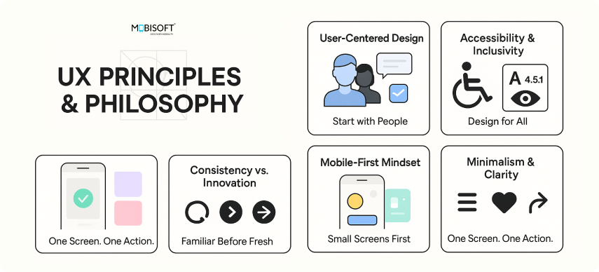
UX Principles & Philosophy

A strong mobile app UX design starts with clear thinking and user-first decision making.
User-Centered Design Approach
Begin with people. Talk to them. Watch how they use your app. Build features that solve their real problems.
Example: Spotify’s “Discover Weekly” came from a simple insight that users wanted fresh music without spending time searching.
Accessibility & Inclusivity
UX should work for everyone. Color contrast, readable typography, and screen reader compatibility aren’t optional.
Mobile-First Mindset
Design for small screens first. Prioritize big taps, fast access, and thumb-friendly interactions. Expand to tablets or desktops later.
Minimalism & Clarity
Keep things simple. Each screen should focus on one main action. Every screen should answer: “What’s the single most important thing here?”
Consistency vs. Innovation
Stick to patterns that people already know, like bottom navigation or double-tap to like. Bring in new ideas only when they improve the experience.
Apply UX laws
Apply UX laws wherever possible in your design. It can help you design hustle-free designs. It doesn't mean you should not design apps with out-of-the-box thinking, but always remember, before breaking those thumb rules, first understand why you are breaking it & how much impact it will make on the user experience.
User Research & Personas
Good UX comes from real insight. Research removes guesswork in mobile app UX design.
Research
- Research is your best friend. It pulls the curtain back on what users want. Many teams rely on assumptions, but the smartest teams go beyond assumptions and get into users’ lives. This is the foundation of effective UX design for mobile apps.
- Surveys help you spot broad patterns, and you'll understand mobile app usability preferences, habits, and expectations. You’ll see what people prefer, avoid, and wish they had.
- One-on-one interviews? Gold. That’s where the real nuance shows up. You hear frustrations, habits, even workarounds users never mention in group settings
- Usability tests are your field reports. They highlight exactly where the experience breaks down. What seems obvious to you often isn’t. Watching someone stumble through your flow gives you clarity fast, especially when evaluating mobile-first design effectiveness.
Tip: Always test on actual devices. Simulators miss real-world issues touchscreen usability on mobile, screen glare, thumb slips, and poor network zones. Real context leads to real feedback.
User Persona
A well-defined user persona is key to building better mobile app experiences. There can be more than one target audience, so build profiles that reflect diverse user needs. While creating a user persona, consider factors like age, gender, lifestyle, tech comfort, geography, and usage environment. These profiles directly inform decisions related to mobile app interface design and overall UX flow.
Example: “28-year-old commuter who uses the app with one hand while riding the crowded metro, He lives in a tier 1 city, Tech savvy.”
Empathy Maps
Personas show who your users are, but empathy maps reveal how they think, feel, say, and act while using your app. These insights lead to more emotionally intelligent mobile-first app design and more relevant features.
Use these behavior patterns to design features that are useful in real-world contexts, especially when considering responsive app design across devices.
Journey Mapping
Now you have a persona & empathy map, use that data to draw out the steps users take from opening your app to completing a task. This helps you spot friction points and improve them.
Competitor analysis
Only knowing your user is not enough; study the Competitors' apps. See what they do well. Look at areas where you can offer something better. It will give you an edge over others. Learn from others' mistakes & take inspiration where you feel stuck. Evaluate competitors by using Strength - Weakness - Opportunities - Threat (SWOT) technique. It is effective & fast.
Secondary Research
Use what already exists. Read papers, blogs, and case studies. Check app reviews on the Play Store and App Store. These often highlight repeated frustrations and improvement opportunities.
Information Architecture (IA) Is the Backbone
How your app content is structured determines how quickly users find what they need, an essential factor in mobile app UX design.
Content Hierarchy
Put the most important actions up front. If you want users to book, show "Book Now" right away, don’t bury it behind secondary options. Lead with value, and make key tasks frictionless to reach.
Navigation Patterns
Use bottom navigation when you have 3–5 main sections. Add a drawer or hamburger menu for less important items. This keeps the layout clean and easy to scan. Check if you can logically club the menu items. Keep navigation clean, logical, and minimal. If two items always appear together in use, consider grouping them. Great nav removes thinking.
Taxonomy & Labeling
Keep labels straightforward. Describe exactly what a user will see or do when they tap. Forget the clever names, they often confuse. Aim for clarity over creativity.
Do’s & Don’ts:
- Keep categories easy to spot
- Use the same design style across the app
- Use icons wherever possible.
- Align images, icons & content properly
- Don’t use too many colors & typefaces
- Avoid text-heavy content
- Don’t use stretched, oddly cropped & low-quality images
Design Patterns & UI Components

Familiar patterns build trust. Users know what to expect and act faster.
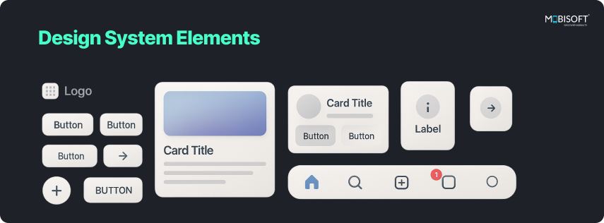
Buttons, Cards, Modals, Forms
Understand the meaning behind shapes, especially for buttons and cards. Rounded corners feel friendly while sharp corners feel professional. Use these design cues thoughtfully in your mobile app interface design. Use it wisely.
Input Controls & Gestures
Add sliders, toggles, and pickers where needed, and allow users to tap or swipe instead of typing. This enhances mobile interaction design and supports touchscreen usability on the go.
Feedback Patterns
Give users a sign that their actions worked. Show a loading bar when something takes time. Use snackbars and toasts to confirm tasks.
Dark Mode Guidelines
Choose high-contrast colors. Soft black and muted tones improve readability. Adjust shadows and highlights for depth. Dark mode is good for users who use the app at night & it also saves battery, but that doesn’t mean you should use it everywhere. Understand the user's needs and apply it accordingly.
Design system
Use a popular system to unify and standardize designs. Material Design, Apple’s Human Interface Guidelines, and Atlassian’s Design System all provide pre-built components and documentation containing design rules. By using one of these systems, you can establish a clear, flexible, and recognizable interface.
Embrace the Mobile-First Mindset
People use mobile apps all day, while commuting, relaxing, or multitasking. A mobile-first app design ensures your app feels good in every moment.
Make it thumb-friendly
Most users hold their phones in one hand. Place buttons in natural reach zones to help them act quickly.
Use easy tap zones
Target 28–32 px for icons and 180–210 px for buttons. It makes actions easier and more accurate.
Real-world example
Swiggy places cart, menu, and profile tabs near the thumb for faster ordering.
Quick tip: Floating action buttons can spotlight your app’s main value without clogging the interface. Use them to focus the user’s attention while enhancing touchscreen usability in mobile devices.
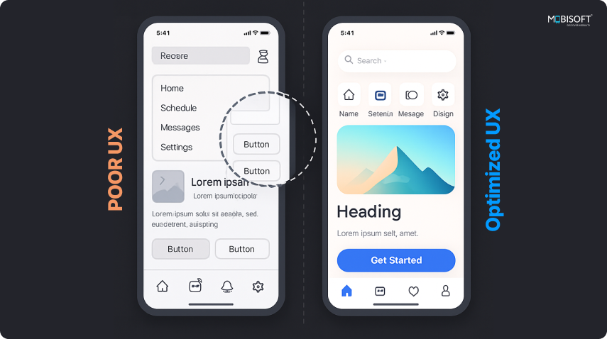
Simplicity Wins

A clean layout helps users stay focused. When only the essentials are visible, people move faster and with more clarity. This is the core of mobile UX best practices.
One screen, one goal
Design each screen around one key task. For instance, a booking screen should show just booking options. Decide what matters most and build around it.
Fewer steps, better flow
Autofill, smart defaults, dropdowns, these aren’t just UX tricks. They’re how you help users glide through tasks with confidence.
Break up content visually
Use space well. Group items logically. Add icons and headers that guide the eye.
Example: Spotify nails this. Every screen has just enough. Browsing, playing, and discovering new music all feel natural and focused.
Quick tip: Stick to consistent fonts and colors. Familiarity reduces effort and supports designing seamless mobile app experiences.
Navigation Should Be Effortless
Easy navigation keeps people moving. When flow feels effortless, users explore more and get things done faster. This is key to responsive app design success.
Bottom navigation works well:
Use 3–5 icons with clear meanings. Familiar symbols make navigation easy to follow.
Label every possible icon:
Don’t leave users guessing. Add short, readable text under icons, "Cart," "Wallet," "Home." It helps.
Support flexible movement:
Add back arrows, undo, cancel buttons, and home icons so users feel in control. These small affordances create a sense of control.
Confirmation pop-up:
Show confirmation popups for important actions. Accidental clicks happen; it should not be a headache for users.
Quick tip: Stick to a consistent menu layout. When users recognize patterns, they don’t have to relearn anything. It enhances the overall mobile app interface design.
Fix Forms Before They Frustrate
Well-built forms speed up action. When users can complete tasks quickly, they feel confident and keep going.
Ask only what’s needed
Trim the fat. Users want results, not paperwork. Ask what’s essential and skip the rest.
Match keyboard to input
Phone fields should trigger number pads. Email fields should show the @ symbol. It’s all about reducing extra taps.
Allow users to return later
If something interrupts the process, let them save their spot. Progress-saving removes anxiety.
Quick tip: Add a progress bar for longer forms. People feel better when they know where they stand. This is a proven mobile app UX checklist item.
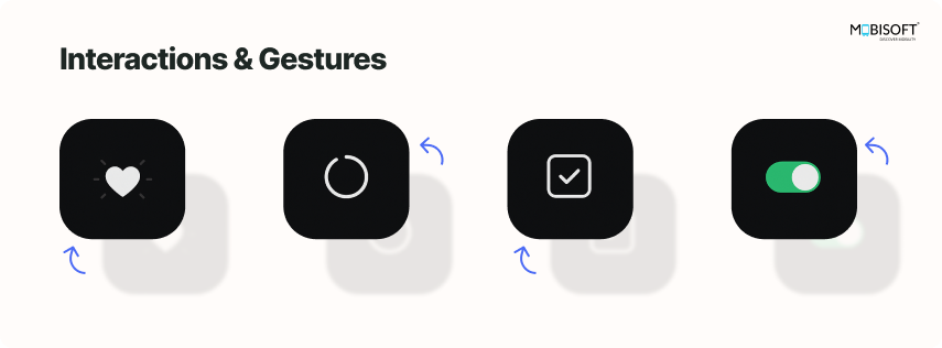
Interactions & Gestures are Important
Subtle interactions help users know the app is responding. A swipe, tap, or animation keeps things clear and boosts mobile app interaction design.
Give instant feedback
Every tap should trigger a visible response. A soft animation, toast, or success state helps users trust the app.
Support familiar gestures
Swiping to delete, dragging to reorder users are already expected. Deliver what feels natural.
Use motion to guide focus
Light animations help users track transitions, changes, and updates. Slide-ins, fades, and loaders all count in UX design for mobile apps.
Onboarding & progression Animations
Short, purposeful animations during onboarding or loading screens can make the experience feel polished.
Quick tip: Keep animations quick and subtle. They should enhance, not distract fro,m the mobile app user experience.
Accessibility Is Non-Negotiable

Make your app usable for everyone. Prioritize accessibility in mobile apps for an inclusive experience.
Accessibility
Accessibility counts; it’s good design. If your app is accessible to everyone, it becomes more empathetic, easier to use, and more welcoming key to mobile UX best practices.
This is how you bake access into the experience from day one:
Here’s how to bake accessibility into the experience from day one:
- Text & Color: Utilize text that is legible with a contrast ratio of no less than 4.5:1
- VoiceOver & TalkBack: Test your app with screen readers and voice control. Most users take advantage of them, and it keeps things from sliding under your radar.
- Tappable Areas: Buttons and links must be tappable, particularly on small screens or for individuals with reduced use of their hands. Don't make them pinch and zoom to tap on a target.
- Alternate Input Options: Think beyond touch. Voice input, keyboard input, and assistive technology make your app more accessible and versatile.
Why it matters
Universal design makes the experience of everyone better, not only individuals with special needs. You can see that your product has been made with consideration and attention, and users will be favorably disposed towards this.
Visual Design System
Design needs rhythm. A solid visual design system brings consistency across every screen and interaction. It’s less about looking pretty and more about making things feel familiar and intuitive, an essential foundation for any mobile app UX design.
- Typography: Stick to 2–3 type styles max. Clean, clear, and readable wins every time.
- Color Palette: Na. Select your primary, secondary, and feedback colors early on. Utilize color to drive behavior.
- Iconography: Stability of style; avoid combining styles. All icons should be of the same family.
- Grid & Spacing: Margins are important. A tight grid generates flow and breathing space.
- Brand Integration: Careful details, color, tones, and soft interactions make individuals recall your business more.
Our design systems for mobile apps ensure your app’s interface stays consistent and scalable.
Wireframing to Prototyping
Get your thoughts out of your head and into your hands in a hurry. Wireframes and prototypes allow everyone to see what the app will look like before any code is written, which supports responsive app design from the start.
- Tools like Figma, Adobe XD, and Sketch are UI design tools. They help with mobile app ux checklist creation, wireframes, high-fidelity design, and clickable prototyping. There is a free tool called Penpot, which helps you get started without spending money.
- For more advanced interactions, look at Axure or Protopie
- Start low-fidelity. Get the structure right first, and then iteratively move to detailed visuals. It saves time and avoids confusion, core to mobile app design principles.
- Always create clickable prototypes. Let the stakeholders experience the flow, not just glance at screens. This is crucial in how to design mobile app UX effectively.
UX Writing & Microcopy Creates a magic
Words are designed. They shape how your product feels, what it promises, and how users move through it. Good microcopy enhances mobile app user experience while guiding users naturally.
Voice & Tone
Your words should reflect your brand’s soul, warm, clear, and consistent. Think of tone as body language. It sets the mood even before users take action.
Error Messages
No one enjoys errors, but they're inevitable. What matters is how you handle them. A message like “Oops, something went wrong. Try again in a moment or check your internet” builds trust because it feels human and helpful.
Call-to-Action Writing
Button labels should drive clarity, not confusion. "Book Now" or "Get Started Free" tells users exactly what’s next. Avoid generic commands.
Localization
Design like you're already global. Plan for local phrasing, layout shifts due to longer words, right-to-left scripts, and cultural tone. You’re adapting.
Learn how designing for user trust enhances retention and credibility.
Test in the Real World (Not Just Simulators)
You don’t build apps for clean rooms. You build them for coffee shops, elevators, poor networks, and tired eyes at midnight. That’s where your mobile app usability is truly tested.
When to Test
The earlier the better. Don’t wait for “final designs.” Rough prototypes can uncover more than polished screens.
Create Test Cases
They should mirror real goals, like changing a delivery address or completing a payment. That’s how you spot what breaks flow.
Metrics
Look beyond opinions. Measure task success rates, System Usability Scale (SUS), average time on task, and heatmaps. The patterns will tell you where users thrive
Feedback Loop
Capture insights. Share with the team. Then adjust fast. Iteration is your competitive edge.
Speed Is Part of UX
Speed isn’t a bonus, it’s an expectation. Users won’t sit around to see why your app is slow. This makes app performance and UX tightly connected.
Optimize Everything
Compress images, minify your code, and remove non-essentials. Users won’t thank you, but they’ll stay.
Expectation Benchmark
Three seconds is the ceiling. Faster than that, and users feel a flow. Slower, and doubt creeps in.
Micro-Interactions Matter
Subtle transitions, fast loading spinners, and tiny motion cues make the experience feel polished. They also reassure the user that something is happening.
Example: Open Google Maps. Pinch, swipe, drag, everything responds instantly. That’s a performance standard baked into muscle memory.
See examples of effective microinteractions in mobile UX that elevate app usability and delight.
ASO (App Store Optimization) UX Considerations
Your app experience starts before users download anything. Your app’s first impression doesn’t start at launch. It starts in the store, where users judge you by screenshots, reviews, and onboarding flows.
Onboarding for Conversion
Make it optional, visual, and lightning-quick. Let people explore without barriers. Allow skipping or revisiting later.
Review Prompts
Timing matters. Ask after a win, like when someone finishes a task or saves time. That’s when goodwill is highest.
Retention
Notifications are a trust test. Send them when they help. Skip them when they don’t. If a push doesn’t add value, it adds friction.
Design Handoff & Collaboration
A great idea poorly shared leads to delays. Smooth design-dev handoff matters. It ensures your mobile UX best practices are implemented correctly.
Annotations Are Key
Document each screen state, edge case, and interaction. What feels “obvious” in Figma often isn’t in code.
Use Real Tools
Work inside tools like Figma, Zeplin, or Storybook. Avoid screenshots or vague comments. Live specs save time.
File Hygiene
Keep it clean, clear names, single source of truth, no guessing games. A tidy file is a productive one.
UX Metrics & Continuous Improvement
Design is never done. Every user session teaches you something. Pay attention.
Track What Matters
Daily/Monthly Active Users, retention rates, drop-offs in key flows. They show behavior.
Visualize Friction
Tools like heatmaps and session replays reveal more than surveys ever will. See where users hesitate, rage tap, or vanish.
A/B Test Everything
One change at a time, one hypothesis per test. Iterate with intent, and stay focused on outcomes.
Design for All Devices
Today’s users jump between phones, tablets, foldables, and landscape views, and expect it all to just work.
Responsive Layouts
Use grids, scalable fonts, and layouts that adjust without breaking
Device Testing
Simulators are just a start; real devices are the truth. Test on edge screen sizes, low-end phones, and niche use cases.
Edge Case Ready
No element should fall apart just because someone rotated their screen or zoomed in. Your layout should flex, not break.
Checklists & Templates
Your pre-launch safety net. Checklists are unglamorous and completely essential. They catch what your brain skims past.
UX Review Checklist
Are the flows clear? Is the copy readable? Is the primary action always obvious?
Accessibility Checklist
High color contrast, screen reader compatibility, keyboard navigation, small details, big reach.
Design QA
Does spacing look right? Do animations run smoothly? Do buttons behave across screen sizes?
Final Thoughts: Great UX = Invisible UX
The finest experiences must fade into the background.
When UX just works, no one even notices. They order, book the trip, or browse freely, without anxiety or hesitation. That is the norm.
If your user can operate your app with one hand at a busy coffee shop while sipping a latte and dreaming about their day, you've won.
Discover how designing mobile UX for Gen Z can align your app with modern user expectations.
Keep it simple. Keep it quick. Keep it about them. That's how you create an app that users will want to return to.


 June 4, 2025


